The 6-Step Guide to Make Your Mobile Site Load Faster
Your users expect your site to load fast. If it doesn’t, you could lose a ton of traffic.
How fast, you ask?
Some research suggests that if a page doesn’t load in the literal blink of an eye, people could lose interest. That’s about 400 milliseconds.
Just a one-second delay can reduce customer satisfaction by 16 percent and one in four visitors will abandon a site if it takes more than four seconds to load.

Not to mention the mighty Google says site speed is a ranking factor for mobile sites.
So if your site isn’t fast, both your audience and Google will think poorly of it. You’ll lose visibility and traffic.
So, how fast is your site?
Because if it takes longer than one or two seconds to load, you’re losing traffic right this moment.
It’s okay if your site is slow. There are steps you can take to make it faster to ensure you don’t let a single visitor slip through your fingers. Here’s how.
Step 1: Test Your Mobile Site Speed
Before you do anything else, you should test how fast your mobile site really is.
You might think it loads just fine, but it could be slower than you think.
One of the best mobile tests is from Ubersuggest. Here’s how it works:
Step #1: Enter Your URL and Click “Search”

Step #2: Click “Site Audit” in the Left Sidebar

Step #3: Scroll Down to “Site Speed”
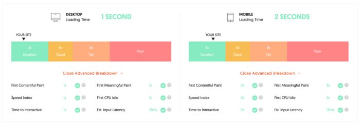
This is where you’ll find the loading time for both desktop and mobile devices. This shows that my site’s mobile loading time is 2 seconds, which is an “excellent” score.
It also tests speed related to six key elements of your website:
- First Contentful Paint
- Speed Index
- Time to Interactive
- First Meaningful Paint
- First CPU Idle
- Estimated Input Latency
If your site speed is excellent, you shouldn’t have any concerns. But if there’s room for improvement, don’t wait to take action. Every additional 0.5s it takes to load your site increases the percentage of visitors that will leave.
I’m going to address the most common causes of slow mobile sites and explain what you can do to improve yours.
Step 2: Perfect Your Mobile Site Design
Think back to when you designed your site.
Did you have mobile devices in mind?
I’m guessing you didn’t. (If you did, give yourself a pat on the back.)
If you didn’t now is the time to rethink your design with a mobile-first mindset.
Mobile sites have changed a lot in the last few years.
It used to be that sites would have two versions, one for mobile and one for desktop.
A mobile site is easily identified by the “m.” subdomain:

In this situation, the mobile and desktop sites are two completely different animals operating separately from one another.
This is no longer the case. Now, most sites use responsive design.
Responsive design allows you to have one site that dynamically changes depending on how it’s being accessed.
So your mobile and desktop users will be looking at the same site, but it will appear differently on each device.
This is actually what Google prefers. They state it quite simply:
“Responsive design is Google’s recommended design pattern.”
You’re probably thinking, “Okay, cool, but what does this have to do with speed?”
Responsive designs typically load faster than mobile-only sites, so you’re gaining a massive SEO advantage there.
If you use a responsive design, your site will get more attention in the form of social shares, which will also boost your SEO.
Making your site responsive is good for both the short term and the long term. If you don’t already have a responsive site, I recommend looking into it as soon as you can.
Step 3: Keep Your Site Lightweight
It’s easy to get caught up in making the best and most eye-catching design out there.
Sometimes you get too caught up, and as a result, your site gets slower and slower because you keep adding more and more.
This is a condition that developers call code bloat.
Code bloat happens when your site gets weighed down with excess code.

Most of the time, code bloat happens when a designer is too focused on the visual presentation of a site.
Don’t get me wrong. How a site looks is extremely important.
But performance can’t take a backseat to looks.
Luckily, it doesn’t have to. You can have your cake and eat it too. Here are some tips to keep in mind when designing your site:
Keep it Simple
Leonardo da Vinci had this to say about simplicity:
Simplicity is the ultimate sophistication.
Now, about five hundred years later, his words still ring true.
Look all around you. The complex designs of the past have been replaced with the minimalist designs of the future.
This applies to websites too. Especially mobile sites.
On a mobile screen, sites can easily become too crowded, so it’s important to keep everything open and decluttered.
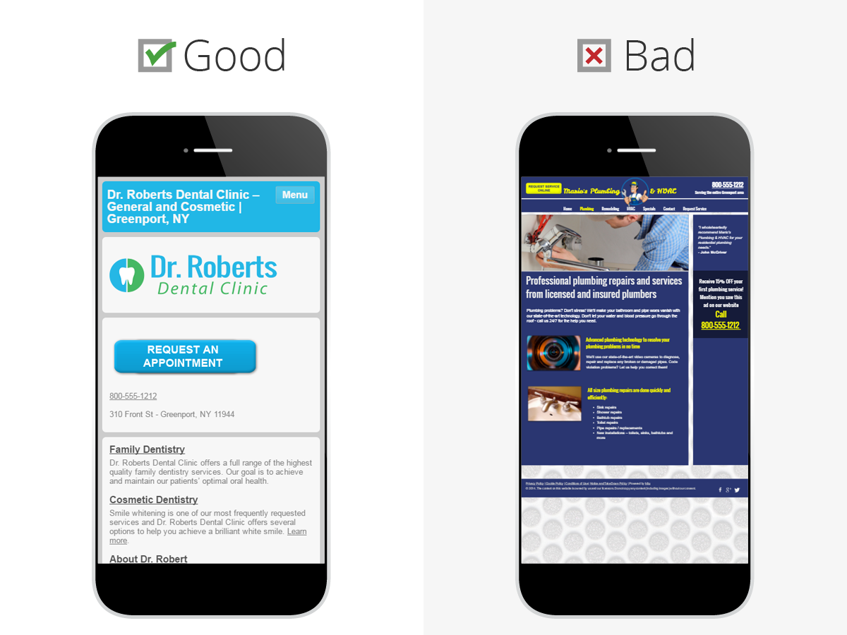
As a rule of thumb, you should only have one call-to-action per page. This will help you reduce the amount of code you use, and it’ll also improve your site’s user experience.
You might also want to consider a more simplistic design like this one from Rug Doctor:
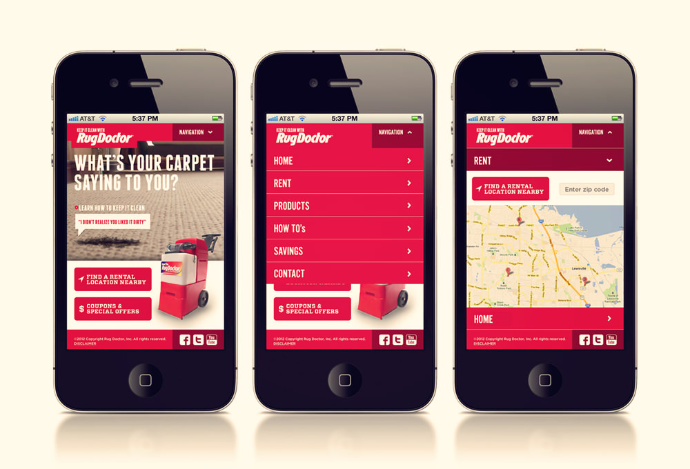
It’s not flashy, but it catches your attention with its sleek style.
You don’t need lots of bright colors and photos to make your site stand out. When it comes to mobile design, less is often more.
Eliminate Steps
The less your users have to do, the better.
Think about it. Why should there be seven steps between a customer and a sale when there could be only 3?
This effectively shortens your sales funnel, but it also makes the user experience even simpler.
Lots of ecommerce sites use this strategy to increase their sales.
On Boden’s mobile site, it’s super easy to buy a product. You add it to your cart, click checkout, and pay.
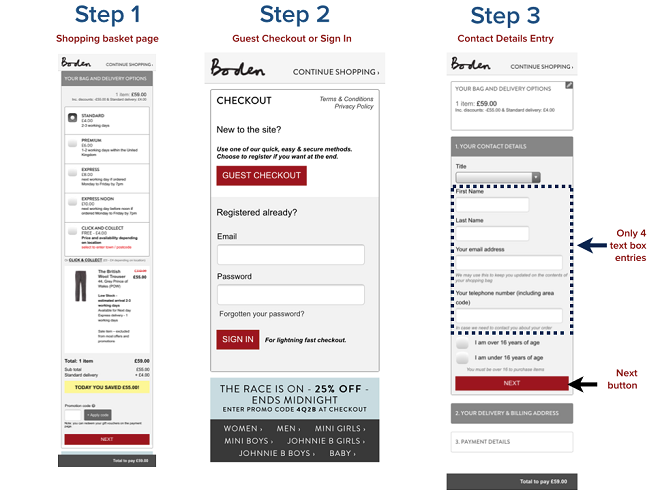
It’s straightforward and to the point. There are no unnecessary steps.
This also naturally helps relieve code bloat. It’s hard to go overboard with code if you don’t have tons of pages on your site.
Cutting out unneeded steps is one of the best things you can do for your visitors. Mobile users are much more likely to stay on your site if they don’t have to do much.
Save your users a few clicks, and you’ll reap gigantic rewards.
Use Fewer Images
Before I get into this, I want to say that good images are definitely important for any site, and they also have SEO benefits.
However, you can have too much of a good thing.
In this case, you can go crazy with images and slow down your site in the process.
You may not think this is a big deal, but images make up roughly 63 percent of a page’s “weight.”
From 2011 to 2015, the size of the average mobile page tripled.
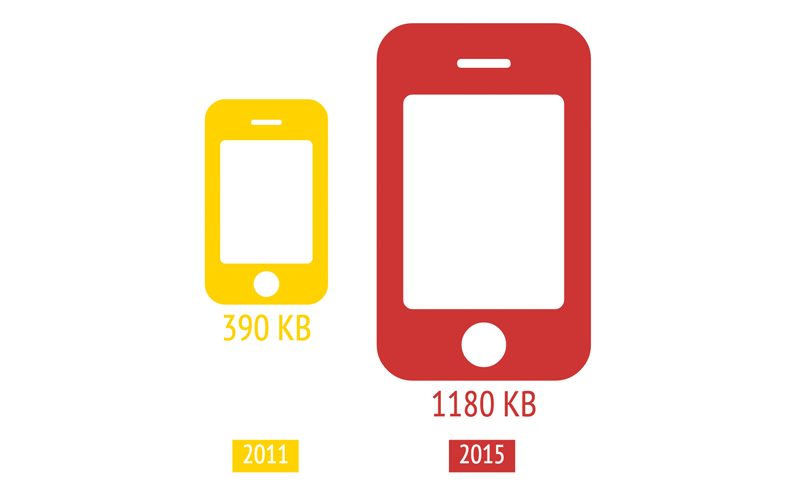
That means images are some of the most demanding elements on your site. They take up a lot of space, so having too many is not good.
One solution is to simply cut back on images.
Another (probably more practical) solution is to compress your images and reduce their file sizes.
Compression basically makes your images smaller without degrading the quality. This reduces the amount of time it takes for your site to load.
As a bonus, it also reduces the amount of time it takes for search engine bots to crawl and index your site.
Sites like Compressor.io can do this in a snap.
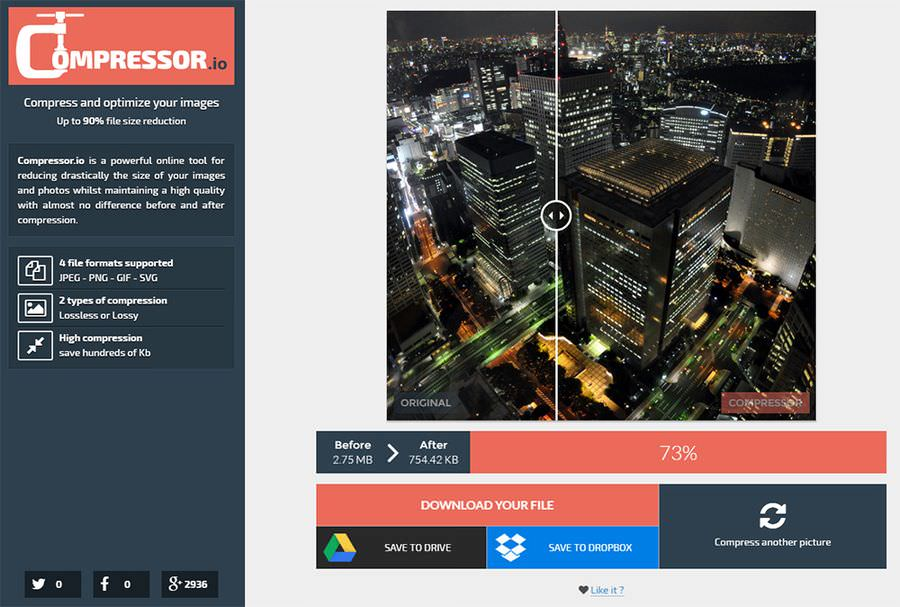
In fact, this is a best practice you should adopt even if your site is already blazing fast.
Don’t Use Custom Fonts
I like a nice custom font as much as anyone else, but some of them are really high maintenance.
Some fonts use tons of CSS, while others go heavy on JavaScript. Either way, you’re looking at a ton of code.
If you want a really deep read on this subject, check out this post on Google’s Web Fundamentals site.
If you want the short version, here it is: Only use custom fonts when they’re absolutely necessary.
Step 4: Minify Your Code
Minification is a super useful technique for streamlining your code.
Here’s a quick definition of what it means to “minify” code:
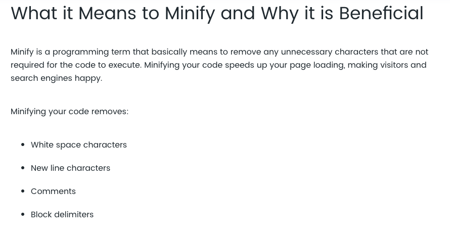
Essentially, minifying your code takes out everything that’s redundant and unnecessary. It makes sure your site is only using the code it needs.
This goes a long way toward making your site lightweight.
You can minify code manually (instructions here), but if you don’t have any coding experience, it can be a little bit intimidating.
Thankfully, there are several free tools you can use to minify your code in no time at all.
Minifycode.com offers several minifying tools to let you simplify your HTML, CSS, JavaScript, and more.
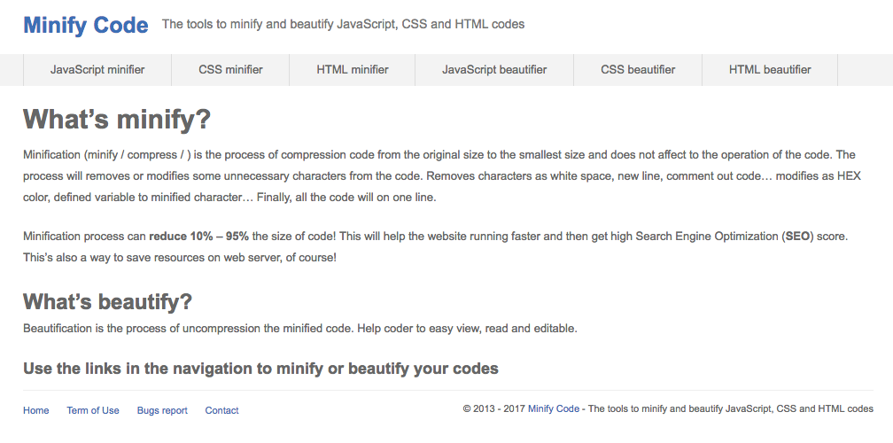
If your site runs on WordPress, you have even more options thanks to plugins like Better WordPress Minify:
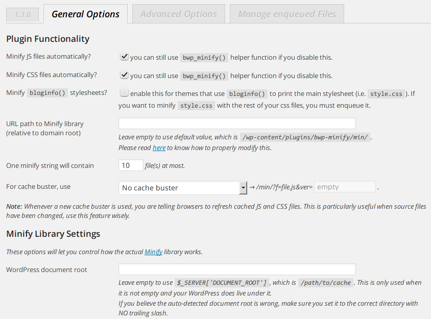
By using these tools, you can minify your code with just a few clicks, and you’ll be well on your way to a speedier site.
Of course, you should do all that you can to make sure there’s no unnecessary code, but mistakes happen. These tools let you fix those mistakes and improve your site at the same time.
Step 5: Cut Down on Redirects
I love redirects. They can be really useful for SEO and user experience.
But just like code, redirects have limited uses. You can’t use redirects all over the place and expect your site to perform well.
That’s because redirects inherently slow down your site.
When you click on a normal mobile link, the server provides the document found at that link.
But a redirect means there’s no document at that particular link. Because of that, the server has to go to the page where the document lives and retrieve it.
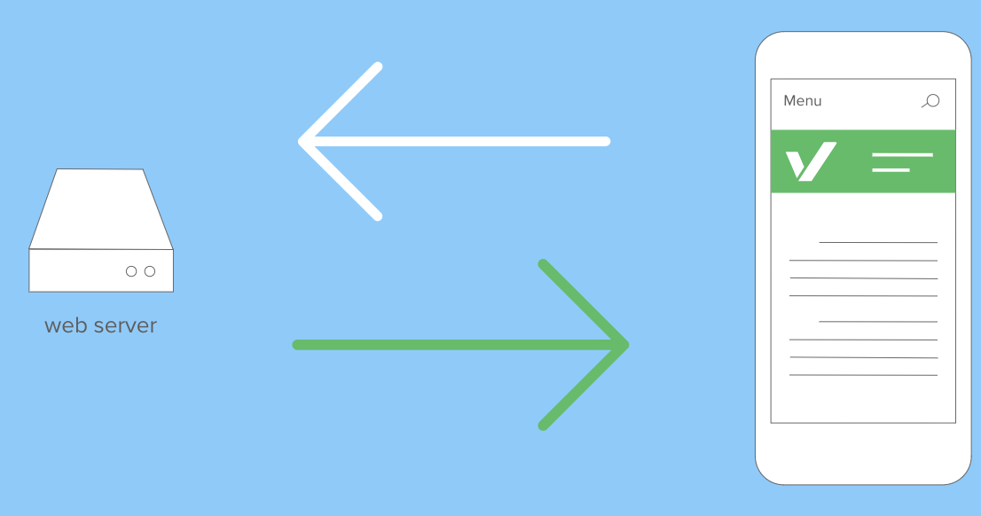
This process has to happen with each file on a web page. That means every image, CSS file, and JavaScript file will go through the redirect.
As a result, it could be several seconds before the right page loads. By that time, your users could be long gone.
I recommend using Screaming Frog to check for redirects.
Then you can trace the roots of your redirects and change any that aren’t completely necessary.
The less work your site has to do, the faster it’ll go. While redirects have a time and a place, don’t overuse them or grow dependent on them.
Step 6: Load Above The Fold First
It’s obvious that users see above the fold content before they see anything else.
So why load your entire page all at once?
Why not load only the above the fold content at first and then load the rest as needed?
This is a concept referred to as “lazy loading,” and it can work wonders for site speed.
I bet that if you had the choice, you’d rather lift three pounds than 30. Am I right?
Lazy loading is that exact same concept applied to websites.
By implementing lazy loading, you’re asking your site to do only as much work as it needs to do and no more.
If you’re comfortable with code, you can use this jQuery plugin.
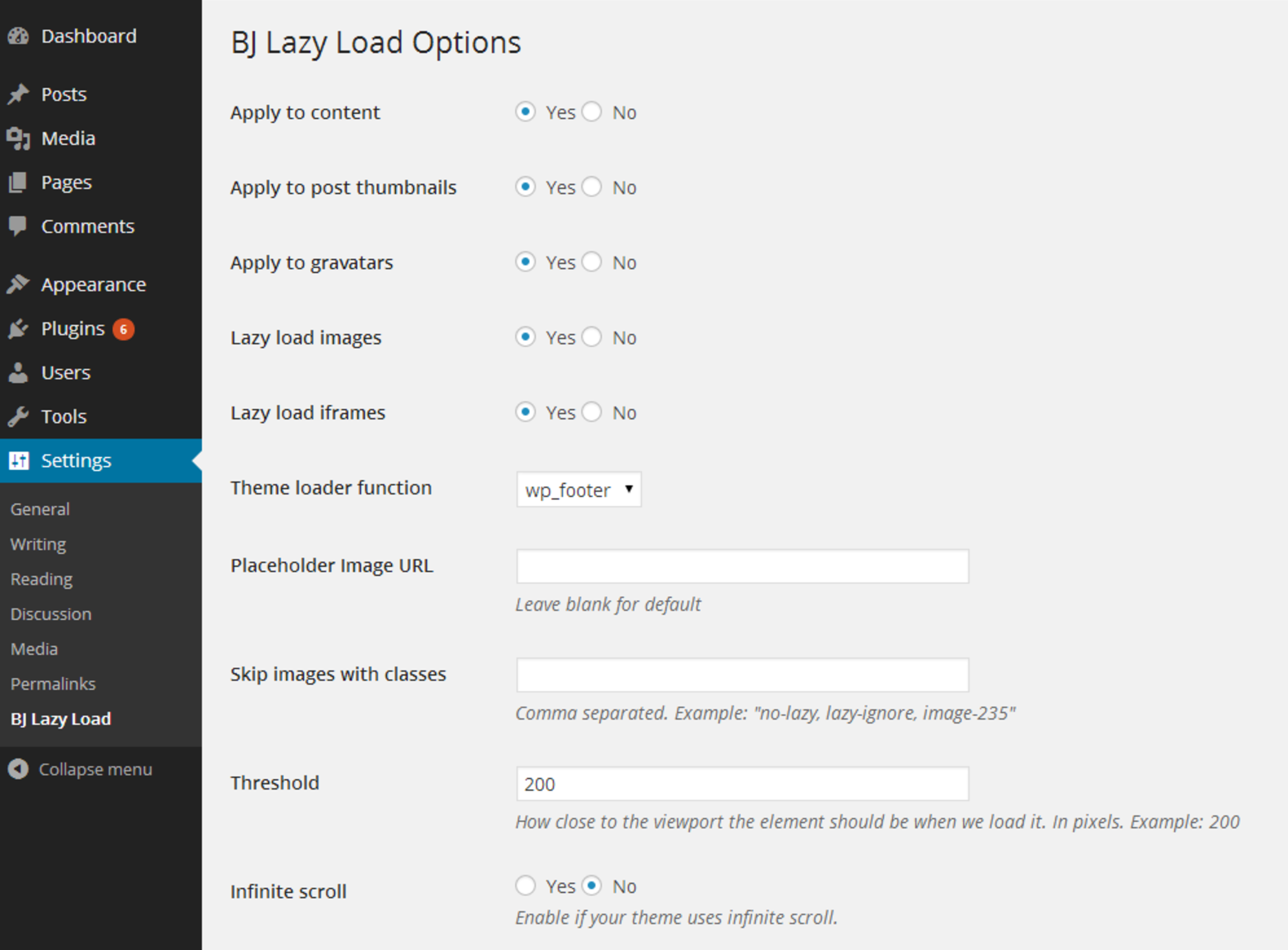
For WordPress sites, there are plugins like BJ Lazy Load to come to the rescue.
If neither of those options fit, you may need to hire a developer to help you out.
This is a more advanced technique, but it can save your site from doing a lot of work in the long term.
Conclusion
Speed isn’t just for race cars. It’s one of the most fundamental ingredients of a great mobile site.
A faster mobile-friendly site can increase traffic and bring in a flood of new customers and conversions.
It’s no surprise.
Mobile is here, and it’s here to stay.
Desktop performance still matters, but mobile is the present and the future.
In short, make your site as fast as possible and reduce the amount of weight your site is pulling.
This Think With Google article put it perfectly: “If speed thrills, friction kills.”
Improving your mobile site speed is a one-two punch that will make your site better for your users and for search engines.
If you haven’t focused on mobile yet, I urge you to start today.
Which of these techniques are you going to use to speed up your mobile site?

