Social media is one of the fastest-changing industries out there. It is changing everything: Your customers’ expectations, the way they find and interact with you. Is your business keeping up? Here are a few ideas … The post Three Social Media Marketing Trends to Embrace This Year! appeared first on Paper.li blog. The post Three …
Social media is one of the fastest-changing industries out there. It is changing everything: Your customers’ expectations, the way they find and interact with you. Is your business keeping up? Here are a few ideas … The post Three Social Media Marketing Trends to Embrace This Year! appeared first on Paper.li blog.
A well-designed landing page can greatly increase conversions for your PPC or email marketing campaigns.
Rather than directing visitors from those sources to your general website (where they may have a hard time finding what they’re looking for), you can direct them to a specifically designed landing page that steers them in exactly the right direction.
Creating effective landing pages isn’t the same as crafting a successful website or email newsletter. There are certain guidelines you should adhere to in order to maximize your page’s success.
Here is what you need to know to create an effective landing page.
Set a Goal For Your Landing Page
Landing pages, like any other part of your online marketing strategy, need goals. Without concrete, specific goals, there’s no way to create an effective page. Your goal should be clear before you begin designing your page.
For example, your page might be designed to encourage:
sales
email list sign-ups
white paper downloads
software trials
webinar sign-ups
You also need specific expectations for your landing page, on which to gauge its success. These expectations can be based on previous experience, anecdotal evidence, or simply wishful thinking.
It’s helpful to have a specific number to compare your actual results with. This could be the total number of conversions, or the number of people who make it past your landing page, or some other number, based on your own goals.
A Clear Call to Action is Vital
Once you know what your goal for the page is, you need to come up with a clear call to action. This is possibly the single most important part of any landing page.
Your call to action should be specifically tied to your goal and should be supported by everything else on your page, from headline and body copy to images and overall layout.
The Backpack landing page has a very clear call to action, though they opt to first direct visitors to more information about their plans and pricing, rather than going straight for the signup.
Keep Copy Clear and Concise
Your copy should be clear and concise. It should be persuasive, too. Landing pages are not the place to show off your creativity, unless that creativity is clear, concise, and persuasive. Leave the creative turns-of-phrase for your blog.
It’s pretty safe to assume that most of the people who visit your page are already interested in what you have to say, because they’ve likely clicked through from a PPC ad or email. But just because they’re interested when they arrive doesn’t mean they’ll stay interested if you don’t get to the point.
Every single sentence and word on your landing page should serve a purpose, and that purpose should be to support your call to action. If it doesn’t do that, cut it. Be ruthless in editing your copy. Tell your visitors what they want to know in as few words as possible, and get them to respond to your call to action as quickly as possible.
The VideoWizard example has a simple design with clear copy that has definite goals.
Keep Your Landing Page Form Simple
If your page includes a form, make sure it’s only asking for the most vital information. If you’re trying to get visitors to sign up for an email newsletter, make sure you’re just asking them for their email address. Anything more than that decreases the chances that they’ll finish and submit the form.
If you’re asking them to make a purchase, keep it simple. Just ask for the vitals: billing and shipping information, plus a confirmation screen before placing their order. Wait to ask them for additional information until after their order has been placed.
This form only asks for name and email address, neither of which are likely to deter sign-ups.
This form, on the other hand, has too many fields. Do they really need a phone number and company name? And wouldn’t it make more sense to just ask for a name in one field, rather than two?
Remove Navigation Elements
The major difference between your normal website and your landing pages is your landing pages shouldn’t include the usual site navigation. Instead, the only clickable links should be your call to action, and possibly a link to more information for those who are undecided.
Linking your logo to your regular home page can also be a good idea.
This example shows just the vital links, without a ton of extraneous navigation.
Forget about links to everything else. All they do is clutter up the page and increase the likelihood that your visitors will abandon your landing page (and ultimately, your site) without converting.
Simplify Your Normal Site Design
Your landing page should still echo the design of your regular website, though, to reinforce your branding. This can be done through the graphics, general look and feel, or your color scheme and font choices.
This is important for branding and lets users know they are on the right page.
Choose Long Page or Series of Pages
There are some questions about whether it’s better to use a single page for your landing page that requires scrolling, or if visitors respond better to a series of short pages (sometimes referred to as a “mini-site”).
Mini sites generally have multiple pages with short content that funnel visitors from one step to the next along the conversion process. This has the advantage of getting users in the habit of moving from one page to the next, which can help get them in the right psychological frame of mind to convert.
The downside to mini sites is that they work best for conversion funnels that need a lot of content.
Landing pages, on the other hand, are perfectly suited to shorter content. They also only have to load once, which can be a big consideration for companies targeting people in rural areas or developing nations, where bandwidth and connection speeds could be an issue.
The downside is a lot of content can get overwhelming and can come across as spammy if not well-designed.
The CameraPlus page is quite long, with all the information you need about the app. (The image above is split, as the entire page would be several thousand pixels long.)
Compare this page, which barely fills a single screen, and uses multiple steps to gather information.
Pay Attention to the Fold
While there’s a lot of debate as to the importance of “the fold” in web design, landing pages are one area where the fold is crucial. Make sure that your call to action is located near the top of the page, where someone can click it without having to scroll.
This doesn’t necessarily mean that your visitors won’t scroll down the page to read more information. Hopefully, at least some percentage of your visitors will be ready to buy as soon as they arrive on your landing page, either because the email or link that brought them there already persuaded them, or because it’s not their first time visiting the page.
Putting a call to action right near the top of the page makes things easier on these visitors. (Plus, it can increase your conversion rates.)
The most important navigation elements are located just above the fold, with the call to action well above the fold.
The signup button is well above the fold here, too.
Below-The-Fold Calls to Action
That doesn’t mean you should neglect those users who scroll. Make sure calls to action appear at regular intervals on your page, tied into the page’s copy.
This becomes more and more important as your pages get longer. Make sure that your users have to do minimal scrolling once they decide to convert.
FreshBooks includes links to a free trial or tour throughout their landing page.
Use Minimal Images and Larger Fonts
Your landing pages should use only one or, at most, two images. You want to avoid visual clutter on the page, or anything that detracts from the message and call to action.
Larger font sizes are also a good idea to keep visitor’s eyes focuses on what matters and reduce eye strain. Just don’t go overboard and put everything in a headline-size font.
The ideal line length for copy readability is 39 characters, so size your font (and column width) accordingly.
The typography becomes a major part of the visuals of this landing page, minimizing the need for graphics.
Start With a Centered, Single-Column Design
Studies show that centered, single-column landing pages convert best. Yet, there are still plenty of marketers out there who are opting for two-column designs.
Make sure that you test single-column versions against any two-column versions prior to committing to a design.
This is a great example of a centered page that makes great use of the available space.
Match the Look and Feel of Your Campaign
If your page is tied to an email campaign or PPC campaign, make sure the landing page echoes the look and feel of the ad or email.
If the designs of the two are wildly different, your visitors may wonder if they’ve ended up in the right place. The easiest way to do this is to carry over fonts, images, and colors from your campaign to your landing page. This is especially important for paid ads, as it can increase your quality score.
Use the Landing Page Tools to Get it Right
If you don’t want to have to use a web designer for your landing pages, there are options for creating great pages without any technical knowledge.
Unbounce is one of the easiest to use and lets you create landing pages without any IT experience. They have best-practices templates available that you can customize (or design your own page entirely from scratch), and flexible pricing (including a free plan for sites with limited traffic). Unbounce also integrates with Google Analytics for tracking your traffic, and Qualaroo for gathering user input.
Don’t Forget To Test Your Landing Page
Creating effective landing pages isn’t a one-size-fits-all project. What works for one site might not work so well for another. Finding the most effective page design is a matter of trial and error.
It’s important to test the different versions of your landing page (called A/B testing)to find the one that works the best for your particular situation. Without doing so, you might be leaving a lot of potential conversions on the table.
A few features to consider testing include:
headline
CTA
button size and placement
number of form fields
images
right, left, or center column design
colors
Just remember to test each variant one at a time — if you change five different elements, you won’t know which impacted conversions.
Landing Page Guide
A well-designed landing page can greatly increase conversions for your PPC or email marketing campaigns. Here’s how to do it.
Set a Goal For Your Landing Page
Without concrete, specific goals, there’s no way to create an effective page. Your goal should be clear before you begin designing your page.
A Clear Call to Action is Vital
Your call to action should be specifically tied to your goal, and should be supported by everything else on your landing page, from headline and body copy to images and overall layout.
Keep Copy Clear and Concise
Landing pages are not the place to show off your creativity, unless that creativity is clear, concise, and persuasive. Leave the creative turns-of-phrase for your blog.
Keep Your Landing Page Form Simple
If your landing page includes a form, make sure it’s only asking for the most vital information.
Remove Navigation Elements
Your landing pages shouldn’t have your usual site navigation. Instead, the only clickable links should be your call to action, and possibly a link to more information for those who are undecided.
Simplify Your Normal Site Design
Your landing page should still echo the design of your regular website, though, to reinforce your branding.
Pay Attention To The Fold
Make sure that your call to action is located near the top of the page, where someone can click it without having to scroll.
Use Minimal Images and Larger Fonts
Your landing pages should use only one or, at most, two images. You want to avoid visual clutter on the page, or anything that detracts from the message and call to action.
Start With a Centered, Single-Column Design
Studies show centered, single-column landing pages convert best, so test that version first.
Match the Look and Feel of Your Campaign
If your landing page is tied to an email campaign, make sure that the landing page echoes the look and feel of the email.
Use the Landing Page Tools to Get it Right
You don’t need a masters in computer science to design a landing page. Instead, use tools like Unbounce to create great looking landing pages.
Don’t Forget To Test Your Landing Page
Creating effective landing pages isn’t a one-size-fits-all project. What works for one site might not work so well for another. Finding the most effective page design is a matter of trial and error.
Conclusion
Landing pages are website pages designed with one goal in mind — conversions. Following the tips above will help you create a powerful page that drives users towards your business.
Just make sure to keep it simple. This is because landing pages have very specific goals and shouldn’t include any extraneous information that might distract your visitors and prevent them from converting.
Are you considering creating a landing page? What is your landing page goal?
One of a for-profit business’s best investments is often their online marketing strategy.
Is the same for true for nonprofits?
Let’s take a look at how nonprofit marketing strategy is different from for-profit strategy and how nonprofit corporations may be able to better reach their goals by further leveraging digital marketing.
What Makes Nonprofit Marketing Different From Marketing in Other Fields?
The main difference for nonprofit marketing is about the goals. Often, with a for-profit company, the goal in advertising is the sale at the end. A nonprofit may have other needs in mind, and therefore other goals for the marketing campaign. We will dive more into detail on this in a bit.
It Has More Complicated Messaging
Think about your messaging. It’s not just about a transactional sale, so you want to be clear as well as inspiring. This is part of what makes nonprofit marketing difficult. People are used to being shown ads for a shoe or a new table. They can filter that out mentally or get on board and buy the product.
With nonprofit marketing, you’ve got a taller order. You’re not just trying to convert a sale. You may be trying to convert a mindset, or at least connect with a mindset that the person already has. You’re trying to appeal to values and aspirations for the world at large.
That’s asking a lot of a small social media ad, a video, a banner, or whatever other method you are using.
Its Main Goal Is Making It about Others
However, it’s not impossible. In fact, in some ways, you could think of this as more straightforward. Why? One thing people struggle with when trying to sell a product is not making it all about themselves and the product. There’s always the “why” question. Why should a customer care about what you’re selling?
With a nonprofit, the mission is built in. Usually, your message isn’t even really about you. It’s about those you serve. That’s the story you can tell in your nonprofit marketing and automatically, you’re the good guy or the hero others want to rally around.
Here is an example from Charity: Water’s Instagram account. There’s a lot of faces there, with, of course, some water thrown in. Their pictures are about the results and what they are trying to do, rather than about the organization. They draw you in and entice you to click to learn more.
All the Working Parts are Different
As you’re working through your nonprofit marketing campaign components, everything is going to be different. For instance, the imagery you choose may tell a story instead of showcase a product.
Where you run the ad might change too. You can’t use a shopping ad on Google for a donation, for instance. You want to be thoughtful about where you are placing your nonprofit marketing ads and whether that’s the place people will be in the headspace to convert.
You’ll also want to think about where they are going to learn more. It’s not just an e-commerce shop. You will probably want places on your website dedicated to telling stories about what your nonprofit does, with longer-form narratives and videos, as well as plenty of opportunities to engage, such as donate buttons and email newsletter sign-ups.
Goals of Nonprofit Marketing Ads
As we just talked about, there are a lot of differences between typical marketing and nonprofit marketing. The most fundamental difference is in the goals. Sometimes with e-commerce or for-profit advertising, the goal is very obvious. Nonprofit marketing goals may be more complicated. It’s not necessarily about making a sale; rather, the advertising goals might include:
gathering donations
spreading awareness
building follower base
recruiting volunteers
promoting an event
encouraging involvement
Of course, every organization needs to gather money one way or another, just to keep the doors open. That’s just the nature of things.
With nonprofit marketing though, it can all feel complex. When you ask someone what the goal of an ad is, the answers may include any number of the above, maybe more.
That’s because, with nonprofits, it’s all about the mission. When you’re working in this field, you just want to keep doing better at what you’re doing. You want to reach more, make more of a difference. When you think about marketing, you want all those goals. You want more people involved, more money to run the organization, more awareness of the problems, and more awareness of the solution you provide.
However, it’s going to be key to drill down as much as you can. Get a handle on what you want this marketing campaign or set of ads to do in particular. If you have to, maybe there are a couple of subgoals, but keep it as specific as you can.
Knowing exactly what you want out of your nonprofit marketing campaign will help you evaluate how well it’s working so you can pivot and leverage the parts that are succeeding. This will help your marketing stay cost-efficient in the long term, and you will have more to show your board of directors and other key players.
5 Tips to Make Effective Nonprofit Marketing Ads
As we’ve discussed, nonprofit marketing ads can be so different from other types of ads, not only in the messaging but also in what you’re trying to accomplish. Measuring effectiveness will come down to what exactly the goal is and how you’re going to track it. Once you know that, you can start designing and developing your nonprofit marketing campaign. Here are a few tips to keep in mind as you are creating it to leverage maximum results for your goals.
1. Appeal to Emotions
We touched on this above, but let’s take a closer look at the emotional aspect of your nonprofit marketing. This comes down to the mission of your organization. what are you about? Why is your mission so vitally important?
Emotions of “Why?”
First, let’s talk about how emotions are relevant to any kind of marketing. Even if you’re selling a shoe, people want to know why they should buy that shoe. As in, why should they really? How are they going to feel after having that shoe? What kind of connections will they have with others because of the shoe?
Does that sound far-fetched? Well, think about Michael Jordan’s sneakers for a moment and it’s suddenly not so crazy.
The great thing about your nonprofit marketing is the emotional appeal is not a stretch. It won’t take you long to come up with stories and testimonials that speak to why your organization is changing lives and the planet.
Lean into those and let them drive your marketing.
Emotions of Urgency
Urgency is part of the emotional appeal, but with a specific drive. You want people to understand why your work is vital now, as well as why their support is vital.
Getting people to act is the foundational goal of any ad so building in urgency can help that happen faster.
Don’t fake it, though. This isn’t about drumming up fake urgency, which makes your organization sound slimy. Look at your data and share the numbers to help people understand why what you’re doing is important and why you need them.
In their Facebook sponsored ads, Feeding America highlights the number of meals they have distributed as well as highlight the urgency of needing to deliver even more. It ends with a call to action to learn more about the organization.
2. Clear CTAs
If you want to know if your ad is effective, you’re going to need to track how people interact with it. Beyond that, it needs to be very obvious what you want them to do next and how they can go about doing it.
Think about goals, and write calls to action that speak to those goals. Here are some examples:
If you need donations, say “Donate Now.”
If you need awareness, say “Learn More.”
If you need followers and volunteers, say “Join Us.”
Make sure once they click or do what you’ve asked them to do, the next step is just as easy. Build a great landing page that shares more of your story and inspires action.
3. Make Donate Options Easy
You may not be trying to sell a product, but you may be gathering donations. Whether it’s an annual fund drive or a critical need that needs to be covered, nonprofit marketing can help raise awareness of that need for donations.
To be as effective as possible with a donation drive, include as many ways to donate as possible:
Set up an easy and automatic payment via credit card, PayPal, Venmo, and other integrations.
Make it clear where they can send donations if they prefer a slower method, such as a check.
Give a phone option, or at least email, for anyone having trouble donating online.
Make sure to include an opportunity to sign up for your newsletter or otherwise stay in touch with you as they are donating.
4. Gather Followers
With nonprofit marketing, it isn’t always about immediate action. Sure, you may want some donations or shares of your content, but there’s also an important long game driving your initiative.
As you are creating your campaigns, make it clear how to join the mission and align with what you’re about.
You can gather email addresses or provide a section on your website where people can learn more about local events or gatherings.
One of the easiest ways to do this is to include links to your social media accounts. Make sure your social media is filled with pictures and videos that highlight what you do. If your accounts are new, be sure to upload a dozen or so photos and videos to make them look full and scrollable. Use the daily features, such as Instagram Stories, to make it clear it’s an active account. Make it enticing to follow, with recent updates so they know if they follow, they will continue to learn more.
5. Look for Grants and Other Opportunities
For nonprofit marketing, grant opportunities exist to help get your message out there for a reduced price or costs covered. Depending on your goals and where you want to place your ads, you may want to take the time to apply for these, save money, and learn more from the provider about how to create effective ads. Here are a few examples to get you started:
Google Ad Grants
Google Ad Grants provide some free search ads to eligible nonprofit organizations as account support and other resources. You can also browse the Google Ad Grants site to see examples of other nonprofits running effective campaigns.
Twitter for Good
Twitter for Good provides free ads, as well as marketing campaign support and a variety of resources, such as custom emoji options, to nonprofits that join. This program focuses on areas of interest like internet safety, freedom of speech, equality, environmental conservation, and crisis management. Organizations involved in those areas may wish to apply.
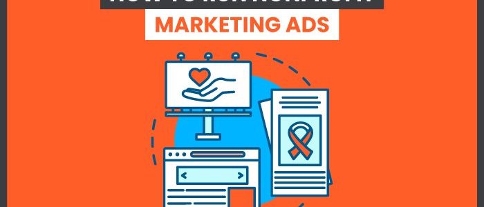
How to Make Successful Nonprofit Marketing Ads
5 Ways to Ensure Your Nonprofit Ads Achieve Their Goals
Appeal to emotion
Tug on your reader’s heartstrings so they open their pursestrings.
Include clear CTAs
Include buttons and clear statements that make it obvious to your users what action they should take next (like donate, follow, share, etc.)
Make donate options easy
Give clear instructions on how users can provide donations and offer as many methods of payment as you can.
Gather followers
The more followers you have, the more likely you are to get donations and spread awareness about the causes behind your nonprofit. To gain followers, be active on social media, host events, network, etc.
Look for Grants and Other Opportunities
Some platforms, like Google and Twitter, allow you to run ads for free. Be on the lookout for opportunities like these!
Conclusion
Nonprofit marketing can seem more complicated on the surface, with a larger mission and lots of different ways to engage with people. However, when you dive into the messaging, it often becomes a little easier. Nonprofits have a great story to tell, which can work into content marketing with ease. As you develop ads for your nonprofit marketing, focusing on an achievable goal can help ensure your ads are effective and keep your spending at a minimum.
If you are a nonprofit needing help with your digital strategy, reach out. Our team of experts can help!
How are you going to evolve your next nonprofit marketing campaign to make it more effective?
GDPR Cookie Consent Agreement
This website uses cookies to improve your experience. We'll assume you're ok with this, but you can opt-out if you wish.AcceptRejectRead More
Privacy & Cookies Policy
Privacy Overview
This website uses cookies to improve your experience while you navigate through the website. Out of these, the cookies that are categorized as necessary are stored on your browser as they are essential for the working of basic functionalities of the website. We also use third-party cookies that help us analyze and understand how you use this website. These cookies will be stored in your browser only with your consent. You also have the option to opt-out of these cookies. But opting out of some of these cookies may affect your browsing experience.
Necessary cookies are absolutely essential for the website to function properly. This category only includes cookies that ensures basic functionalities and security features of the website. These cookies do not store any personal information.
Any cookies that may not be particularly necessary for the website to function and is used specifically to collect user personal data via analytics, ads, other embedded contents are termed as non-necessary cookies. It is mandatory to procure user consent prior to running these cookies on your website.