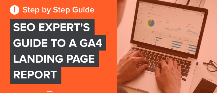
With the sunsetting of Universal Analytics (UA) on the horizon in 2023, it’s more important than ever to learn how to create a Google Analytics 4 (GA4) landing page report.
Change can be difficult. What steps are you taking to get ahead of the curve?
While this post is not an ultimate guide to Google Analytics, I’ll show you how to get GA4 set up and give you the best GA4 tips out there. From setting yourself up to best practices, by the time you’re finished, you’ll feel confident creating a landing page report in GA4.
What Is GA4?
Google Analytics 4 is the latest edition of one of the greatest web analytics tools on the market.
With a landing page report in GA4, you can follow the digital path your customers travel along your branded content.
The best part? GA4 landing page reports track customer data from all the platforms your content is on to determine trends in traffic, engagement, product demand, predictions, and more.
It accomplishes these incredible analytic feats with the help of artificial intelligence. With the use of AI, GA4 helps you figure out how customers are currently using your content, as well as predict what customers will do next.
You don’t have to be a large business to make GA4 work for you. In fact, a recent survey by Enlyft found that roughly 71% of businesses that use Google Analytics are small companies with less than 50 employees.
While this may all sound similar to what you’re used to in Universal Analytics, the two function quite differently.
The biggest difference between UA and GA4 is the way data is collected and organized. While the former groups user interactions into time-blocked “sessions,” GA4 tracks each and every user interaction as its own event.
What does this mean? Well, because of this key switch, GA4 is better at predicting the behavior of customers in a wider variety of ways.
What Is A Landing Page Report in GA4?
Simply put, a GA4 landing page report is a detailed analysis of user interactions based on metrics that you choose.
For those who don’t know, a landing page is the page that is a user’s first interaction with your website or platform. For example, if you searched for information about landing page reports and clicked on the link for this article, then this page is your landing page for my site.
A landing page report in GA4 gives you deeper analytic tools that can really help you develop the best SEO strategy.
If you’re familiar with UA, you’ll remember that their landing page report was automatically generated. All you had to do was look for the report by clicking the Behavior drop-down menu. and from there. clicking Site Content and then Landing Pages.
GA4 is not automatic. Fortunately, it only takes a few steps to get your GA4 set-up.
Creating Your Landing Page Report In GA4
GA4 landing page reports must be generated manually. The good news is you can create your own preset landing page report, so you don’t have to set it all up each time you need information.
Follow these steps to create your own landing page report in GA4.
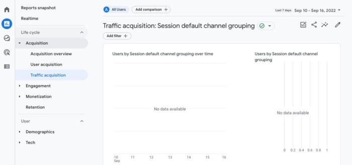
Get Started
Log in to your account with GA4. From there, open your Reports (the button below the Home icon, with a bar graph inside a white square). Next, click on Acquisition and then look for and select Traffic Acquisition in the dropdown menu.
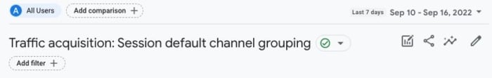
Pull a Report
In case you don’t already know, dimensions are essentially the qualitative titles or categories being measured by GA4. When you choose Traffic Acquisition, GA4 will pull a report for you, automatically using the Session default channel grouping dimension.
While this is great info for you to know in order to increase traffic to your website, it’s not the data on user landing page interactions.
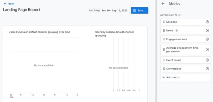
Customize Your Report
To create a custom landing page in GA4 to suit your analytical needs, click on the small pencil icon in the upper right corner of the user window.
In addition to adding new dimensions, the Customize Report button can add new metrics, rework charts and create summary cards.
For our purposes, we’ll focus for now on the dimension aspect.
Add a New Dimension
On the right side of the screen, click on Dimensions and then select Add dimension.
From there, you should be able to scroll through the options until you find one labeled Landing Page. Click it, and landing pages will be added to your primary dimensions.
Don’t forget to save when you’re done!
Set as Default
Let’s get real: do you actually want to go through those steps every time you want to analyze user interaction on landing pages?
No way! Follow this quick GA4 tip to make a shortcut for yourself.
Locate the Landing Page dimension once more. This time click on the three vertical dots and then select Set as Default.
When you are finished, click the Apply button in the lower right corner to save your new default setting.
If your goal is to replicate the UA report as close as possible, you will need to follow a few more steps.
Customize Metrics
Not all engagement metrics are created equal. As you become more familiar with the GA4 set-up, explore all the data at your fingertips to determine which data will help the most. You never know what new insights you’ll discover!
Customizing metrics is not all that different from dimension customization.
Instead of clicking on Dimensions, this time select Metrics.
From here, you can add and remove metrics that suit your needs. For a UA-style landing page report, make sure to choose the following metrics:
Sessions
New Users
Engagement Rate
Average Engagement Time
Event Count
Conversions
Create a New Summary Card
Summary cards are a great way to take a fast scan of your analytics when checking reports.
While they won’t show you everything, summary cards can help you streamline your review of the information you find most important.
To create a new summary card, simply click on Create a New Card. From there, you can customize the card to choose specific dimensions, metrics, and visualization style.
Save Your New Template
The key here is not to overwrite your other template that you used to get started. Instead, save your work as a New Report.
Make a Shortcut to Your Report
Remember, our intention is to make pulling GA4 landing page reports as quick and easy as possible.
That’s why I would recommend creating a shortcut for you to access this with just a couple of clicks going forward.
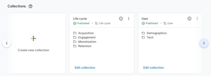
First, click on Reports.
Next, click on Library. There should be a folder icon next to the word.
Unless you’ve already created some collections, you should only see two collections. In the collection marked Life Cycle, click where it says Edit Collection.
A prompt on the left will ask you to drag reports to create collection. Find your report template and drag it into the topic labeled Acquisition.
That’s it!
Now when you click on the Reports icon on the main menu, you can pull your latest landing page report with ease. Simply click the drop-down menus for Life Cycle and Acquisition, where you will find the template that we’ve been putting together.
Best Practices For Landing Page Reporting
The whole point of this practice is to understand what customers are driven towards and how we can improve our content to bring in more traffic.
When you run your GA4 landing page report, be on the lookout for pages that have a low number of visits, or worse, poor engagement. These are areas of growth for your brand.
Take advantage of landing pages that are doing well. Any time a landing page has a high click rate and engagement, you should be looking for ways to capitalize on that momentum.
Add more links to that page that direct users to more of your articles. Use those pages to advertise upcoming promotions. If at all possible, recreate that style of writing in new content.
Conclusion
Google Analytics 4 is a powerhouse of reporting. In the right hands, GA4 can revolutionize your marketing and content strategies.
Don’t wait until UA finally kicks the bucket for good in 2023. Learn about GA4 now to easily generate the reports that matter most. You should consider creating your GA4 tracking ASAP so you have as much data as possible to compare for reporting.
We’re also here to help!
If you need more information on how to best utilize the features of your GA4 landing page report, or if something doesn’t look right, just reach out and my team will get back to you ASAP.
How are you going to use Google Analytics to increase your web traffic? Let me know!
Você prefere ter um site bonito ou um site que seus clientes adoram?
De um ponto de vista de negócios, você não deveria escolher nenhum dos dois.
Sua resposta deve ser 100% “eu quero um site de alta conversão”.
Porque, se as pessoas compram, é porque elas gostaram e você vai poder escalar seu negócio de forma segura e previsível.
Muita gente cai na armadilha de criar designs que acham legais enquanto o avatar do cliente perfeito é totalmente diferente do que elas imaginam.
E isso pode ser facilmente percebido quando se clica em anúncios nas redes sociais.
Você pode até gostar do anúncio em si, mas muitas vezes a landing page, por outro lado, não é bem o que você quer ver.
A conexão entre o seu tráfego e a sua landing page tem o nome propício de encaixe entre mensagem e mercado.
Você quer que a sua mensagem se encaixe perfeitamente no seu mercado para você começar com um funil campeão, que só tende a melhorar.
Porque, se você fizer besteira aí, você vai precisar ficar otimizando e ajustando pequenos componentes que mal vão te permitir compensar seu investimento.
Mas se você emplacar a mensagem certa, os clientes vão começar a chegar até você a torto e a direito, sem nem você saber por que ou como eles chegaram.
É a sua arma mais poderosa, e a maioria dos negócios faz tudo errado.
Então, para te ajudar e garantir seu sucesso imediato, vamos analisar os 12 melhores exemplos de landing page em que você deveria se inspirar para escalar seu negócio.
Vamos analisar os pontos fortes e fracos de cada uma delas, garantindo que você encontre a que se encaixa exatamente no seu negócio.
Você pode se pegar otimizando uma landing page que não gera lucro por meses antes de ela começar a gerar retornos reais.
Se você não estiver pronto para isso, eu recomendo que você pare antes mesmo de começar.
Claro, você pode ter um golpe de sorte e marcar um gol na primeira tentativa, mas não conte com isso.
Esteja pronto para um esforço de longo prazo, para obter retornos futuros que são muito melhores do que uma satisfação momentânea.
Qual é o seu orçamento?
Antes de começar a desenhar sua landing page de alta conversão, você precisa preparar um orçamento sólido.
Não dá para esperar que tudo corra tranquilamente ao longo do processo.
Problemas vão acontecer, e na maioria das vezes, o jeito mais fácil e rápido de resolvê-los é pagar um especialista na área.
Pode ser um desenvolvedor, um designer de funis, um especialista em anúncios ou um consultor de CRO.
Seja como for, você precisa estar pronto para pagar alguém para fazer a coisa do jeito certo e você não ter que enfrentar os mesmos problemas várias vezes.
No marketing e na vida, existe uma regra de ouro segundo a qual quando você terminar seu trabalho, peça para alguém julgá-lo.
Obviamente, para landing pages, o jeito é veicular alguns anúncios e ver se o tráfego converte.
Se converter, você aumenta seu orçamento de anúncios e tenta escalar.
Se não converter inicialmente, é melhor pedir para um profissional dar uma olhada.
Mesmo que você já tenha contratado alguém para construir tudo para você, não espere que essa pessoa te ajude aqui.
Sim, ela pode otimizar sua página, mas você precisa ter em mente que as pessoas têm um apego emocional ao trabalho delas.
É por isso que você precisa de um terceiro para te ajudar.
Grandes agências de marketing hoje em dia têm centenas, senão milhares, de clientes que já estiveram exatamente na mesma situação que você.
É por isso que contratar uma agência de marketing para te ajudar a aumentar sua conversão é a melhor aposta.
Quando o assunto é CRO (conversion rate optimization ou otimização da taxa de conversão), não tem escolha melhor do que a NP Digital.
Ela é simplesmente a melhor agência, tanto para SEO quanto para CRO.
Se você está naquele estágio em que você quer otimizar a landing page que você já tem, mas não sabe exatamente como, então agende uma ligação rápida com um profissional, através da qual você vai descobrir os métodos secretos de otimização que o seu negócio precisa.
Agora, vamos ver alguns exemplos de landing page.
Os 12 Melhores Exemplos de Landing Page
Esses são os 12 Melhores Exemplos de Landing Page que a gente encontrou.
Vamos analisar as conversões, ofertas, design e experiência do cliente.
1. Get Response
A Get Response é um exemplo de uma landing page simples, porém interativa.
Dá para ver que a equipe Get Response é ousada, uma vez que eles são o único software no mercado que usa um título interativo.
O símbolo amarelo que você está vendo na imagem abaixo muda entre as palavras “crescer”, “leads” e “vendas”.
Além disso, eles usam um rosto amigável e positivo, algo que a gente não vê com tanta frequência em negócios que não são focados em uma marca pessoal.
E claro que isso não é uma coisa ruim. É algo que automaticamente cria confiança e torna mais fácil para as pessoas se cadastrarem para usar o software.
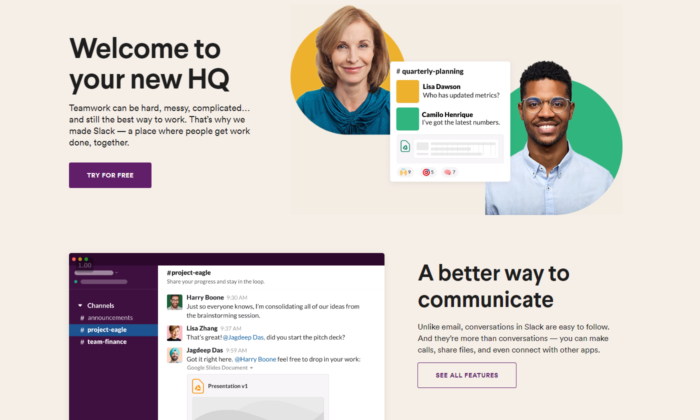
2. Slack
O Slack está sempre na vanguarda quando o assunto é landing page.
Eles estão sempre otimizando para conversões, e essa é a melhor maneira de encontrar sua landing page campeã.
A página atual deles é extremamente interativa, tem um título super chamativo e mostra como o software é fácil de usar através de um gif de cinco segundos.
Logo de cara você consegue ver que eles valorizam a satisfação do cliente, e, se você ainda não tiver certeza, descer até o final vai mostrar um mar de resultados e credibilidade que comprovam a autoridade deles no mercado.
3. Intercom
O principal objetivo do Intercom nessa landing page é fazer com que você se inscreva na lista de emails deles.
Limitar-se ao email é uma ótima forma de aumentar sua taxa de opt-in.
Um título grande e positivo que te coloca no ânimo certo para começar a agir.
As imagens que eles usam representam perfeitamente a principal proposta única de venda do título.
Dá pra ver um ambiente amigável como um todo, e se você entrou na página, a única coisa que você precisa fazer é se cadastrar.
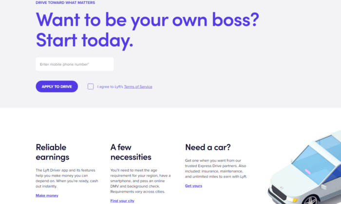
4. Lyft
A Lyft vem crescendo nos últimos anos, e seu site, landing page, e funil online em geral, só ganham força.
Eles focam em atrair novos motoristas que querem ter controle sobre a própria vida.
Prometer liberdade aos seus funcionários enquanto eles trabalham para você é a melhor maneira de desviar os melhores candidatos dos seus concorrentes.
A Lyft já usou diversas landing pages desde que começou, mas a atual mostra verdadeiro profissionalismo.
Mais uma vez, vemos um título gigante e chamativo. Dessa vez, com uma pergunta para ir gerando curiosidade e ideias nos clientes em potencial.
Dê uma olhada no botão “INSCREVA-SE PARA DIRIGIR”. Significa que não é 100% certo que você vai conseguir o trabalho.
Fazer com que os clientes tenham que competir pela sua atenção faz com que eles se esforcem mais no trabalho em si.
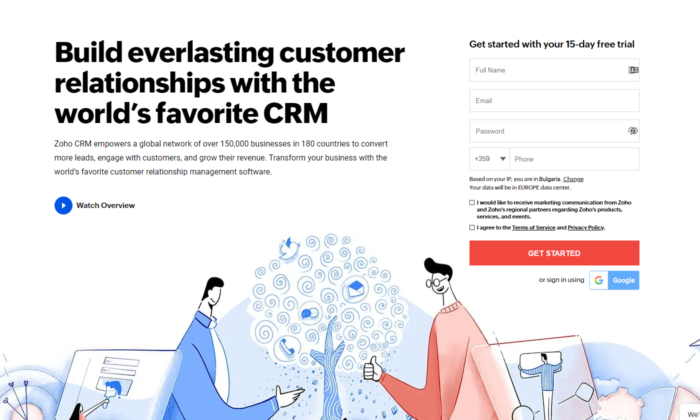
5. Zoho
A landing page da Zoho é um ótimo exemplo de transmissão de mensagem um pouco mais complicada, mas igualmente poderosa.
Eles usam mais texto do que a média dos softwares no mercado, mas isso não é necessariamente ruim.
Nesse caso específico, eles precisam converter o cliente em potencial para iniciar um teste gratuito, o que automaticamente gera tensão, uma vez que esse cliente sabe que vai chegar um momento em que ele vai ter que pagar.
Converter alguém para pagar é bem mais difícil do que simplesmente conseguir o email da pessoa.
É por isso que usar mais texto para transmitir essa mensagem contribui para uma estratégia poderosa de copywriting que maximiza o número de cadastros.
6. Squarespace
O Squarespace está no topo da lista com a menor quantidade de texto no design da landing page.
Você pode achar que texto não é suficiente para converter alguém.
No entanto, quando você vir que essa pessoa é alguém que cria sites, você vai ver como o design e uma mensagem rápida e forte é tudo que você precisa para se cadastrar.
Eles sabem que os principais problemas de seus clientes em potencial são códigos complicados e querem mostrar um lugar seguro onde eles podem relaxar, criando um design campeão para seu site só arrastando e soltando.
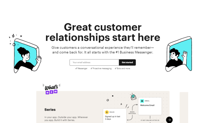
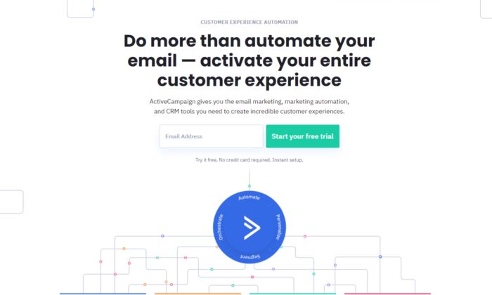
7. ActiveCampaign
O ActiveCampaign foca apenas em te mostrar como o software deles traz a melhor experiência possível para o cliente.
Se você é dono de um negócio, você quer ser tratado bem e também ajudar seus clientes em momentos difíceis.
O título deles mata dois coelhos com uma cajadada só, e, mais uma vez, sem nenhum texto ou design desnecessários.
Tudo leva ao grande botão verde para você começar seu teste gratuito.
8. Hubspot
O Hubspot é mais uma ferramenta de CRM no topo da nossa lista hoje.
Bem como o ActiveCampaign, eles te mostram que usar o software deles vai ajudar tanto você quanto seus clientes a se sentirem melhor ao longo do processo.
Saber que o principal problema do cliente ideal deles é que aprender a usar uma nova ferramenta de CRM do zero provavelmente vai ser difícil, chato, e talvez até impossível, os ajuda a afinar a mensagem deles no ponto exato.
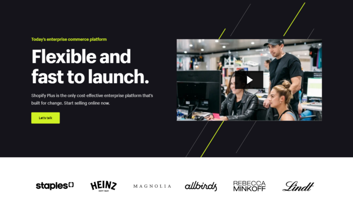
9. Shopify Plus
O Shopify é uma das plataformas mais conhecidas na internet hoje em dia, e eles sabem disso.
Conforme eles foram crescendo, eles puderam testar diversos designs de landing page até encontrar o que convertesse melhor.
E a landing page do Shopify Plus é prova disso.
O principal objetivo deles é agendar uma ligação com seus clientes em potencial, o que leva um pouco mais do que só algumas palavrinhas.
Eles têm orçamento para gravar vídeos profissionais de todos os seus produtos e serviços, o que os ajuda a transferir informações valiosas para seus clientes em potencial da maneira mais rápida possível – vídeo marketing.
Descendo a página, você vê uma forte credibilidade, e se você parar para assistir o vídeo, tem grandes chances de você agendar uma ligação com eles.
Vídeos são uma arma poderosíssima nas mãos dos negócios certos, e o Shopify é a prova disso – e com praticamente tudo que eles fazem.
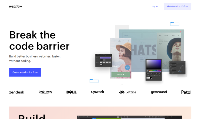
10. Webflow
O Webflow mostra os insights do software imediatamente quando você entra na landing page.
Você também pode ver exemplos de credibilidade de grandes sites que usaram os serviços deles e pode começar gratuitamente.
Isso acaba com qualquer tensão que um cliente em potencial possa ter.
Além disso, você pode ver que o software deles é parecido com o Photoshop.
Então, se você já usou os produtos da Adobe, você vai ver de cara que vai ser moleza para você.
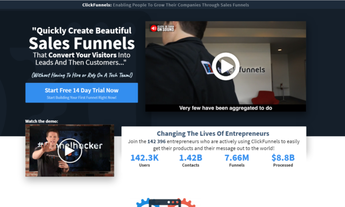
11. ClickFunnels
A ClickFunnels usa seu software para te converter para um teste gratuito.
Mesmo que você seja cético, você pode brincar um pouco com as páginas e botões do funil para ver a responsividade da ferramenta.
Você pode ver que eles usam mais texto do que a média dos construtores de sites/funis.
Mais uma vez, eles estão tentando converter as pessoas para que elas comecem um teste gratuito de 14 dias, o que não é uma tarefa fácil.
Eles também usam vídeos poderosos que vendem direto para seus clientes ideais.
A melhor parte são as métricas que eles incluíram na landing page.
É uma estratégia ousada e poderosa, se executada corretamente.
A maneira como essas métricas são elaboradas permite que elas sejam sempre atualizadas, e não sejam só 100K+ usuários como você vê em outras plataformas.
A ClickFunnels valoriza as histórias de sucesso dos seus clientes e está sempre lá para registrar cada resultado.
É um dos designs de landing page mais difíceis de se colocar em prática, mas se você conseguir, suas conversões vão disparar.
12. Conversion Lab
O Conversion Lab já usa esse design de landing page há anos.
Percebemos que eles fazem testes A/B com diferentes botões de chamada à ação, como “agende uma ligação”, “obtenha uma consultoria gratuita” e vários outros.
Ter o rosto do fundador na página principal do site cria um relacionamento de longo prazo que muitos negócios hoje em dia deixam passar.
Eles transmitem de forma clara seus serviços através de um título persuasivo, e, mesmo que você não esteja pronto para agendar uma consultoria, um pop-up vai aparecer pedindo seu email.
Follow-up por email é uma ótima forma de garantir que um alto percentual de clientes em potencial que chegam até seu site acabem agendando uma ligação com você.
Exemplos de Landing Page: Perguntas Frequentes
O que é uma landing page e como ela funciona?
Uma landing page é uma página desenhada especialmente para estimular os usuários a completarem uma tarefa específica (ou seja, converter). Elas funcionam destacando pontos-chave, usando prova social ou estudos de caso para criar confiança e uma chamada à ação para estimular conversões.
O que deve ter em uma landing page?
Embora o formato possa variar, toda landing page deve ter:
um cabeçalho que inclua a palavra-chave principal
um subcabeçalho que esclareça o cabeçalho
uma descrição da oferta
uma imagem, vídeo, ou ilustração
botão ou formulário de chamada à ação
(opcional) elementos de confiança como logo, avaliações e depoimentos de clientes
Quem precisa de uma landing page?
Qualquer negócio que tenha um site deve ter algum tipo de landing page para estimular os usuários a tomarem alguma ação, como agendar uma demonstração, ligar para pedir um orçamento, se inscrever em uma lista de email, etc.
Eu preciso fazer testes A/B para as minhas landing pages?
Com certeza. Testes A/B devem ser um processo constante para melhorar o desempenho da sua landing page.
Exemplos de Landing Page – Conclusão
Esses exemplos podem servir de inspiração para você criar uma landing page de alta conversão. Para aproveitar ao máximo a sua landing page, não deixe de:
Descubra qual é o principal problema dos seus clientes e acabe de uma vez com essa objeção com um título curto e direto.
Use credibilidade e vídeos, se possível.
Saiba quais são seus objetivos — é conseguir o email ou telefone dos clientes, agendar uma ligação, começar um teste gratuito/pago ou alguma outra coisa?
Por fim: sempre, sempre otimize suas landing pages.
NÃO DÁ para ser perfeito desde o primeiro dia. Todos os negócios dessa lista testaram suas páginas dezenas, senão centenas de vezes antes de encontrar a landing page campeã.
E mesmo assim, eles ainda otimizam.
Você já tentou criar uma landing page antes? Como foi — ela converteu bem e quais foram seus principais avanços?
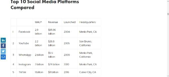
TikTok has steadily become one of the most popular social media apps.
According to data from Sensor Tower, TikTok now surpasses three billion downloads, and it’s the only non-Facebook app to achieve this.
Consumer spending within TikTok is looking pretty rosy, too, with TikTok surpassing $2.5 billion worldwide.
There appears to be no stopping the social media juggernaut that is TikTok, and as its popularity grows, so does the question of getting on the FYP.
If you’re new to the social media giant, the TikTok FYP consists of curated content that users see when they log in.
This article will answer how to get your TikTok on the FYP and teach you everything you need to know about the site’s mysterious algorithm and how to use it to your advantage.
However, first, let’s begin with the basics.
What Is TikTok?
TikTok is an iOS and Android social media app for creating and sharing short 15 to 60-second videos on any topic.
In 2016, the app launched as Douyin in China, and in the following year, ByteDance released it for markets outside of China as Musical.ly before rebranding to TikTok.
While it started as a fun lip-syncing app with a cult Gen Z following, it’s evolved into a way for users to share short comedy skits, business tips, and more.
As the newest social media app on the block, it could be much easier to grow a following on TikTok than on over-saturated sites like Instagram and Facebook with restricting algorithms.
TikTok also lends itself well to how we consume our content these days. With 6.6 billion smartphone users out there, TikTok’s bite-sized format is perfect for those that want to watch their content on the go.
Naturally, with the popularity of TikTok, and a keen audience, businesses are flocking to the platform. Some of the high-profile companies there include Nando’s, Levis, and BMW.
In addition, TikTok offers powerful tools for businesses to measure their performance and track engagement, allowing companies to see which videos are performing well and better understand their audience preferences. With this data, companies can create more compelling content strategies for future campaigns and grow their followings.
What Is the FYP On TikTok Designed For?
The For You page, aka “FYP,” is the first page you land on when you open the TikTok app. It’s a curated feed of videos from creators you might not follow, but TikTok’s algorithm thinks you will like them based on your interests and past interactions.
Several factors contribute to the content you see on the TikTok FYP. Each feed is unique and stems from the types of content you watch and the interest you state as a new user.
Other factors include:
Information from videos, like captions and hashtags.
Device settings, such as language preference, country settings, and your device type.
The types of content you share, like, follow and create, along with the comments you add.
For example: If you like and leave comments on several videos about Instagram tips, you can expect to see a fresh serving of social media marketing TikToks on your For You page every day.
Think of it as the Instagram Explore Page. The app wants to hook you in with more content you like to keep you scrolling longer.
Why You Should Optimize Your Content for the TikTok FYP
The TikTok For You page showcases the best content from around the platform. It’s also where users go to discover new content. It’s simple: if you want users to find your business or content, you need to be in the mix.
To further enhance your chances of getting your content on TikTok’s FYP, you can optimize your content to get more views and followers.
That’s why many consider the TikTok FYP as the ‘holy grail’ of success on the app. After all, it means you’ve created a piece of content that resonates with your audience, and it’s attracting attention.
The algorithm picks this up and recognizes your content’s quality above all the other videos on the app.
What this means for business owners and influencers:
Followers and Monetization: By landing on the TikTok FYP, you could gain followers faster and get closer to the 10k goal. Once you hit that milestone, you can start making money from your videos with the TikTok Creator Fund.
Sponsorships, Thought Leadership, and Sales: Once the algorithm starts pushing out your video to a broader audience, you might start getting more recognition as a master of your niche. This can lead to paid sponsorships or more sales in your business.
Platform Growth: Ever heard the saying, “it takes a platform to grow a platform?” Once you’ve struck TikTok gold, you can use the attention to redirect traffic back to your other platforms like Instagram or YouTube and start growing your community across the board.
Free Exposure: If you usually get 100 views per TikTok, an FYP feature could push that to tens of thousands. It’s incredible exposure you can leverage without spending a dime on ads.
In addition, you can reach your target market, share your messaging and use it for relationship building.
3 Ranking Factors That Determine How To Get Your TikTok on The FYP
For years, the TikTok FYP algorithm was cloaked in mystery. Rumors and speculation flew around the internet, sparking the rise in hashtags like #fyp and #ForYou, until TikTok HQ came out with a statement settling the debate once and for all.
On TikTok, the For You feed reflects preferences unique to each user. The system recommends content by ranking videos based on a combination of factors – starting from interests you express as a new user and adjusting for things you indicate you’re not interested in, too – to form your personalized For You feed.
Here are the nitty-gritty details of the TikTok algorithm and how the For You page works.
1. User Interactions
The more comments, likes, shares, and duets your video gets, the more likely the algorithm will pick it up.
Another ranking factor you need to keep in mind is your video completion rate. As more users watch your TikTok to the end, it’s more likely to get pushed out for further distribution.
2. Video Information
Hashtags, sounds, and captions are a treasure trove of information to help you get onto the For You page. For instance, if you use a trending hashtag or sound bite, it’s more likely to get noticed by the algorithm.
Remember, TikTok’s goal is to keep people on the app, and serving trending content is one way to do that.
3. Device and Account Settings
Your location, language preference, device, and country setting play a role in curating your TikTok FYP. After all, a comedy skit about South African politics would probably only appeal to South African users.
However, these signals don’t have as much weight as the others, giving you the chance to reach a global audience.
Before wrapping up this section, just a quick note:
You also want to avoid duplicate content. It’s tempting to repeatedly share the same content, like some do on Twitter. for businesses leading to wasted time and resources but also decreased engagement as TikTok won’t recommend duplicated content.
Finally, if you’re new to TikTok or have yet to create any viral content, don’t worry because TikTok doesn’t consider any of this.
Eight Tips to Get on the TikTok For You Page (FYP)
There is no bulletproof recipe for success on TikTok or any other social media network. Algorithms are constantly changing, and if your content doesn’t resonate with your audience, it won’t rank.
However, you can do several things to improve your chances of hitting TikTok’s FYP:
Let’s start with the basics:
It’s important to optimize your videos for search engine optimization (SEO). This means including keywords in your titles and descriptions so that people looking for content like yours are more likely to find it.
To get started, research to find out which keywords are most relevant to your topic. Then, use those keywords throughout your video title and description. You can also include them in the tags section of the app.
Use creative visuals. Since the main purpose of the app is to watch short videos, it’s important to include effects that capture people’s attention.
Add subtitles for greater accessibility.
1. Use Proper Hashtag Etiquette
Some users believe using #fyp or #ForYou will get their content pushed out to the masses, but it’s only a rumor. TikTok has never confirmed this, and these hashtags don’t guarantee you any viral success.
You don’t want to use those hashtags as a crutch and miss out on using keywords relevant to your content and niche.
After all, the main goal of social media is to attract the right followers and then monetize your audience.
Here are some basic TikTok hashtag rules to follow:
Don’t hashtag stuff. Choose a small number of relevant hashtags.
Mix popular hashtags with less popular ones.
Use trending hashtags in your niche.
Participate in hashtag challenges.
Use #fyp and #ForYou, but don’t only rely on them.
Remember, there is no tried-and-true formula, so as on Instagram, you’ll need to experiment to find a hashtag strategy that works best for your account.
2. Create Shorter Videos
Remember when I told you how vital the video completion rate is on TikTok? Creating shorter, engaging videos is the easiest way to achieve top marks for this ranking factor.
Although you can record 60-second clips, using all the time available won’t necessarily translate into viral success. The less time someone spends watching your TikTok, the more likely they’ll watch to the end and not swipe away.
You can improve your watch time by ensuring you have a hook right in the beginning to encourage viewers to stay until the end.
As your video completion rate increases, so do your chances of landing a coveted spot on the TikTok FYP.
Here are some tips for creating awesome videos:
Keep it simple. The best TikTok videos are those that are simple and easy to follow.
Use creative transitions. Try using some of the app’s built-in transitions, or develop your ideas.
Be funny and entertaining if it suits your overall tone. The best TikTok videos are those that are entertaining and make people laugh. Be creative and think of original ways to grab people’s attention.
Engage with your viewers – Be interactive with your viewers and reply to their comments. This helps create a community around your content.
3. Write Engaging Captions
TikTok is not the platform to spill your guts in a microblogging session.
You only get 150 characters, including any hashtags you add, which leaves you with fewer characters at your disposal than on Twitter.
With such limited real estate, you need to focus on writing short captions that compel viewers to engage with your content.
The ideal TikTok caption should:
Be short
Feature related hashtags
Encourage engagement
How do you do this?
You could stir up some mystery by saying something like, “this took me five attempts to get right,” or “wait until the end.” This could encourage viewers to stick around and watch the entire video.
Another tactic is to ask a question. Comments are another engagement factor, and getting people to watch and reply can help send all the right signals to the FYP algorithm.
Lastly, you can tease viewers with the information you’re revealing in your video. For example, “How I find clients as a freelance writer” or “One easy hack to make $100 online.”
4. Create High-Quality Videos
Are you still posting grainy, low-quality videos on TikTok? That might be one of the reasons you haven’t earned a spot on the For You Page.
A high-quality video is more likely to keep eyeballs on your content, which means higher completion rates and more views.
TikTok isn’t going to push out low-definition, blurry, or grainy videos to the masses. At best, it could cause users to swipe away; at worst, people will close the app.
With most smartphones offering HD video, it’s easier than ever to produce high-resolution videos without a big budget or full production team.
Besides the quality of your content, the platform also rewards editing skills. Experiment with filters, stickers, and transitions to make your videos more exciting and keep people watching (and hopefully rewatching) until the end.
1. Use a tripod or other stabilization device to keep your camera still. This will help minimize shaking and ensure your videos look smooth.
2. Use TikTok’s optimal sizes, which are 1080 x 1920 with a 9:16 aspect ratio. You can resize videos using a free app like Veed or Kapwing.
3. Use good lighting. Natural light is always best, but if you need to use artificial light, make sure it’s bright and doesn’t create harsh shadows.
5. Post New Content When Your Audience Is Most Active
With engagement being such a critical factor in getting onto TikTok’s FYP, posting at the right time can make or break your video’s success.
How do you figure out when your followers are online and ready to engage?
With a free TikTok Pro Account. It’s similar to Instagram Analytics, and you can see:
Video views over the last 7-28 days
Profile views
Follower growth
Trending videos
Gender/age demographics
Your international audience
When your followers are online
Basically, everything you need to tailor your TikTok content to prospects in your niche. A Pro account also gives you access to a WorkSpace and tools to help grow your followers.
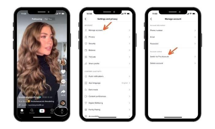
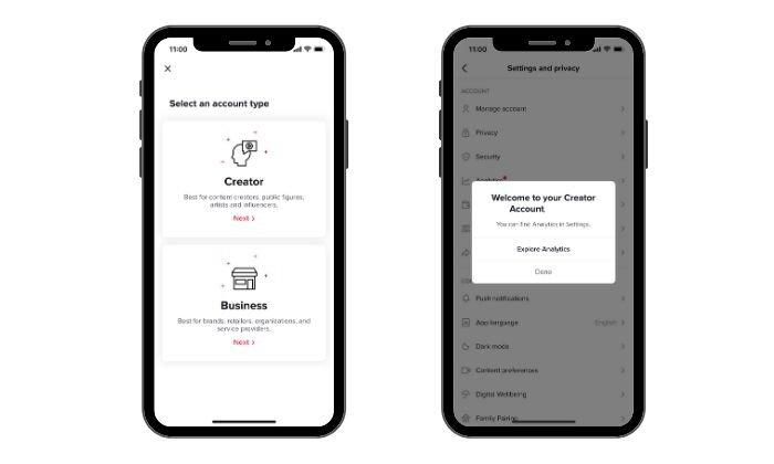
To switch to a TikTok Pro account, do the following:
Open the TikTok app.
Tap the “Me” icon at the bottom of the screen.
Tap the three dots in the top left corner.
Tap “Manage Account.”
Tap “Switch to Pro account.”
Select “Creator” or “Business,” and you’re done!
6. Add Trending Sounds and Music to Your Videos
Think of music and sounds on TikTok like hashtags. You can use trending audio clips to boost your discoverability and get a bump in likes, comments, and views.
How do you find popular sounds to use in your videos?
You’ll need to put on your stealth hat to uncover what’s getting the most traction. Here are three ways to find trending music:
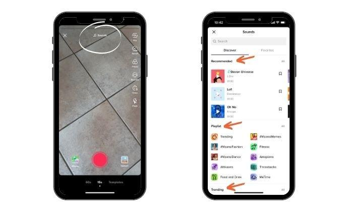
Sounds in the Video Editor
When creating a video, tap the “Sounds” button at the top of the screen. A new page will load, and you’ll see a “Discover” page.
Here, you can view recommended sounds for you to use and a “Playlist” section featuring viral clips, trending sounds, and TikTok music charts. You can also explore the “Trending” page to see what’s currently trending in different categories like “fitness” or “food and drink.”
Scroll through the sounds and add what you like to your Favorites folder to use for later.
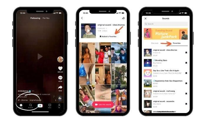
Save Sounds to Your Favorites
When you’re swiping through TikTok and come across a sound you want to use for a video, add it to your Favorites folder.
The feature collects your clips in one handy spot, and you don’t need to waste time trying to remember the name of a sound.
If you like a sound and want to save it, tap the sound name under the username. An audio page will load where you can see a list of all the other videos using it and a button to add the clip to your Favorites.
Use Sounds Your Followers Are Listening to on TikTok
Once you’ve switched to a TikTok Pro account and hit 100 followers, you’ll get access to another juicy analytics feature.
Under the “Followers” tab, you’ll see a list of sounds your followers have watched in the last seven days.
It helps reduce research time and shortlist sounds for your next video.
Use TikTok Stories
While they’re not a firm feature yet, TikTok has been trialing Stories. After an initial pilot in Brazil, U.S. users are starting to see notifications about the new app.
TikTok Stories appear for 24 hours before disappearing from feeds and have a blue circle next to them. Users can find stories by going to your TikTok FYP. Posting videos works much the same way as regular content. You just:
Open TikTok’s posting tool and choose the ‘post’ button’
Create some content
Choose the ‘Story’ button. Then the TikTok automatically posts it to the For You feed
Look at other users’ profiles and look for video posts.
Be UniqueTo Get Your TikTok On The FYP
It may seem like a good idea to copy popular ideas, but if you want to stand out, one of the best ways to go about it is by creating unique content.
Use the sounds and effects that others are using as inspiration, and see if you can take it in a different direction.
You can also get creative with your editing techniques and use filters and effects to add an extra layer of creativity to your videos.
Just one more tip before rounding off this section: stay active and engaged with your followers, liking and commenting on their videos as often as possible.
FAQs
What is FYP in TikTok?
FYP on TikTok is an abbreviation of ‘For You Page.’
How can I use hashtags to get on Tiktok’s FYP?
Choose popular hashtags that are trending and relevant to your topic. Also include #fyp and #foryou (even though TikTok has not confirmed this guarantees a spot on the FYP.
How long are videos on TikTok’s FYP?
Most popular TikTok FYP videos are 60 seconds or less.
What TikTok FYP captions should I use?
Captions on your TikTok videos should be short, include related hashtags, and encourage engagement (likes, comments, and shares) from other TikTok users.
What time should I post a video, so it appears on TikTok’s FYP?
After you get 100 followers, look at your free TikTok pro account to see when users that like your videos are usually online. Try to publish a video when people are most active.
According to research from Later, Monday to Friday at 1 PM is the optimal time for posting. However, there are plenty of variables, such as time zones and niches, so that’s not guaranteed.
If it’s engagement you’re after, Later’s research also found that Thursdays and Fridays get the most attention.
What sounds will help me get on TikTok’s FYP?
Effects are another factor in how to get your TikTok on the FYP. Try to use trending or popular sounds with your videos. While there is no official confirmed link between using trending sounds and being on the FYP, it usually helps increase popularity.
How long does it take to get on TikTok’s FYP?
There’s no firm timeline. Some find their content appears within 48 hours, while others wait weeks for their content to appear on the TikTok FYP.
How can I get my TikTok on the FYP?
Remember the basics. Use hashtags, short content, and viral sounds/images. Post at the optimum times and always maintain quality.
FYP on TikTok is an abbreviation of ‘For You Page.’
”
}
}
, {
“@type”: “Question”,
“name”: “How can I use hashtags to get on Tiktok’s FYP? “,
“acceptedAnswer”: {
“@type”: “Answer”,
“text”: ”
Choose popular hashtags that are trending and relevant to your topic. Also include #fyp and #foryou (even though TikTok has not confirmed this guarantees a spot on the FYP.
”
}
}
, {
“@type”: “Question”,
“name”: “How long are videos on TikTok’s FYP?”,
“acceptedAnswer”: {
“@type”: “Answer”,
“text”: ”
Most popular TikTok FYP videos are 60 seconds or less.
Captions on your TikTok videos should be short, include related hashtags, and encourage engagement (likes, comments, and shares) from other TikTok users.
”
}
}
, {
“@type”: “Question”,
“name”: “What time should I post a video, so it appears on TikTok’s FYP?”,
“acceptedAnswer”: {
“@type”: “Answer”,
“text”: ”
After you get 100 followers, look at your free TikTok pro account to see when users that like your videos are usually online. Try to publish a video when people are most active.
According to research from Later, Monday to Friday at 1 PM is the optimal time for posting. However, there are plenty of variables, such as time zones and niches, so that’s not guaranteed.
If it’s engagement you’re after, Later’s research also found that Thursdays and Fridays get the most attention.
”
}
}
, {
“@type”: “Question”,
“name”: “What sounds will help me get on TikTok’s FYP?”,
“acceptedAnswer”: {
“@type”: “Answer”,
“text”: ”
Effects are another factor in how to get your TikTok on the FYP. Try to use trending or popular sounds with your videos. While there is no official confirmed link between using trending sounds and being on the FYP, it usually helps increase popularity.
”
}
}
, {
“@type”: “Question”,
“name”: “How long does it take to get on TikTok’s FYP? “,
“acceptedAnswer”: {
“@type”: “Answer”,
“text”: ”
There’s no firm timeline. Some find their content appears within 48 hours, while others wait weeks for their content to appear on the TikTok FYP.
”
}
}
, {
“@type”: “Question”,
“name”: “How can I get my TikTok on the FYP? “,
“acceptedAnswer”: {
“@type”: “Answer”,
“text”: ”
Remember the basics. Use hashtags, short content, and viral sounds/images. Post at the optimum times and always maintain quality.
”
}
}
]
}
Conclusion
These tips are good starting points to get on the FYP. However, I’m not making any guarantees.
While these tips can significantly improve your chances, multiple factors can influence whether TikTok features your content in users’ feeds.
There’s more to TikTok than stardom, hashtags, and trending sounds. If you’re not creating memorable, worthwhile, and shareable content for your audience, there’s less chance TikTok will pick it up and share it.
How do you plan to use TikTok in your social media strategy?
Wikipedia is an ever-evolving, user-generated encyclopedia that allows users to add content, including pages, articles, and general knowledge. Topics span from pinball to Prometheus and everything in between.
If you’re interested in creating a Wikipedia page for your business or marketing endeavors, you should know upfront that getting a page added to the encyclopedia is notoriously challenging.
With a slew of rules that determine what content can be added to the site and the sheer effort of writing a highly-researched page about your business, creating a Wikipedia page is no easy feat.
To help guide what content does end up on the platform, Wikipedia has five pillars to guide creators as they build content for the platform:
Wikipedia is an encyclopedia.
Wikipedia is written from a neutral perspective.
Wikipedia is free, editable, usable, and distributable by all.
Respect and civility must guide interactions among Wikipedia editors.
The platform has no firm rules, only guidelines and policies.
After a page is published, volunteer editors are deputized to edit and add to the page for the duration of its existence.
Although those guidelines may seem daunting, there are big benefits for marketers and business owners who manage to make the encyclopedia work in their favor.
The largest benefit of Wikipedia is its sheer size and reach. The encyclopedia averages over 2.5 billion unique visitors per month, earning it the title of one of the most visited sites in the world.
In addition to the sheer magnitude of users, the platform offers other benefits to marketers and business owners:
Earn traffic and drive backlinks to your site: When you become an active contributor on Wikipedia and start optimizing content, you can identify pages that are relevant to your audience. Search for relevant articles with broken links and those with missing citations, then use links to your site to update those pages. When you add appropriate links in the right spot, you’ll score backlinks and drive traffic to your website.
Guide to your services and offerings: Given the structure of a Wikipedia page, you can provide readers with basic information like your brand story, location, and executive list. You can also include numbered lists of your services and offerings that allow interested parties a top-of-funnel interaction with your products. Through direct linking, you can then drive to the respective pages on your website.
Build credibility: While Wikipedia is not a valid source for scholarly research given its user-generated nature, there’s no denying that people flock to the platform for information. By building a page for your organization on the site, you can further develop your credibility as an established company.
As we’ve discussed, publishing your page on Wikipedia can be a complex process. However, the benefits far outweigh the challenges.
In this post, we break down the ten steps on how to create a Wikipedia page.
1. Create an Account
The first step in your journey to creating a Wikipedia page is registering an account on the platform.
While starting an account enables you to create pages, it has other benefits, including:
access a permanent user page where you can share a brief bio and a few photos
access a talk page where you can interact with other users
After you’ve completed this step, you’re on your way to your first Wikipedia page.
2. Contribute to Existing Accounts
While Wikipedia is home to exclusively user-generated content, to build credibility on the site, you should contribute to existing accounts and pages.
You can do this by editing existing entries regularly for clarity, factuality, and reliability. To do so, you need to first create a user page.
As you engage more with improving content, you can boost your credibility on the site, increasing the likelihood that, when the time comes, your page will stand a fighting chance of getting published.
3. Verify a Page Doesn’t Already Exist
Perhaps you’re an expert on a particularly niche topic that you’re certain no one has tackled in the expansive landscape that is Wikipedia.
Regardless of how unique you perceive your topic to be, you should still dig to determine whether someone has already staked their flag in your topic.
Use the search bar to explore any pages that may be related to your intended topic.
4. Check Your Topic’s Notability
Unique to Wikipedia, notability is a test editors use to determine whether a topic is substantial or relevant enough to need a unique article.
To earn this title of notable, the information on your page must use reliable, independent sources. In general, a topic needs to meet two specific qualifications to be deemed worthy of a stand-alone page: general notability and subject-specific notability.
If your topic meets these two guidelines, you’re a step closer to actually getting your Wikipedia page published. However, editors can still opt to merge related topics, eliminating the need for a stand-alone page.
5. Research Your Topic and Gather Resources
Before diving into writing your Wikipedia page, be sure to fully research your topic. Whether you’re building a page for your business or developing an adjacent industry topic, be sure to include both internal and external sources to ensure that you are solidifying your reliability and notability in your draft.
6. Create an Outline
After you’ve gathered your research sources, build an outline for your page. Here, break your information into digestible sections that can be indexed through the site’s table of contents that accompany every page.
7. Write a Draft of Your Wikipedia Page
Take your time as you write your Wikipedia page. You want your content to be thorough, thoughtful, and helpful, providing searchers with what they want to know. While Wikipedia pages can do a lot to benefit your marketing efforts, keep in mind that the true intent of the platform is encyclopedic and impartial.
8. Add Citations
Incorporating citations into your Wikipedia page is vital to your page’s success. Citations are the vehicle that drives searchers to trust the information you share on your page.
Before you start creating your page, Wikipedia shares the disclaimer that: “The topic of an article must already be covered in reliable sources that are independent of the subject. These include journals, books, newspapers, magazines, and websites with a reputation for fact-checking. Social media, press releases, or corporate/professional profiles do not qualify.”
We’ve talked a lot about credibility in this blog post—by using reliable citations, you can boost your overall credibility.
9. Submit Your Article for Review
After you’ve written and proofed your page, it’s time to submit your article to Wikipedia for review. This process can take anywhere from a few days to a few weeks to get the go-ahead from Wikipedia.
As we mentioned earlier, publishing on Wikipedia is notoriously challenging; you may have your page or article rejected a few times for finally gaining approval.
10. Continue Making Improvements
Once you’ve completed your page and gained approval, it’s not time to rest on your laurels. As your page gains traction on Google, you must conduct regular updates to ensure it provides the most relevant information about your offerings.
Frequently Asked Questions About How to Create a Wikipedia Page
Should I Build a Wikipedia Page for My Business?
Yes, you should absolutely build a Wikipedia page for your business (or for a client’s business). When you build a page, you earn benefits that include a boost in both search and backlinks, increased credibility, and more traffic.
In addition to these benefits, you can anticipate more exposure for your business given the sheer number of users searching Wikipedia daily.
Is Creating a Wikipedia Article Challenging?
It can be, yes. Not only does your page have to adhere to a number of guidelines set by Wikipedia, but you also must write a comprehensive, research-driven article about your topic or business.
How Can I Know If My Wikipedia Page Will Be Published?
If you adhere to the guidelines established by Wikipedia and ensure your content is not duplicative, you have a good chance of getting your page published. However, we will note that the creation of a Wikipedia page takes a lot of work. Essentially, you are creating a well-researched document that details your organization’s history, mission, and offerings.
How Long Will My Wikipedia Article Be Under Review Before Publication?
While we wish there were a straightforward answer to this question, publication review time varies from page to page, spanning a couple of days to several weeks.
{
“@context”: “https://schema.org”,
“@type”: “FAQPage”,
“mainEntity”: [
{
“@type”: “Question”,
“name”: “Should I Build a Wikipedia Page for My Business?”,
“acceptedAnswer”: {
“@type”: “Answer”,
“text”: ”
Yes, you should absolutely build a Wikipedia page for your business (or for a client’s business). When you build a page, you earn benefits that include a boost in both search and backlinks, increased credibility, and more traffic.
In addition to these benefits, you can anticipate more exposure for your business given the sheer number of users searching Wikipedia daily.
”
}
}
, {
“@type”: “Question”,
“name”: “Is Creating a Wikipedia Article Challenging?”,
“acceptedAnswer”: {
“@type”: “Answer”,
“text”: ”
It can be, yes. Not only does your page have to adhere to a number of guidelines set by Wikipedia, but you also must write a comprehensive, research-driven article about your topic or business.
”
}
}
, {
“@type”: “Question”,
“name”: “How Can I Know If My Wikipedia Page Will Be Published?”,
“acceptedAnswer”: {
“@type”: “Answer”,
“text”: ”
If you adhere to the guidelines established by Wikipedia and ensure your content is not duplicative, you have a good chance of getting your page published. However, we will note that the creation of a Wikipedia page takes a lot of work. Essentially, you are creating a well-researched document that details your organization’s history, mission, and offerings.
”
}
}
, {
“@type”: “Question”,
“name”: “How Long Will My Wikipedia Article Be Under Review Before Publication?”,
“acceptedAnswer”: {
“@type”: “Answer”,
“text”: ”
While we wish there were a straightforward answer to this question, publication review time varies from page to page, spanning a couple of days to several weeks.
Through a number of strategies, marketers can make the user-generated encyclopedia work to their benefit, doing much more than simply providing information to interested parties.
As you begin to learn how to create a Wikipedia page, keep in mind that the process may be complicated. For your page to be approved, you need reliable sources that stack up to imbue credibility in your page.
However, regardless of how long the process takes, the end product will be well worth it.
What strategies have you used for marketing on Wikipedia?
Facebook offers businesses new ways to connect with their audience, promote and sell products, and improve online visibility for their brand. The addition of shopping features such as Facebook Marketplace can also be leveraged by businesses to improve online conversions.
With over 140 million business accounts on Facebook, you may think competition is high. However, the right tactics and execution can help you create a Facebook Business Page that drives new revenue for your business.
Let’s review how to create Facebook business pages that increase your engagement, clicks, and revenue.
What Is a Facebook Business Page?
A Facebook Business Page is a stand-alone page that allows you to promote your business on one of the world’s biggest social platforms.
Facebook Business Pages are different from personal pages because they represent a business or brand, rather than an individual. This means the content on your Facebook Business Page needs to be brand-focused and professional.
A Facebook Business Page will let you share content, respond to customers, have conversations with your followers, and promote products within your feed.
You can also invite other people to manage your Facebook Business Page including any partners or outside agencies you may be working with.
Facebook Business Pages can also run paid Facebook ads to further promote your brand and products.
As you can see, it includes features a personal page doesn’t have, such as a “learn more” button, map, and a Like button.
Why Should You Create a Facebook Business Page?
When you create a Facebook Business Page you are helping people find your business and learn more about what you offer.
Your business page also helps you build an online community and better service your customers. Once you’re set up, your followers can interact with you and ask questions about your products and services in real-time, which is a great way to improve your brand integrity.
To create a great Facebook Business Page, you need to analyze everything, from your profile picture and cover photos to Facebook ads, target audience, and media planning (types of posts and when it’s time to post).
Here is a six-step guide to creating your Facebook Business Page.
1. Login or Sign-up to Facebook
First, you need to log in or join Facebook. You can create your Facebook page from your personal page if you prefer, or you can create an entirely new account for your Facebook business page.
Select the type of page you want to create, either a business/brand or community/public figure, and then click Get Started.
Here, you’ll be asked to supply some basic information.
The basic information you can add includes:
Page name: Which should be your business or brand name.
Business category: One or two words to describe your business. Facebook will give you options once you start typing. If your business falls under more than one category, try to pick the one your customers will associate with your business.
Description: A brief description of what you do, services you offer, and the purpose of your Facebook Business Page.
From there, click Continue. Moving forward indicates you have accepted Facebook’s Pages, Groups and Events Policies so familiarize yourself with these if you haven’t already.
2. Upload Cover Photo and Profile Picture
Your cover photo and profile picture are the main visual assets of your Facebook Business Page.
Many businesses use their logo for their profile picture, but you can choose any photo that represents your business and branding.
When choosing a profile picture, be sure to adhere to Facebook’s sizing guidelines to ensure your photo does not get cropped.
You’ll also want to add a cover photo when you create your Facebook Business Page. Your cover photo should be visually exciting and representative of your business and branding. Refer to the sizing guidelines for cover photo sizing.
Once you complete this step, your page will be automatically published.
3. Enter Your Business Information
Now that you have the skeleton of your page setup, it’s time to start adding content.
Your Facebook Business Page contains basic information about your business that you’ll need to fill in. This includes:
Contact: Share how your followers can contact your business if they have questions or concerns. This can include your phone number or email.
Location: Where you are located. If you don’t have a physical storefront, you can simply input your city and state.
Hours of operation: The hours you are open for business or available for customer communications.
Username: This is a unique username used in your Facebook interactions. This should be @ followed by your business name. Don’t get too creative here or it can make it difficult for your customers to find your business.
A CTA button is featured at the top right-hand of every Facebook Business Page, just below the cover photo.
It’s important to choose a relevant CTA to ensure you are directing your audience to the most pertinent actions.
For example, if you are a physiotherapy clinic looking to book more clients, your CTA button may say Book Now.
If you are an e-commerce business looking to sell products, then you may want to choose a CTA button that says Shop Now.
To edit your CTA button, click “+ Add a Button.”
From there, Facebook will give you a list of actions that your CTA could encourage. These include Start an Order, Book Now, Contact Us, and more. Choose your action and follow the steps given to complete your CTA button.
If you don’t choose a custom CTA here, Facebook will automatically create a Contact Usbutton for your page.
5. Publish Your First Post
Before you invite people to your Facebook Business Page, you should make a post so there is content for them to view.
Your first post can be a welcome post that explains who you are and what you do, or it can be something aimed at user-generated content (UGC) to get visitors engaged with your Facebook Business Page right away.
For example, a contest or giveaway can be a great way to drive immediate traffic. You can also promote sales or discounts to encourage your audience to browse and purchase your products.
Your Facebook Business Page is now ready to get traffic, so you can start inviting your audience to follow your page.
If you used your personal Facebook account to set up your page, you will be prompted to invite your Facebook friends. This group is usually a good base for your Facebook Business Page, so invite as many of your personal friends as you feel appropriate.
You can invite followers by clicking on the three dots “…” below your CTA button and clicking Invite Friends.
You can also use other channels to drive traffic to your Facebook Business page, such as your website, social media accounts, email marketing, and paid advertising campaigns.
How to Track the Success of Your FB Business Page
Now that you’ve created your Facebook Business Page, you’ll want to know how it performs and continuously optimize it to get better results.
There are many ways to track the success of your Facebook Business Page. Here are a few metrics you can track with Facebook Insights.
Engagement: Facebook uses an algorithm to show posts in your followers’ News Feeds. Posts that have higher engagement are seen as more popular and relevant, so they are more likely to show up. This means you want more likes, comments, and engagements on your posts to increase your reach. Pay attention to posts that perform well and find ways to mimic that engagement to ensure your Facebook Business Page is successful.
Reach: Reach refers to the number of people who see your content on Facebook. To see this, click on the Reachtab on your Facebook Insights page. Track and analyze your Reach regularly to learn what your audience likes and doesn’t like to better inform your post decisions.
Impressions: Impressions measure the number of times your post was seen, even if it was seen multiple times by a single user. You can find this in Facebook Insights by switching Reach to Impressions.Impressions can show you how viral your posts are and how likely they are to continuously impact your customers. Remember, it often takes a customer hearing about your brand seven times before they’ll convert to a customer.
Page likes and follows: Page Likes refer to the number of people that follow your Facebook Business Page. You can see this number on your Business Page homepage or through Facebook Insights under theLikes tab. While Page Likes are often considered a vanity metric, they are important to track the growth of your audience. If you find your page is plateauing and your Likes are not growing, it may be time to reevaluate your digital marketing strategy.
How to Create a Facebook Business Page
Summary of How to Create a Facebook Business Page
Log in or sign-up to Facebook
You can use a personal account or set up a new one for your business.
Upload a cover photo and profile picture
These should represent your branding and adhere to Facebook’s sizing guidelines.
Enter your business information
This includes opening hours, contact information, location, your About section, and more.
Add a CTA button to your page
Use a CTA to drive the most conversions for your business.
Publish your first post
This should be engaging and immediately draw users into your business.
Invite your audience
Start with your personal friends’ list and then use your other digital channels to grow your audience.
Conclusion
Creating a Facebook Business Page is a great way to improve your revenue and grow your business online.
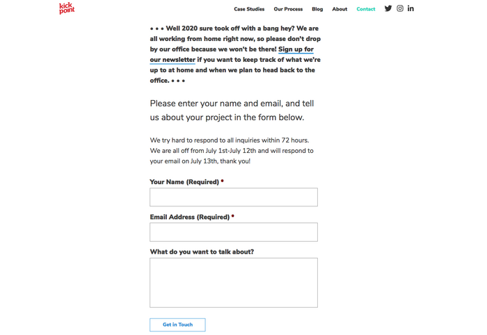
A well-designed landing page can greatly increase conversions for your PPC or email marketing campaigns.
Rather than directing visitors from those sources to your general website (where they may have a hard time finding what they’re looking for), you can direct them to a specifically designed landing page that steers them in exactly the right direction.
Creating effective landing pages isn’t the same as crafting a successful website or email newsletter. There are certain guidelines you should adhere to in order to maximize your page’s success.
Here is what you need to know to create an effective landing page.
Set a Goal For Your Landing Page
Landing pages, like any other part of your online marketing strategy, need goals. Without concrete, specific goals, there’s no way to create an effective page. Your goal should be clear before you begin designing your page.
For example, your page might be designed to encourage:
sales
email list sign-ups
white paper downloads
software trials
webinar sign-ups
You also need specific expectations for your landing page, on which to gauge its success. These expectations can be based on previous experience, anecdotal evidence, or simply wishful thinking.
It’s helpful to have a specific number to compare your actual results with. This could be the total number of conversions, or the number of people who make it past your landing page, or some other number, based on your own goals.
A Clear Call to Action is Vital
Once you know what your goal for the page is, you need to come up with a clear call to action. This is possibly the single most important part of any landing page.
Your call to action should be specifically tied to your goal and should be supported by everything else on your page, from headline and body copy to images and overall layout.
The Backpack landing page has a very clear call to action, though they opt to first direct visitors to more information about their plans and pricing, rather than going straight for the signup.
Keep Copy Clear and Concise
Your copy should be clear and concise. It should be persuasive, too. Landing pages are not the place to show off your creativity, unless that creativity is clear, concise, and persuasive. Leave the creative turns-of-phrase for your blog.
It’s pretty safe to assume that most of the people who visit your page are already interested in what you have to say, because they’ve likely clicked through from a PPC ad or email. But just because they’re interested when they arrive doesn’t mean they’ll stay interested if you don’t get to the point.
Every single sentence and word on your landing page should serve a purpose, and that purpose should be to support your call to action. If it doesn’t do that, cut it. Be ruthless in editing your copy. Tell your visitors what they want to know in as few words as possible, and get them to respond to your call to action as quickly as possible.
The VideoWizard example has a simple design with clear copy that has definite goals.
Keep Your Landing Page Form Simple
If your page includes a form, make sure it’s only asking for the most vital information. If you’re trying to get visitors to sign up for an email newsletter, make sure you’re just asking them for their email address. Anything more than that decreases the chances that they’ll finish and submit the form.
If you’re asking them to make a purchase, keep it simple. Just ask for the vitals: billing and shipping information, plus a confirmation screen before placing their order. Wait to ask them for additional information until after their order has been placed.
This form only asks for name and email address, neither of which are likely to deter sign-ups.
This form, on the other hand, has too many fields. Do they really need a phone number and company name? And wouldn’t it make more sense to just ask for a name in one field, rather than two?
Remove Navigation Elements
The major difference between your normal website and your landing pages is your landing pages shouldn’t include the usual site navigation. Instead, the only clickable links should be your call to action, and possibly a link to more information for those who are undecided.
Linking your logo to your regular home page can also be a good idea.
This example shows just the vital links, without a ton of extraneous navigation.
Forget about links to everything else. All they do is clutter up the page and increase the likelihood that your visitors will abandon your landing page (and ultimately, your site) without converting.
Simplify Your Normal Site Design
Your landing page should still echo the design of your regular website, though, to reinforce your branding. This can be done through the graphics, general look and feel, or your color scheme and font choices.
This is important for branding and lets users know they are on the right page.
Choose Long Page or Series of Pages
There are some questions about whether it’s better to use a single page for your landing page that requires scrolling, or if visitors respond better to a series of short pages (sometimes referred to as a “mini-site”).
Mini sites generally have multiple pages with short content that funnel visitors from one step to the next along the conversion process. This has the advantage of getting users in the habit of moving from one page to the next, which can help get them in the right psychological frame of mind to convert.
The downside to mini sites is that they work best for conversion funnels that need a lot of content.
Landing pages, on the other hand, are perfectly suited to shorter content. They also only have to load once, which can be a big consideration for companies targeting people in rural areas or developing nations, where bandwidth and connection speeds could be an issue.
The downside is a lot of content can get overwhelming and can come across as spammy if not well-designed.
The CameraPlus page is quite long, with all the information you need about the app. (The image above is split, as the entire page would be several thousand pixels long.)
Compare this page, which barely fills a single screen, and uses multiple steps to gather information.
Pay Attention to the Fold
While there’s a lot of debate as to the importance of “the fold” in web design, landing pages are one area where the fold is crucial. Make sure that your call to action is located near the top of the page, where someone can click it without having to scroll.
This doesn’t necessarily mean that your visitors won’t scroll down the page to read more information. Hopefully, at least some percentage of your visitors will be ready to buy as soon as they arrive on your landing page, either because the email or link that brought them there already persuaded them, or because it’s not their first time visiting the page.
Putting a call to action right near the top of the page makes things easier on these visitors. (Plus, it can increase your conversion rates.)
The most important navigation elements are located just above the fold, with the call to action well above the fold.
The signup button is well above the fold here, too.
Below-The-Fold Calls to Action
That doesn’t mean you should neglect those users who scroll. Make sure calls to action appear at regular intervals on your page, tied into the page’s copy.
This becomes more and more important as your pages get longer. Make sure that your users have to do minimal scrolling once they decide to convert.
FreshBooks includes links to a free trial or tour throughout their landing page.
Use Minimal Images and Larger Fonts
Your landing pages should use only one or, at most, two images. You want to avoid visual clutter on the page, or anything that detracts from the message and call to action.
Larger font sizes are also a good idea to keep visitor’s eyes focuses on what matters and reduce eye strain. Just don’t go overboard and put everything in a headline-size font.
The ideal line length for copy readability is 39 characters, so size your font (and column width) accordingly.
The typography becomes a major part of the visuals of this landing page, minimizing the need for graphics.
Start With a Centered, Single-Column Design
Studies show that centered, single-column landing pages convert best. Yet, there are still plenty of marketers out there who are opting for two-column designs.
Make sure that you test single-column versions against any two-column versions prior to committing to a design.
This is a great example of a centered page that makes great use of the available space.
Match the Look and Feel of Your Campaign
If your page is tied to an email campaign or PPC campaign, make sure the landing page echoes the look and feel of the ad or email.
If the designs of the two are wildly different, your visitors may wonder if they’ve ended up in the right place. The easiest way to do this is to carry over fonts, images, and colors from your campaign to your landing page. This is especially important for paid ads, as it can increase your quality score.
Use the Landing Page Tools to Get it Right
If you don’t want to have to use a web designer for your landing pages, there are options for creating great pages without any technical knowledge.
Unbounce is one of the easiest to use and lets you create landing pages without any IT experience. They have best-practices templates available that you can customize (or design your own page entirely from scratch), and flexible pricing (including a free plan for sites with limited traffic). Unbounce also integrates with Google Analytics for tracking your traffic, and Qualaroo for gathering user input.
Don’t Forget To Test Your Landing Page
Creating effective landing pages isn’t a one-size-fits-all project. What works for one site might not work so well for another. Finding the most effective page design is a matter of trial and error.
It’s important to test the different versions of your landing page (called A/B testing)to find the one that works the best for your particular situation. Without doing so, you might be leaving a lot of potential conversions on the table.
A few features to consider testing include:
headline
CTA
button size and placement
number of form fields
images
right, left, or center column design
colors
Just remember to test each variant one at a time — if you change five different elements, you won’t know which impacted conversions.
Landing Page Guide
A well-designed landing page can greatly increase conversions for your PPC or email marketing campaigns. Here’s how to do it.
Set a Goal For Your Landing Page
Without concrete, specific goals, there’s no way to create an effective page. Your goal should be clear before you begin designing your page.
A Clear Call to Action is Vital
Your call to action should be specifically tied to your goal, and should be supported by everything else on your landing page, from headline and body copy to images and overall layout.
Keep Copy Clear and Concise
Landing pages are not the place to show off your creativity, unless that creativity is clear, concise, and persuasive. Leave the creative turns-of-phrase for your blog.
Keep Your Landing Page Form Simple
If your landing page includes a form, make sure it’s only asking for the most vital information.
Remove Navigation Elements
Your landing pages shouldn’t have your usual site navigation. Instead, the only clickable links should be your call to action, and possibly a link to more information for those who are undecided.
Simplify Your Normal Site Design
Your landing page should still echo the design of your regular website, though, to reinforce your branding.
Pay Attention To The Fold
Make sure that your call to action is located near the top of the page, where someone can click it without having to scroll.
Use Minimal Images and Larger Fonts
Your landing pages should use only one or, at most, two images. You want to avoid visual clutter on the page, or anything that detracts from the message and call to action.
Start With a Centered, Single-Column Design
Studies show centered, single-column landing pages convert best, so test that version first.
Match the Look and Feel of Your Campaign
If your landing page is tied to an email campaign, make sure that the landing page echoes the look and feel of the email.
Use the Landing Page Tools to Get it Right
You don’t need a masters in computer science to design a landing page. Instead, use tools like Unbounce to create great looking landing pages.
Don’t Forget To Test Your Landing Page
Creating effective landing pages isn’t a one-size-fits-all project. What works for one site might not work so well for another. Finding the most effective page design is a matter of trial and error.
Conclusion
Landing pages are website pages designed with one goal in mind — conversions. Following the tips above will help you create a powerful page that drives users towards your business.
Just make sure to keep it simple. This is because landing pages have very specific goals and shouldn’t include any extraneous information that might distract your visitors and prevent them from converting.
Are you considering creating a landing page? What is your landing page goal?
If a user clicks through to a page on your website and finds themself waiting more than a few seconds for your page to load, they are likely to leave your page and can cost you a conversion.
Luckily there’s a remedy to increase page speed, but it involves the identification of the issue or issues causing slow lead times.
Since it can be difficult to pinpoint what’s wrong, you can use tools such as Google’s PageSpeed Insights to help. Google PageSpeed considers several factors for an overall score load time score. When you analyze page speed, Google gives you a list of metrics that contribute to the score. Let’s find out what those metrics are.
Increase Page Speed with Google PageSpeed Insights Field Data
The first set Google PageSpeed Insights gives you is called field data. This includes a variety of aspects of your site. (You can also learn more about core web vitals and how it will affect speed and SERP performance.)
1. First Contentful Paint (FCP)
FCP is when your browser renders the initial information. That includes text, images (including background images), non-white canvas, and scalable vector graphics (SVG).
2. Largest Contentful Paint (LCP)
LCP is a Google experience metric that measures the time it takes for the largest bit of information on the page to load. Google uses LCP as a ranking factor for pages.
3. Cumulative Layout Shift (CLS)
CLS is another ranking factor for Google. It’s an unexpected shift—meaning jumping around to other locations on your screen—of page elements as it loads. It’s an indication of poor coding and can be caused by images, ads, videos, contact forms, and fonts.
4. First Input Delay (FID)
FID measures site response time when a user first interacts with it. If your user clicks on a video, the time it takes to play a video is your FID.
Using Lab Data to Increase Page Speed
The second set of elements is called lab data. It includes the elements above, as well as total blocking time, time to interactive, and speed index.
1. Speed Index (SI)
SI measures the average time it takes for all elements on a page to become visible. Measured in milliseconds, it calculates the time it takes for visual elements to load above the fold—the part of a webpage seen before a user has to scroll.
2. Time to Interactive (TTI)
TTI measures how long it takes for all of the interactive elements on a page to become fully functional. It’s the time between the First Contentful Paint to the time the page can handle the user’s input.
3. Total Blocking Time (TBT)
TBT measures the time between time to first contentful paint and the time a site becomes interactive.
Why Is It Important to Improve Page Speed?
Page speed affects user experience, which can make or break your site. Faster page speed makes for a better user experience and can increase page views and conversions and reduce bounce rate. Let’s get into more detail on the benefits of improving page speed.
1. Improve User Experience by Increasing Website Speed
According to our research, 47 percent of consumers expect a website to load in no more than two seconds.
Every second afterward damages user experience. Viewers don’t want to wait for your page to load, and they’ll often bounce to find another business with a better user experience.
2. Increase Page Views
You might have noticed that some of the metrics I mentioned above, namely LCP and CLS, affect Google page ranking. In their quest to provide high-quality search results for users, Google includes metrics measuring load times. So, the better your page speed, the better ranking you may get on Google.
3. Increase Conversions
If your pages load quickly, it stands to reason your users will be happier and more willing to turn into customers. In 12 case studies conducted by HubSpot, they found decreasing page load time increased conversions by anywhere from three to 17 percent.
We did the math. If you’re an e-commerce site making $10,000 a day, a one-second page delay could cost you $2.5 million per year.
4. Lower Bounce Rate
According to Think with Google, when your page load time increases from one second to three seconds, the probability of bounce increases by 32 percent. If it rises from one to five seconds, that probability increases 90 percent.
The difference of a few seconds is the difference between keeping and converting users and watching them go elsewhere.
8 Ways to Increase Page Speed
To get a baseline for your current page speed, test your site using a tool like Google PageSpeed Insights.
It will prompt you to enter a URL, then take a few minutes to analyze your page.
When it’s done, you’ll get an overall score that looks like this.
This is a pretty low score, but don’t panic. Google explains a number of factors can affect the final score and even cause it to fluctuate. Some of these factors include:
conducting A/B tests
changing the ads on your page
changes in internet traffic routing
testing on different devices, such as a high-performance desktop and a low-performance laptop
browser extensions that inject JavaScript, which can add or modify network requests
antivirus software
Google can analyze these factors and serve you a list of opportunities and diagnostics to help you speed up your page load time.
You can also try the following actions to increase page speed:
1. Limit Redirects
The more redirects you have, the longer it takes the server to find and load the correct page. Eliminate unnecessary redirects wherever you can.
2. Include the Trailing Slash
Don’t forget to include the trailing slash at the end of the URL. By doing so, you’re telling the server there are no file directories to search, and this page is the final destination.
It will shave a fraction of a second off your load time, where every millisecond counts.
3. Compress and Optimize Images
Large image files or a lot of images can take up a lot of your page load time. Make sure all your images are resized and compressed correctly.
They should be saved in the right format as well. PNG and JPEG files are the most easily compressed, and every browser supports them.
Compressing an image reduces the size of the file and is represented in kilobytes and megabytes. As a general rule, high-quality images can be compressed by 60% to 80%. You should never have an image larger than 1MB.
Resizing changes the size of the image on the page. Hero images may take up the entire width of your site (or about 1900 pixels), while smaller images should be 700 pixels or fewer. You can always size down, but it’s very difficult to size up without an image looking pixelated.
4. Use a Content Delivery Network (CDN)
With a CDN, a network of servers hosts your site locally to speed up page load times. A user in Dublin accessing a website hosted in Los Angeles, for example, wouldn’t have to ping the server of origin but rather a closer one in Ireland.
By spreading out the content on multiple servers, it reduces the number of requests to the server of origin, which slows down load times.
5. Limit Plugins and Extra Page Elements
Plugins, JavaScript, and other extra elements add to page load time. Include only those elements that are necessary for your page.
Of course, there are plugins made to help with site speed. Plugins that automatically resize images, minify code, and defer JavaScript loading can help with page speed. You have to determine if the bells and whistles these plugins allow are worth the trade-off with page speed.
6. Minify Your HTML or CSS
When you minify your site’s code, you take out all the spaces, notes, and extra markup developers use to make their code readable and easier to work on down the road. A server doesn’t need all that to read HTML, JavaScript, or CSS, and it can get in the way when it tries to load a page.
There are tools to help you minify your sites:
YUI Compressor from Yahoo! for CSS
Google Closure Compiler for JavaScript
Microsoft Ajax Minifier for CSS
HTMLMinifier for HTML
7. Utilize Caching
When a site caches, the server saves copies of its pages, so it doesn’t have to start from scratch every time it loads the site. By using caching, you can reduce time.
8. Choose Your Web Host Carefully
When it comes to web hosting, you get what you pay for. Cheaper plans may not be able to handle as much traffic, which could slow your page speed.
Shared Hosting: A single server hosts multiple small sites. The price for shared hosting is low, but a surge in traffic to any other hosted sites can slow down yours.
VPS Hosting: A virtual private server, or VPS, hosts many sites, but each site has a virtual “spot” dedicated only to them. Because it’s virtual, it gives you more resources, potentially reducing the risk of site speed issues related to traffic.
Dedicated Server Hosting: One site is hosted on a single server. Although more expensive, it helps to lower or eliminate the risk of losing site speed due to other sites’ traffic surges.
Cloud Hosting: Websites are hosted on a network of virtual and physical servers that offer more resources and more flexibility. If you suddenly get a surge in traffic, a virtual host will scale up to handle it.
To choose the right hosting service for your site, consider the sizes of your site and budget.
Conclusion
A fast load time has always been an important component of user experience. Now that it’s one of Google’s components in its ranking algorithm, page speed has become critical for ranking and page views.
To improve page speed, look out for common issues that cause pages to load slowly like the images too large or you’re using too many plugins.
Would you rather have a beautiful website or a website your customers love?
From a business perspective, you shouldn’t go for either.
Your answer must be 100% I want a high-converting website.
Because if people buy, then they both like it and you can safely and predictably scale your business.
Many people get in the trap of creating designs they like while their perfect client avatar is so much different than what they would imagine.
And that can be easily noticed when you click on ads you see on social media.
You might like the ad itself but most times the landing page on the other side is not what you want to see.
The connection between your traffic and your landing page is called an accurate message to market fit.
You want your message to perfectly fit your market so you can start with a winning funnel that’s only bound to go up from there.
Because if you mess up there, you would be optimizing and tweaking little components that will barely get you to break even.
But if you nail your message you would be getting customers left and right without even knowing why or how they came to you.
It’s your most powerful weapon and most businesses do it completely wrong.
So to help you out and guarantee your immediate success, we’ll be going over the best 12 landing page examples that you should use to scale your business.
We’ll go over each one’s strengths and weaknesses while making sure you find one that fits your exact business.
After this post, you’ll be able to come up with high-converting landing pages like magic.
But before we do that, we must go over…
What Makes a Great Landing Page
That question solely depends on your needs.
So let me ask you a couple of questions that will help you clear your mind and think in the right direction.
#1 What do you want to accomplish with your landing page?
Your most common options are:
Getting people to opt-in in exchange for Free value on a subject
Directly selling a low-ticket product like a book or a mini-course
Free Trial offer for a monthly service or software
Free + Shipping offer where you count on upsells to make a profit
You’ve got to know exactly what offer you want to present in your landing page before creating it.
And of course, there are other offers you can make but the idea here is to clarify what is the one that you want to use for your business.
If you’re not sure, there would be multiple examples further down the post.
Now for the next question, you need to ask yourself…
#2 Are you committed to this project or are you just trying out an offer?
Building a high-converting landing page is not an overnight hustle.
You might find yourself optimizing a non-profitable landing page for months before it starts generating real returns.
And if you’re not ready for that, then I recommend you quit before you even start.
Yes, you can get a lucky shot and hit a homerun from your first try but counting on it is delusional.
Be ready for the long game so you catch the long-term gains that are so much sweeter than the momentary satisfaction.
And for the final question…
#3 What’s your budget?
Before you begin designing your high-converting landing page, you need to prepare a solid budget.
You can’t expect everything to go smoothly throughout the process.
Problems are going to occur and most times the easiest and fastest way to solve them is to pay someone who is an expert in the field.
That can be a developer, a Funnel designer/builder, an Ad specialist, or a CRO consultant.
Either way, you should be ready to pay someone to do it right so you don’t face the same problems over and over.
In marketing and life, there’s a rule of thumb that suggests you should finish your work and then let someone else judge it.
Obviously, for landing pages, the way is to run some ads and see if the traffic converts.
If it does, you raise your ad budget and try to scale.
If it doesn’t convert initially then you should let a professional take a look at it.
And even if you already hired someone to build it for you, don’t expect him to help you here.
Yes, he can optimize your page but you’ve got to keep in mind that people have an emotional attachment to their work.
That’s why you need a third party to help you out.
And especially when it comes to optimizing a landing page for conversions, you must consider the idea of hiring an agency.
Big marketing agencies nowadays have had hundreds if not thousands of clients who had been in your exact situation.
That’s why hiring a marketing agency to help you increase your conversion is the best bet.
And talking about CRO (conversion rate optimization) there’s no better choice than NP Digital.
It is simply the best marketing agency for both SEO and CRO.
If you’re at the stage where you want to optimize your existing landing page but you don’t know exactly how to do it…
Then you should book a quick call with a professional where you’ll unravel the secret conversion optimization methods your business needs.
And now for the main event…
The Best 12 Landing Page Examples
These are the 12 Best Landing Page Examples we could find.
We’ll be judging them for conversions, offer, design, and customer experience.
#1 Get Response
Get Response is an example of a simple yet interactive landing page example.
You can see the Get Response team are bold as they’re the only software in the industry that uses an interactive headline.
The yellow sign you see on the image below changes between the words growing, leads, and sales.
That makes it for a great attention-grabbing headline that just makes you read on.
Also, they use a friendly, positive face which is something we don’t see very often in business that is not centered around a personal brand.
That of course is not a bad thing. It automatically builds trust and makes it easier for people to sign up for their software.
#2 Slack
Slack is always on the top of its game when it comes to landing pages.
They are constantly optimizing for conversions and that’s the best way to find your winning landing page.
Their current one is once again, extremely interactive, has a big eye-popping headline, and also shows how easy it is to use the software with a quick 5-second giff.
Straight from the get-go, you can see they value customer satisfaction and if you’re still not sure, scrolling down will lead to non-stop credibility and results that prove their authority in the marketplace.
#3 Intercom
Intercom’s main objective on this landing page is to get you to opt-in with your email.
Keeping it to email only is a great way to increase your opt-in rate.
A big, positive headline that puts you in the right state of mind to act now.
The images they use perfectly represent the headline’s main USP.
You can see an overall friendly environment and you just have to opt-in if you got to this page.
#4 Lyft
Lyft has been riding up the charts in the past years and their website, landing page, and their overall online funnel is not lacking behind.
They focus on attracting new drivers that want to control their own life.
And promising your employees freedom while working for you is the best way to snap the best candidates from your competitors.
We know Lyft has used multiple landing pages in the past but their current one shows real professionalism.
Once again, we see a giant, attention-grabbing headline. This time with a question to anticipate curiosity and thought process in their prospects.
And check out the button “APPLY TO DRIVE”. It implies that it’s not 100% sure you’ll be able to get the position.
Making it so your clients have to compete to get a hold of your attention makes it so they try harder in the job itself.
#5 Zoho
Zoho’s landing page is a great example of a more complicated but still extremely powerful messaging.
They use more text than the average software in the industry but that’s not necessarily bad.
For their specific case, they need to convert the prospect to begin a free trial which automatically builds tension in a prospect because he knows it will come a time he’d have to pay.
And converting someone to pay is way harder than just getting their email.
That’s why using more text in their messaging makes it for a powerful copywriting punch that maximizes free-trial registrations.
#6 Squarespace
Squarespace tops the list for the least amount of text in their landing page design.
At first, you may think that is not enough to convert someone.
But once you see that they’re a website builder you can see how the design and the quick and powerful messaging are all you need to sign-up.
They know their prospects mainly struggle with complicated codes and want to show a safe space where they can relax and drag and drop their winning website design.
#7 ActiveCampaign
ActiveCampaign solely focuses on showing you how their software brings the best customer experience possible.
And if you’re a business owner, you both want to be treated well and want to help your customers in tough times.
Their headline hits 2 birds with one stone and once again there’s no useless text or design.
Everything leads to the big green button and you starting your free trial.
#8 Hubspot
Hubspot is one more CRM that tops out the list today.
They, just like ActiveCampaign, show you that using their software will both help you and your customers feel better throughout the process.
Knowing that their ideal customer’s main objection is that learning a whole new CRM from scratch might be hard, tedious, and maybe even impossible, helps them narrow their message straight to the point.
#9 Shopify Plus
Shopify is one of the most well-known platforms in today’s online space and they know it.
As they’ve been rapidly growing throughout the years, they’ve been able to test out multiple landing page designs to find one that converts.
And the Shopify Plus’s landing page shows for it.
Their main goal is to book a consultation call with their prospects which takes more than just a couple of words.
They have the budget to shoot professional videos for all of their products and services which helps transfer valuable information to their prospects in the fastest possible way — video.
Down below you see powerful credibility and if you take the time to watch the video, you’re most likely going to book a call with them.
Videos are a deadly weapon in the right business’s hands and Shopify proves that here and pretty much with anything they do.
#10 Webflow
Webflow shows the insights of the software immediately when you land on their landing page.
You can see instant credibility from big websites that have used their services and also you can begin for free.
That breaks any tension the prospect might have.
On top of that, you can see that their software is similar to Photoshop.
So if you’ve ever used Adobe’s products, you immediately know this work will be a piece of cake for you.
#11 ClickFunnels
ClickFunnels uses its software to convert you for a free trial.
And even if you have any skepticism you can play around with the funnel pages and buttons to see the responsiveness of nowadays funnels.
You can see that they use more text than the average website/funnel builder.
But once again they’re trying to convert people to start a 14-day free trial which is not an easy task.
They also use powerful videos that sell directly to their ideal customers.
And the best part is the analytics they’ve slapped on their landing page.
It’s a bold and powerful move if done correctly.
The way these analytics are crafted makes it so they are constantly being updated and it’s not just 100K+ users as you might see on other platforms.
ClickFunnels values its customer’s success stories and is always there to record each result.
It’s one of the harder landing page designs to pull off but if you do it, your conversions will skyrocket.
#12 Conversion Lab
Conversion Lab has been using this landing page design for years now.
We’ve noticed they split test different button CTA-s like book a call, get a free consult, and many more.
Keeping their Founder on the main page of the website builds a long-term relationship many businesses nowadays miss out on.
They clearly state their services through their persuasive headline and even if you’re not ready to book a consultation call with them, a pop-up will appear collecting your email.
Email follow-up is a great way to ensure that a high percentage of prospects that land on your website will end up booking a call with you.
That is all for our list today.
To conclude what you need to know when building your landing page…
Find what your best customers struggle the most with and then directly destroy this objection with a short and punchy headline.
Use credibility and videos if possible.
Know your goals — Is it to get their email, phone, ook a call, start a free/paid trial, or something else?
Clear and easy to follow Call to Action
And always, always optimize in the process.
You can NOT be perfect from day one. Every business on this list tests their pages dozens if not hundreds of times before concluding a winner.
And even then, they still optimize.
Have you tried building a landing page before? How’d it go — did it convert well and what were your biggest breakthroughs when doing it?
Producing a Survey Landing Page A study touchdown web page is an easy touchdown web page that asks the site visitor a couple of concerns as well as after that offers them with the telephone call to activity. When I initially remained utilizing a study touchdown web page, it was for a deal called SeniorSoulmates. …
A visitor hits your website and wants to talk to you. What does that person start searching for?
Your Contact Us page.
It’s a page on your site that pushes visitors from browser to buyer.
Contact Us pages are among the most underutilized and misunderstood resources on the web today.
Some companies don’t use them at all, and those that do have them often push these critical pages to the back burner during website revision projects.
That stops today.
I’ll share a step-by-step plan you can follow to strategize and revise this lowly web page. And I’ll use plenty of examples to spark your creativity.
Let’s get started.
What Is a Contact Us Page?
Think of a Contact Us page as a sort of digital business card. Sure, it’s short and concise. But if someone wants to reach out to you, they’ll use this page to do so.
Contact Us pages often get lumped in with other critical website resources, including:
About Us pages: Use this resource to explain your company’s history, goals, and direction. If someone wants to know how you became a leader in your field, the data is ready to go.
Help pages: Customers with critical product or service questions lean on this page to get their answers.
Employment pages: Job seekers need private, protected spaces to learn more about open opportunities.
A Contact Us page is different because you’re telling people more about getting in touch with you.
Your page should also embody your brand and entice that click. If your Contact Us page is the blandest one on your website, you’re not alone. The best contact us pages contain some value proposition, even when they don’t have a lot of text.
Do You Need a Contact Us Page?
A Contact Us page can’t be skipped because it is a trust signal. Share location information and highlight your phone number and email, and you’ll demonstrate to wary consumers that they can reach you at any time.
Trust and transparency matter in marketing. Contact Us pages start the process.
Five Key Contact Us Page Elements
You know you need a Contact Us page. But you have no idea what to put on the page. Push past the writer’s block, and follow this recipe for success.
A converting Contact Us page contains these critical pieces:
Your company name: Don’t beat around the bush. Use your full company name.
Your physical address: This can get tricky for multi-location companies. Maps often solve the problem (and more on that in a minute). If you share only one address, use the one associated with your corporate headquarters.
A map to your location: Google Maps hold immense power for marketers. When customers know where you are, even when they’re looking at a mobile device, your conversion rates can skyrocket. Boost that power by adding a Google Map to your Contact Us page.
Your contact information: Include a phone number, email address, and a quick data-collection form. Customers need plenty of calls to action. Fight off spam with a CAPTCHA as well.
Links to relevant pages: If you know customers have product questions, show them to your Help page. If you have plenty of job seekers, highlight that Jobs page.
Don’t be tempted to clutter up the page with more details and data. Keep things clean and streamlined with this list.
Build the Perfect Contact Us Form
If you’re looking for a way to streamline customer conversations, forms are key. If you build forms correctly, routing questions is a snap.
Your form could include several fields, including:
Name
Location
Current customer (Y/N)
Question
Email address
Phone number
You might be tempted to add all of these fields to your form. The more data you have, the better, right?
To keep those conversion rates up and deliver exceptional user experience, only ask critical questions.
10 Exceptional Contact Us Page Examples
I’ve talked a lot about what should and shouldn’t go on a Contact Us page.
These ten companies have lessons anyone can apply.
Streamlined and Simple: Scorpion
Scorpion offers internet marketing services to law firms, hospitals, franchises, and more. The company shows off robust design skills on all other web pages. But this one is remarkable in its simplicity.
Customers answer one simple question with a dropdown. The answer routes them to an appropriate secondary form.
Customers can also skip the hassle of forms altogether, call the number in the top-right corner of the screen, or visit one of three locations listed at the bottom of the page.
Brand Promise First: BarkBox
A subscription service for happy dogs should have a dog’s photo on a Contact Us page. And that dog should look happy. BarkBox has that element covered.
Customers have three different contact options sitting below that big image. They can search FAQs, start a live chat, or send an email. It’s a simple, streamlined interface made for busy dog lovers.
Personality Plus: Kick Point
This Canadian marketing firm kicks off the About Us page with a chatty, conversational tone.
Keep scrolling, and that clever voice keeps speaking. When you reach the bottom of this page, you know just how these employees talk and write.
The cleverness doesn’t impede clear communication. You’re told the company’s address, email address, phone number, and more.
Crisis Communication: Powell’s Books
Powell’s puts customer communication front and center on this Contact Us page. Timely content about shipping delays comes first. Keep scrolling, and you’re taken to email addresses and phone numbers.
Typically, converting Contact Us pages are short. But you can break the rules when the unexpected happens.
Arresting Graphics: Parker Lee
People hire Parker Lee to design logos, websites, and other branded elements. He puts those skills to work on this visually arresting Contact Us page. The page begins with a brand statement, but scrolling past that is a snap.
A simple form with just four fields appears, and a clever map rounds out the page.
Forms Do the Hard Work: Six Leaf Design
This company emphasizes sales on this Contact Us page. A three-field form, with a tiny multiple-choice quiz, gets potential customers a price quote.
A blue button for anxious customers leads right to a 20-minute consult appointment. For companies hoping to emphasize lead generation, this is a smart model to follow.
Friendly Faces: Byte
Who will customers talk to when they reach out? Byte answers this question with photos of real-life customer service reps ready to respond to questions.
Choose from multiple contact formats, including text, email, Facebook message, and email. All of this data is streamlined, so white space surrounds the page.
Product Photography: Freshly
Freshly offers meal-kit delivery services, and an enticing product takes up about half of this Contact Us page. Putting the product first could attract customers to jump into a purchase.
The contact box is the clever bit. Customers can chat, call, text, or skip to email.
This is a simple, friendly interface that puts the product first.
Multi-Location Mastery: Wendy’s
How do you handle inquiries when customers have dozens of locations to choose from? Wendy’s handles this question with a “Find Wendy’s” button at the top of the page.
Customers with questions can text or call a number displayed in big, black text. It’s nearly impossible to miss. A clever, short form rounds out the page.
Short and Sweet: My Own
I put best practices to use on my website’s Contact Us page. I use a drop-down to route questions, and I ask customers to fill out just three fields.
I keep the branding light on this page, but the colors remind my guests that they’re still on my site.
We’ve walked through several examples of pages that convert. And we’ve shared quite a few tips you can put to use right now.
But there’s more to learn.
As you’re working on your Contact Us page, be sure to:
Be a good journalist. Put the important stuff first. Your visitors are there to connect with you. Make those opportunities easy to find and deliver an exceptional user experience. Save the rest for last.
Promote your page like a pro. Put a link to your page in your email signature and link it to your social media accounts. Make sure customers know you’re interested in a connection.
Link to your page. Customers look in thetop-right corner of a page for Contact Us links. Make sure each page on your site connects to that critical page.
Before you publish your Contact Us page, be sure to avoid:
Cluttered design. Don’t fill the space with tons of graphics, jokes, or text blocks. Respect what your consumers are there to do – contact you.
Overconfidence. Use A/B testing to find the design your customers want. Don’t be overconfident about your design prowess — you might be surprised by what works!
A desktop-first mentality. Test your site on mobile devices. Try out the form fields. Plenty of customers will visit you on the go; make sure their experience is a good one.
It takes time to design a Contact Us page that converts. Don’t be afraid to slow down, test, and head back to the drawing board. You can’t afford to make mistakes on such an essential piece of your website.
Conclusion
Your Contact Us page is one of the most critical assets on your website. People head here when they want to reach you. Make that communication as quick and painless as possible.
Publish with confidence, and watch those conversion rates. If you don’t see the response you want, change it!
With experimentation and vigilance, you can develop the right Contact Us page that works for your customers, your company, and your community.
Is your current Contact Us page lacking? What can you change to make it more effective?
This website uses cookies to improve your experience. We'll assume you're ok with this, but you can opt-out if you wish.AcceptRejectRead More
Privacy & Cookies Policy
Privacy Overview
This website uses cookies to improve your experience while you navigate through the website. Out of these, the cookies that are categorized as necessary are stored on your browser as they are essential for the working of basic functionalities of the website. We also use third-party cookies that help us analyze and understand how you use this website. These cookies will be stored in your browser only with your consent. You also have the option to opt-out of these cookies. But opting out of some of these cookies may affect your browsing experience.
Necessary cookies are absolutely essential for the website to function properly. This category only includes cookies that ensures basic functionalities and security features of the website. These cookies do not store any personal information.
Any cookies that may not be particularly necessary for the website to function and is used specifically to collect user personal data via analytics, ads, other embedded contents are termed as non-necessary cookies. It is mandatory to procure user consent prior to running these cookies on your website.