SEO Expert’s Guide to a GA4 Landing Page Report

With the sunsetting of Universal Analytics (UA) on the horizon in 2023, it’s more important than ever to learn how to create a Google Analytics 4 (GA4) landing page report.

Change can be difficult. What steps are you taking to get ahead of the curve?

While this post is not an ultimate guide to Google Analytics, I’ll show you how to get GA4 set up and give you the best GA4 tips out there. From setting yourself up to best practices, by the time you’re finished, you’ll feel confident creating a landing page report in GA4.

What Is GA4?

Google Analytics 4 is the latest edition of one of the greatest web analytics tools on the market.

With so many awesome features and a smooth user interface, it’s no wonder that over 28 million websites worldwide count on Google Analytics to track their traffic.

With a landing page report in GA4, you can follow the digital path your customers travel along your branded content.

The best part? GA4 landing page reports track customer data from all the platforms your content is on to determine trends in traffic, engagement, product demand, predictions, and more.

It accomplishes these incredible analytic feats with the help of artificial intelligence. With the use of AI, GA4 helps you figure out how customers are currently using your content, as well as predict what customers will do next.

You don’t have to be a large business to make GA4 work for you. In fact, a recent survey by Enlyft found that roughly 71% of businesses that use Google Analytics are small companies with less than 50 employees.

While this may all sound similar to what you’re used to in Universal Analytics, the two function quite differently.

The biggest difference between UA and GA4 is the way data is collected and organized. While the former groups user interactions into time-blocked “sessions,” GA4 tracks each and every user interaction as its own event.

What does this mean? Well, because of this key switch, GA4 is better at predicting the behavior of customers in a wider variety of ways.

What Is A Landing Page Report in GA4?

Simply put, a GA4 landing page report is a detailed analysis of user interactions based on metrics that you choose.

For those who don’t know, a landing page is the page that is a user’s first interaction with your website or platform. For example, if you searched for information about landing page reports and clicked on the link for this article, then this page is your landing page for my site.

A landing page report in GA4 gives you deeper analytic tools that can really help you develop the best SEO strategy.
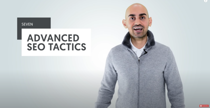
Neil Patel talking about advanced SEO tactics.

If you’re familiar with UA, you’ll remember that their landing page report was automatically generated. All you had to do was look for the report by clicking the Behavior drop-down menu. and from there. clicking Site Content and then Landing Pages.

GA4 is not automatic. Fortunately, it only takes a few steps to get your GA4 set-up.

Creating Your Landing Page Report In GA4

GA4 landing page reports must be generated manually. The good news is you can create your own preset landing page report, so you don’t have to set it all up each time you need information.

Follow these steps to create your own landing page report in GA4.

Get Started

Log in to your account with GA4. From there, open your Reports (the button below the Home icon, with a bar graph inside a white square). Next, click on Acquisition and then look for and select Traffic Acquisition in the dropdown menu.
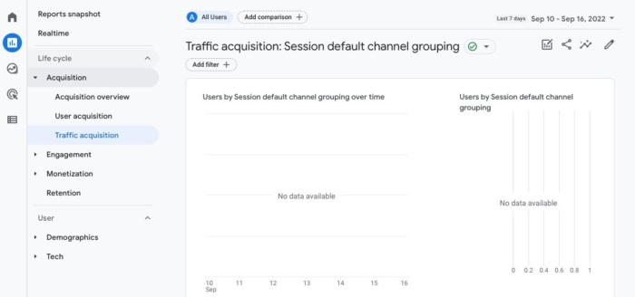
The traffic acquisition page on GA$.

Pull a Report

In case you don’t already know, dimensions are essentially the qualitative titles or categories being measured by GA4. When you choose Traffic Acquisition, GA4 will pull a report for you, automatically using the Session default channel grouping dimension.

While this is great info for you to know in order to increase traffic to your website, it’s not the data on user landing page interactions.

Customize Your Report

To create a custom landing page in GA4 to suit your analytical needs, click on the small pencil icon in the upper right corner of the user window.

Customizing the channel group on the traffic acquisition page on GA4.

In addition to adding new dimensions, the Customize Report button can add new metrics, rework charts and create summary cards.

For our purposes, we’ll focus for now on the dimension aspect.

Add a New Dimension

On the right side of the screen, click on Dimensions and then select Add dimension.

From there, you should be able to scroll through the options until you find one labeled Landing Page. Click it, and landing pages will be added to your primary dimensions.

Don’t forget to save when you’re done!

Set as Default

Let’s get real: do you actually want to go through those steps every time you want to analyze user interaction on landing pages?

No way! Follow this quick GA4 tip to make a shortcut for yourself.

Locate the Landing Page dimension once more. This time click on the three vertical dots and then select Set as Default.

When you are finished, click the Apply button in the lower right corner to save your new default setting.

If your goal is to replicate the UA report as close as possible, you will need to follow a few more steps.

Customize Metrics

Not all engagement metrics are created equal. As you become more familiar with the GA4 set-up, explore all the data at your fingertips to determine which data will help the most. You never know what new insights you’ll discover!

Customizing metrics is not all that different from dimension customization.

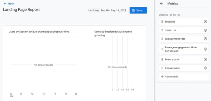
Instead of clicking on Dimensions, this time select Metrics.

From here, you can add and remove metrics that suit your needs. For a UA-style landing page report, make sure to choose the following metrics:

  • Sessions
  • New Users
  • Engagement Rate
  • Average Engagement Time
  • Event Count
  • Conversions
Customizing the metrics of the landing page report in GA4.

Create a New Summary Card

Summary cards are a great way to take a fast scan of your analytics when checking reports.

While they won’t show you everything, summary cards can help you streamline your review of the information you find most important.

To create a new summary card, simply click on Create a New Card. From there, you can customize the card to choose specific dimensions, metrics, and visualization style.

Save Your New Template

The key here is not to overwrite your other template that you used to get started. Instead, save your work as a New Report.

Make a Shortcut to Your Report

Remember, our intention is to make pulling GA4 landing page reports as quick and easy as possible.

That’s why I would recommend creating a shortcut for you to access this with just a couple of clicks going forward.

  • First, click on Reports.
  • Next, click on Library. There should be a folder icon next to the word.
  • Unless you’ve already created some collections, you should only see two collections. In the collection marked Life Cycle, click where it says Edit Collection.
  • A prompt on the left will ask you to drag reports to create collection. Find your report template and drag it into the topic labeled Acquisition.
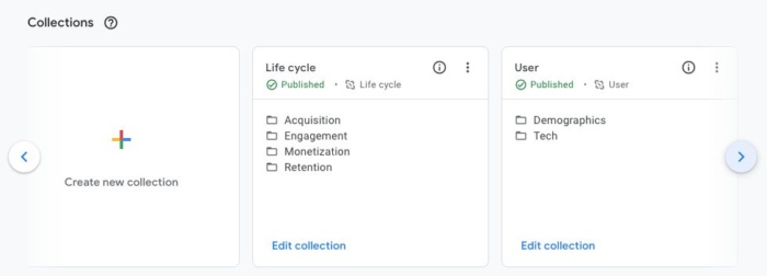
Making a shortcut in the collections screen on GA4.

That’s it!

Now when you click on the Reports icon on the main menu, you can pull your latest landing page report with ease. Simply click the drop-down menus for Life Cycle and Acquisition, where you will find the template that we’ve been putting together.

Best Practices For Landing Page Reporting

The whole point of this practice is to understand what customers are driven towards and how we can improve our content to bring in more traffic.

When you run your GA4 landing page report, be on the lookout for pages that have a low number of visits, or worse, poor engagement. These are areas of growth for your brand.

Take advantage of landing pages that are doing well. Any time a landing page has a high click rate and engagement, you should be looking for ways to capitalize on that momentum.

Add more links to that page that direct users to more of your articles. Use those pages to advertise upcoming promotions. If at all possible, recreate that style of writing in new content.

Conclusion

Google Analytics 4 is a powerhouse of reporting. In the right hands, GA4 can revolutionize your marketing and content strategies.

Don’t wait until UA finally kicks the bucket for good in 2023. Learn about GA4 now to easily generate the reports that matter most. You should consider creating your GA4 tracking ASAP so you have as much data as possible to compare for reporting.

We’re also here to help!

If you need more information on how to best utilize the features of your GA4 landing page report, or if something doesn’t look right, just reach out and my team will get back to you ASAP.

How are you going to use Google Analytics to increase your web traffic? Let me know!

Os 12 Melhores Exemplos de Landing Page 

Você prefere ter um site bonito ou um site que seus clientes adoram?

De um ponto de vista de negócios, você não deveria escolher nenhum dos dois.

Sua resposta deve ser 100% “eu quero um site de alta conversão”.

Porque, se as pessoas compram, é porque elas gostaram e você vai poder escalar seu negócio de forma segura e previsível.

Muita gente cai na armadilha de criar designs que acham legais enquanto o avatar do cliente perfeito é totalmente diferente do que elas imaginam. 

E isso pode ser facilmente percebido quando se clica em anúncios nas redes sociais.

Você pode até gostar do anúncio em si, mas muitas vezes a landing page, por outro lado, não é bem o que você quer ver. 

A conexão entre o seu tráfego e a sua landing page tem o nome propício de encaixe entre mensagem e mercado.

Você quer que a sua mensagem se encaixe perfeitamente no seu mercado para você começar com um funil campeão, que só tende a melhorar.

Porque, se você fizer besteira aí, você vai precisar ficar otimizando e ajustando pequenos componentes que mal vão te permitir compensar seu investimento.

Mas se você emplacar a mensagem certa, os clientes vão começar a chegar até você a torto e a direito, sem nem você saber por que ou como eles chegaram.

É a sua arma mais poderosa, e a maioria dos negócios faz tudo errado. 

Então, para te ajudar e garantir seu sucesso imediato, vamos analisar os 12 melhores exemplos de landing page em que você deveria se inspirar para escalar seu negócio.

Vamos analisar os pontos fortes e fracos de cada uma delas, garantindo que você encontre a que se encaixa exatamente no seu negócio. 

Depois desse post, você vai conseguir criar landing pages de alta conversão num passe de mágica.

Mas, antes disso, precisamos entender…

No Que Consiste Uma Boa Landing Page?

Em geral, uma boa landing page inclui:

  • um cabeçalho forte que inclua sua palavra-chave principal
  • um subcabeçalho que esclareça o cabeçalho
  • texto que explique a oferta
  • uma imagem, vídeo ou ilustração que reforce a oferta
  • um formulário ou botão de chamada à ação pelo qual o usuário possa converter

Você também pode incluir prova social ou símbolos de confiança, como avaliações, depoimentos ou logos de clientes antigos.

O design exato, porém, vai depender dos seus objetivos, seu negócio e seu mercado. 

Vou te fazer algumas perguntas que vão te guiar na direção certa. 

O que você quer alcançar com a sua landing page?

As opções mais comuns são:

  • Fazer com que as pessoas se inscrevam em troca de material gratuito sobre algum assunto.
  • Venda direta de um produto de ticket baixo como um livro ou minicurso.
  • Oferta de teste gratuito de um serviço ou software mensal.
  • Oferta gratuita com frete contando com upselling para lucrar. 

Você precisa saber exatamente a oferta que você quer apresentar na sua landing antes de criá-la.

Claro, existem outras ofertas que você pode fazer, mas a ideia aqui é esclarecer qual delas você quer usar para o seu negócio.

Se você não tiver certeza, teremos vários exemplos ao longo do post. 

Você está comprometido com esse projeto ou só está experimentando uma oferta?

Construir uma landing page de alta conversão não é algo que se resolve da noite para o dia.

Você pode se pegar otimizando uma landing page que não gera lucro por meses antes de ela começar a gerar retornos reais. 

Se você não estiver pronto para isso, eu recomendo que você pare antes mesmo de começar.

Claro, você pode ter um golpe de sorte e marcar um gol na primeira tentativa, mas não conte com isso. 

Esteja pronto para um esforço de longo prazo, para obter retornos futuros que são muito melhores do que uma satisfação momentânea. 

Qual é o seu orçamento?

Antes de começar a desenhar sua landing page de alta conversão, você precisa preparar um orçamento sólido.

Não dá para esperar que tudo corra tranquilamente ao longo do processo. 

Problemas vão acontecer, e na maioria das vezes, o jeito mais fácil e rápido de resolvê-los é pagar um especialista na área. 

Pode ser um desenvolvedor, um designer de funis, um especialista em anúncios ou um consultor de CRO. 

Seja como for, você precisa estar pronto para pagar alguém para fazer a coisa do jeito certo e você não ter que enfrentar os mesmos problemas várias vezes.

No marketing e na vida, existe uma regra de ouro segundo a qual quando você terminar seu trabalho, peça para alguém julgá-lo. 

Obviamente, para landing pages, o jeito é veicular alguns anúncios e ver se o tráfego converte. 

Se converter, você aumenta seu orçamento de anúncios e tenta escalar.

Se não converter inicialmente, é melhor pedir para um profissional dar uma olhada. 

Mesmo que você já tenha contratado alguém para construir tudo para você, não espere que essa pessoa te ajude aqui. 

Sim, ela pode otimizar sua página, mas você precisa ter em mente que as pessoas têm um apego emocional ao trabalho delas.

É por isso que você precisa de um terceiro para te ajudar.

Quando se trata de otimizar uma landing page para conversões, você deve considerar a ideia de contratar uma agência.

Grandes agências de marketing hoje em dia têm centenas, senão milhares, de clientes que já estiveram exatamente na mesma situação que você. 

É por isso que contratar uma agência de marketing para te ajudar a aumentar sua conversão é a melhor aposta.

Quando o assunto é CRO (conversion rate optimization ou otimização da taxa de conversão), não tem escolha melhor do que a NP Digital.

Ela é simplesmente a melhor agência, tanto para SEO quanto para CRO.

Se você está naquele estágio em que você quer otimizar a landing page que você já tem, mas não sabe exatamente como, então agende uma ligação rápida com um profissional, através da qual você vai descobrir os métodos secretos de otimização que o seu negócio precisa.

Ready to think big

Agora, vamos ver alguns exemplos de landing page.

Os 12 Melhores Exemplos de Landing Page

Esses são os 12 Melhores Exemplos de Landing Page que a gente encontrou.

Vamos analisar as conversões, ofertas, design e experiência do cliente. 

1. Get Response

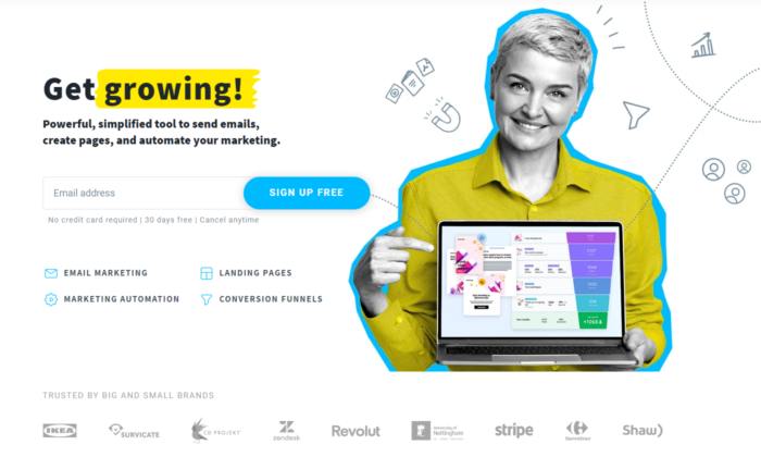
A Get Response é um exemplo de uma landing page simples, porém interativa.

Dá para ver que a equipe Get Response é ousada, uma vez que eles são o único software no mercado que usa um título interativo. 

O símbolo amarelo que você está vendo na imagem abaixo muda entre as palavras “crescer”, “leads” e “vendas”.

Isso contribui para um título chamativo que te faz continuar lendo.

Além disso, eles usam um rosto amigável e positivo, algo que a gente não vê com tanta frequência em negócios que não são focados em uma marca pessoal.

E claro que isso não é uma coisa ruim. É algo que automaticamente cria confiança e torna mais fácil para as pessoas se cadastrarem para usar o software.

Get growing

2. Slack

O Slack está sempre na vanguarda quando o assunto é landing page.

Eles estão sempre otimizando para conversões, e essa é a melhor maneira de encontrar sua landing page campeã. 

A página atual deles é extremamente interativa, tem um título super chamativo e mostra como o software é fácil de usar através de um gif de cinco segundos. 

Logo de cara você consegue ver que eles valorizam a satisfação do cliente, e, se você ainda não tiver certeza, descer até o final vai mostrar um mar de resultados e credibilidade que comprovam a autoridade deles no mercado.

Welcome to new HQ

3. Intercom

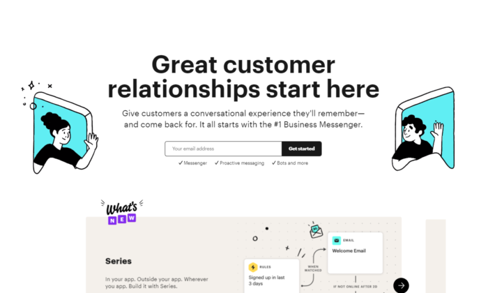
O principal objetivo do Intercom nessa landing page é fazer com que você se inscreva na lista de emails deles.

Limitar-se ao email é uma ótima forma de aumentar sua taxa de opt-in. 

Um título grande e positivo que te coloca no ânimo certo para começar a agir. 

As imagens que eles usam representam perfeitamente a principal proposta única de venda do título.

Dá pra ver um ambiente amigável como um todo, e se você entrou na página, a única coisa que você precisa fazer é se cadastrar.

Great customer relationship start here

4. Lyft

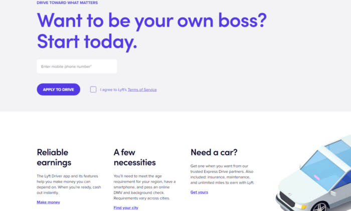
A Lyft vem crescendo nos últimos anos, e seu site, landing page, e funil online em geral, só ganham força.

Eles focam em atrair novos motoristas que querem ter controle sobre a própria vida.  

Prometer liberdade aos seus funcionários enquanto eles trabalham para você é a melhor maneira de desviar os melhores candidatos dos seus concorrentes. 

A Lyft já usou diversas landing pages desde que começou, mas a atual mostra verdadeiro profissionalismo.

Mais uma vez, vemos um título gigante e chamativo. Dessa vez, com uma pergunta para ir gerando curiosidade e ideias nos clientes em potencial.

Dê uma olhada no botão “INSCREVA-SE PARA DIRIGIR”. Significa que não é 100% certo que você vai conseguir o trabalho. 

Fazer com que os clientes tenham que competir pela sua atenção faz com que eles se esforcem mais no trabalho em si. 

Want to be your own boss?

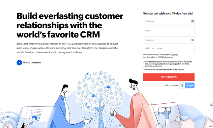
5. Zoho

A landing page da Zoho é um ótimo exemplo de transmissão de mensagem um pouco mais complicada, mas igualmente poderosa.

Eles usam mais texto do que a média dos softwares no mercado, mas isso não é necessariamente ruim. 

Nesse caso específico, eles precisam converter o cliente em potencial para iniciar um teste gratuito, o que automaticamente gera tensão, uma vez que esse cliente sabe que vai chegar um momento em que ele vai ter que pagar. 

Converter alguém para pagar é bem mais difícil do que simplesmente conseguir o email da pessoa.

É por isso que usar mais texto para transmitir essa mensagem contribui para uma estratégia poderosa de copywriting que maximiza o número de cadastros.

Estratégia poderosa de copywriting

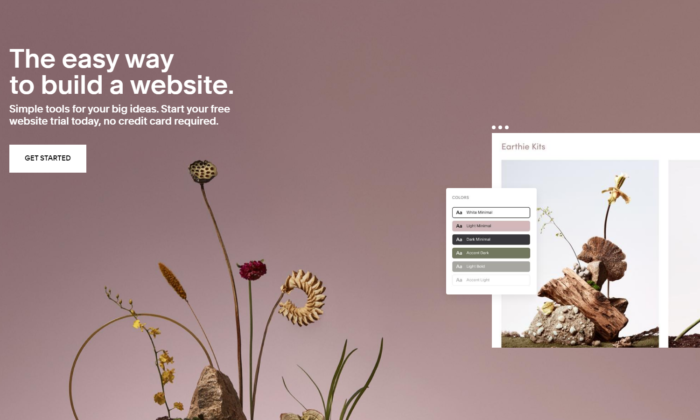
6. Squarespace

O Squarespace está no topo da lista com a menor quantidade de texto no design da landing page.

Você pode achar que texto não é suficiente para converter alguém.

No entanto, quando você vir que essa pessoa é alguém que cria sites, você vai ver como o design e uma mensagem rápida e forte é tudo que você precisa para se cadastrar. 

Eles sabem que os principais problemas de seus clientes em potencial são códigos complicados e querem mostrar um lugar seguro onde eles podem relaxar, criando um design campeão para seu site só arrastando e soltando. 

 Squarespace

7. ActiveCampaign

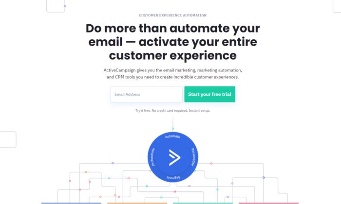
O ActiveCampaign foca apenas em te mostrar como o software deles traz a melhor experiência possível para o cliente.

Se você é dono de um negócio, você quer ser tratado bem e também ajudar seus clientes em momentos difíceis. 

O título deles mata dois coelhos com uma cajadada só, e, mais uma vez, sem nenhum texto ou design desnecessários.

Tudo leva ao grande botão verde para você começar seu teste gratuito. 

ActiveCampaign

8. Hubspot

O Hubspot é mais uma ferramenta de CRM no topo da nossa lista hoje.

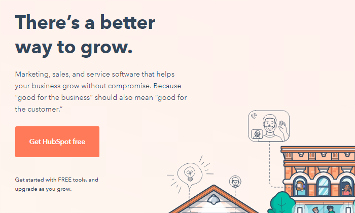
Bem como o ActiveCampaign, eles te mostram que usar o software deles vai ajudar tanto você quanto seus clientes a se sentirem melhor ao longo do processo. 

Saber que o principal problema do cliente ideal deles é que aprender a usar uma nova ferramenta de CRM do zero provavelmente vai ser difícil, chato, e talvez até impossível, os ajuda a afinar a mensagem deles no ponto exato.

Hubspot

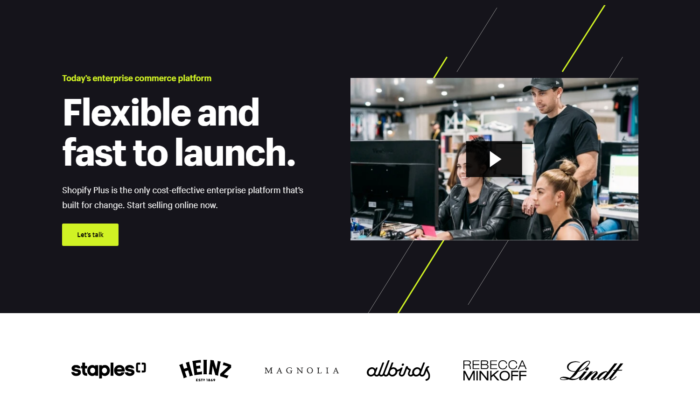
9. Shopify Plus

O Shopify é uma das plataformas mais conhecidas na internet hoje em dia, e eles sabem disso.

Conforme eles foram crescendo, eles puderam testar diversos designs de landing page até encontrar o que convertesse melhor.

E a landing page do Shopify Plus é prova disso. 

O principal objetivo deles é agendar uma ligação com seus clientes em potencial, o que leva um pouco mais do que só algumas palavrinhas.

Eles têm orçamento para gravar vídeos profissionais de todos os seus produtos e serviços, o que os ajuda a transferir informações valiosas para seus clientes em potencial da maneira mais rápida possível – vídeo marketing.

Descendo a página, você vê uma forte credibilidade, e se você parar para assistir o vídeo, tem grandes chances de você agendar uma ligação com eles. 

Vídeos são uma arma poderosíssima nas mãos dos negócios certos, e o Shopify é a prova disso – e com praticamente tudo que eles fazem. 

Shopify Plus

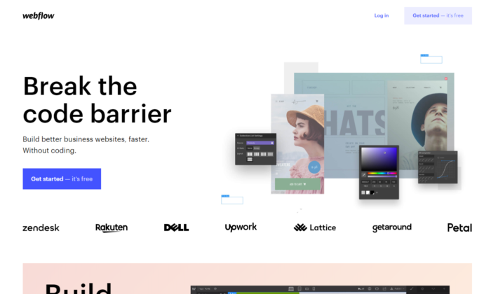
10. Webflow

O Webflow mostra os insights do software imediatamente quando você entra na landing page.

Você também pode ver exemplos de credibilidade de grandes sites que usaram os serviços deles e pode começar gratuitamente.

Isso acaba com qualquer tensão que um cliente em potencial possa ter.

Além disso, você pode ver que o software deles é parecido com o Photoshop.

Então, se você já usou os produtos da Adobe, você vai ver de cara que vai ser moleza para você. 

Webflow

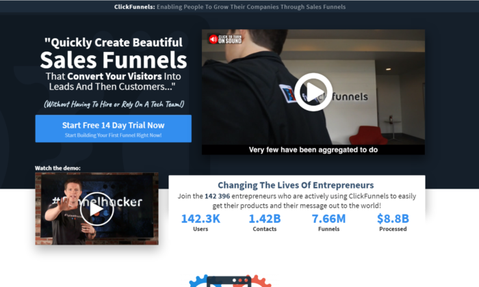
11. ClickFunnels

A ClickFunnels usa seu software para te converter para um teste gratuito.

Mesmo que você seja cético, você pode brincar um pouco com as páginas e botões do funil para ver a responsividade da ferramenta. 

Você pode ver que eles usam mais texto do que a média dos construtores de sites/funis.

Mais uma vez, eles estão tentando converter as pessoas para que elas comecem um teste gratuito de 14 dias, o que não é uma tarefa fácil. 

Eles também usam vídeos poderosos que vendem direto para seus clientes ideais. 

A melhor parte são as métricas que eles incluíram na landing page.

É uma estratégia ousada e poderosa, se executada corretamente.

A maneira como essas métricas são elaboradas permite que elas sejam sempre atualizadas, e não sejam só 100K+ usuários como você vê em outras plataformas. 

A ClickFunnels valoriza as histórias de sucesso dos seus clientes e está sempre lá para registrar cada resultado.

É um dos designs de landing page mais difíceis de se colocar em prática, mas se você conseguir, suas conversões vão disparar. 

ClickFunnels

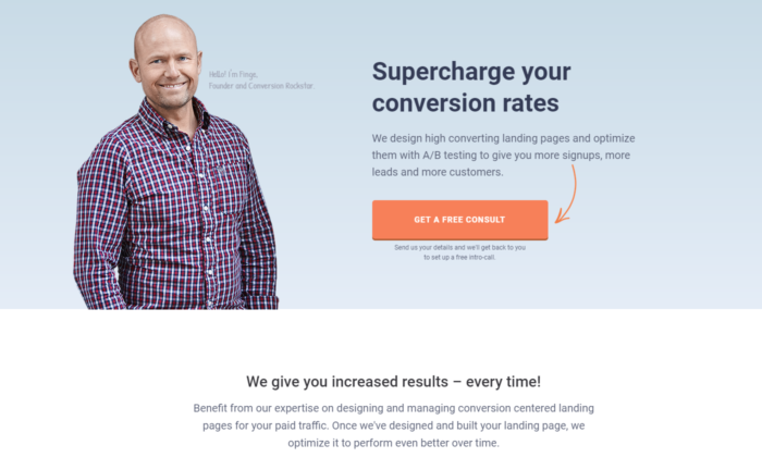
12. Conversion Lab

O Conversion Lab já usa esse design de landing page há anos.

Percebemos que eles fazem testes A/B com diferentes botões de chamada à ação, como “agende uma ligação”, “obtenha uma consultoria gratuita” e vários outros.

Ter o rosto do fundador na página principal do site cria um relacionamento de longo prazo que muitos negócios hoje em dia deixam passar.

Eles transmitem de forma clara seus serviços através de um título persuasivo, e, mesmo que você não esteja pronto para agendar uma consultoria, um pop-up vai aparecer pedindo seu email.

Follow-up por email é uma ótima forma de garantir que um alto percentual de clientes em potencial que chegam até seu site acabem agendando uma ligação com você.

Conversion Lab

Exemplos de Landing Page: Perguntas Frequentes

O que é uma landing page e como ela funciona? 

Uma landing page é uma página desenhada especialmente para estimular os usuários a completarem uma tarefa específica (ou seja, converter). Elas funcionam destacando pontos-chave, usando prova social ou estudos de caso para criar confiança e uma chamada à ação para estimular conversões. 

O que deve ter em uma landing page? 

Embora o formato possa variar, toda landing page deve ter:

  1. um cabeçalho que inclua a palavra-chave principal
  2. um subcabeçalho que esclareça o cabeçalho
  3. uma descrição da oferta
  4. uma imagem, vídeo, ou ilustração
  5. botão ou formulário de chamada à ação
  6. (opcional) elementos de confiança como logo, avaliações e depoimentos de clientes

Quem precisa de uma landing page? 

Qualquer negócio que tenha um site deve ter algum tipo de landing page para estimular os usuários a tomarem alguma ação, como agendar uma demonstração, ligar para pedir um orçamento, se inscrever em uma lista de email, etc. 

Eu preciso fazer testes A/B para as minhas landing pages? 

Com certeza. Testes A/B devem ser um processo constante para melhorar o desempenho da sua landing page. 

Exemplos de Landing Page – Conclusão

Esses exemplos podem servir de inspiração para você criar uma landing page de alta conversão. Para aproveitar ao máximo a sua landing page, não deixe de:

  • Descubra qual é o principal problema dos seus clientes e acabe de uma vez com essa objeção com um título curto e direto.
  • Use credibilidade e vídeos, se possível.
  • Saiba quais são seus objetivos — é conseguir o email ou telefone dos clientes, agendar uma ligação, começar um teste gratuito/pago ou alguma outra coisa?
  • Use Chamadas à Ação claras e fáceis de seguir.

Por fim: sempre, sempre otimize suas landing pages.

NÃO DÁ para ser perfeito desde o primeiro dia. Todos os negócios dessa lista testaram suas páginas dezenas, senão centenas de vezes antes de encontrar a landing page campeã. 

E mesmo assim, eles ainda otimizam.

Você já tentou criar uma landing page antes? Como foi — ela converteu bem e quais foram seus principais avanços?

Landing Page: What is it, Examples, Tips & Best Practices

A well-designed landing page can greatly increase conversions for your PPC or email marketing campaigns.

Rather than directing visitors from those sources to your general website (where they may have a hard time finding what they’re looking for), you can direct them to a specifically designed landing page that steers them in exactly the right direction.

Creating effective landing pages isn’t the same as crafting a successful website or email newsletter. There are certain guidelines you should adhere to in order to maximize your page’s success.

Here is what you need to know to create an effective landing page.

Set a Goal For Your Landing Page

Landing pages, like any other part of your online marketing strategy, need goals. Without concrete, specific goals, there’s no way to create an effective page. Your goal should be clear before you begin designing your page.

For example, your page might be designed to encourage:

  • sales
  • email list sign-ups
  • white paper downloads
  • software trials
  • webinar sign-ups

You also need specific expectations for your landing page, on which to gauge its success. These expectations can be based on previous experience, anecdotal evidence, or simply wishful thinking.

It’s helpful to have a specific number to compare your actual results with. This could be the total number of conversions, or the number of people who make it past your landing page, or some other number, based on your own goals.

A Clear Call to Action is Vital

Once you know what your goal for the page is, you need to come up with a clear call to action. This is possibly the single most important part of any landing page.

Your call to action should be specifically tied to your goal and should be supported by everything else on your page, from headline and body copy to images and overall layout.

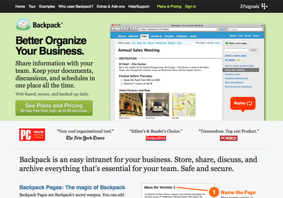
37 signals backpack landing page example

The Backpack landing page has a very clear call to action, though they opt to first direct visitors to more information about their plans and pricing, rather than going straight for the signup.

Keep Copy Clear and Concise

Your copy should be clear and concise. It should be persuasive, too. Landing pages are not the place to show off your creativity, unless that creativity is clear, concise, and persuasive. Leave the creative turns-of-phrase for your blog.

It’s pretty safe to assume that most of the people who visit your page are already interested in what you have to say, because they’ve likely clicked through from a PPC ad or email. But just because they’re interested when they arrive doesn’t mean they’ll stay interested if you don’t get to the point.

Every single sentence and word on your landing page should serve a purpose, and that purpose should be to support your call to action. If it doesn’t do that, cut it. Be ruthless in editing your copy. Tell your visitors what they want to know in as few words as possible, and get them to respond to your call to action as quickly as possible.

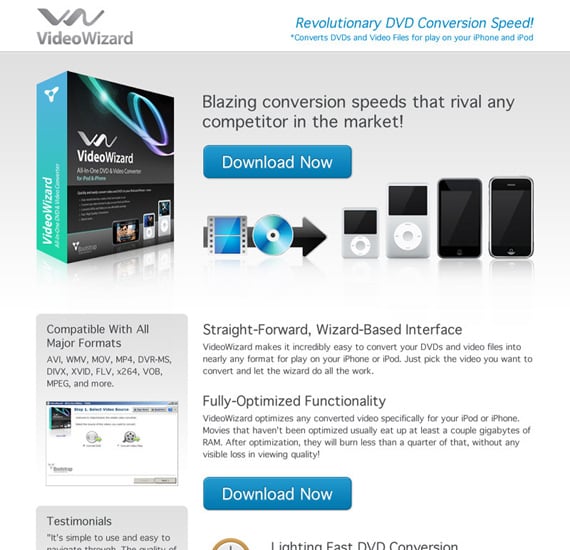
videowizard landing page example

The VideoWizard example has a simple design with clear copy that has definite goals.

Keep Your Landing Page Form Simple

If your page includes a form, make sure it’s only asking for the most vital information. If you’re trying to get visitors to sign up for an email newsletter, make sure you’re just asking them for their email address. Anything more than that decreases the chances that they’ll finish and submit the form.

If you’re asking them to make a purchase, keep it simple. Just ask for the vitals: billing and shipping information, plus a confirmation screen before placing their order. Wait to ask them for additional information until after their order has been placed.

vitals landing page example

This form only asks for name and email address, neither of which are likely to deter sign-ups.

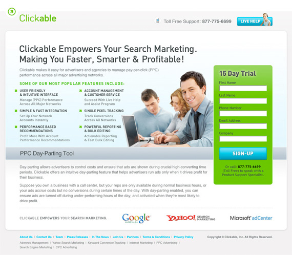
clickable landing page example

This form, on the other hand, has too many fields. Do they really need a phone number and company name? And wouldn’t it make more sense to just ask for a name in one field, rather than two?

Remove Navigation Elements

The major difference between your normal website and your landing pages is your landing pages shouldn’t include the usual site navigation. Instead, the only clickable links should be your call to action, and possibly a link to more information for those who are undecided.

Linking your logo to your regular home page can also be a good idea.

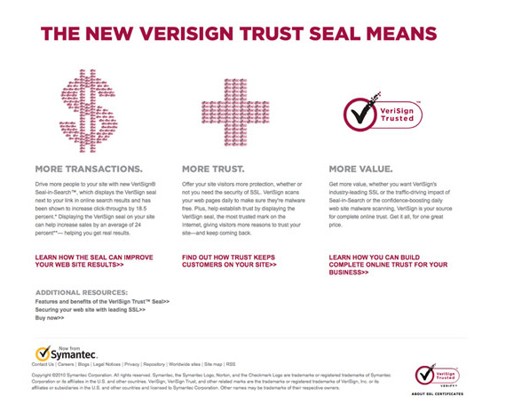
verisign landing page example

This example shows just the vital links, without a ton of extraneous navigation.

Forget about links to everything else. All they do is clutter up the page and increase the likelihood that your visitors will abandon your landing page (and ultimately, your site) without converting.

Simplify Your Normal Site Design

Your landing page should still echo the design of your regular website, though, to reinforce your branding. This can be done through the graphics, general look and feel, or your color scheme and font choices.

This is important for branding and lets users know they are on the right page.

Choose Long Page or Series of Pages

There are some questions about whether it’s better to use a single page for your landing page that requires scrolling, or if visitors respond better to a series of short pages (sometimes referred to as a “mini-site”).

Mini sites generally have multiple pages with short content that funnel visitors from one step to the next along the conversion process. This has the advantage of getting users in the habit of moving from one page to the next, which can help get them in the right psychological frame of mind to convert.

The downside to mini sites is that they work best for conversion funnels that need a lot of content.

Landing pages, on the other hand, are perfectly suited to shorter content. They also only have to load once, which can be a big consideration for companies targeting people in rural areas or developing nations, where bandwidth and connection speeds could be an issue.

The downside is a lot of content can get overwhelming and can come across as spammy if not well-designed.

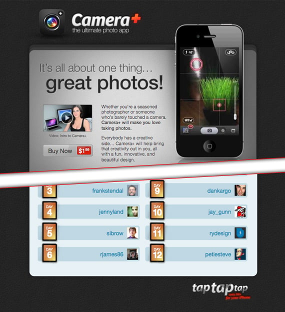
cameraplus landing page example

The CameraPlus page is quite long, with all the information you need about the app. (The image above is split, as the entire page would be several thousand pixels long.)

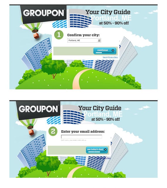
groupon landing page example

Compare this page, which barely fills a single screen, and uses multiple steps to gather information.

Pay Attention to the Fold

While there’s a lot of debate as to the importance of “the fold” in web design, landing pages are one area where the fold is crucial. Make sure that your call to action is located near the top of the page, where someone can click it without having to scroll.

This doesn’t necessarily mean that your visitors won’t scroll down the page to read more information. Hopefully, at least some percentage of your visitors will be ready to buy as soon as they arrive on your landing page, either because the email or link that brought them there already persuaded them, or because it’s not their first time visiting the page.

Putting a call to action right near the top of the page makes things easier on these visitors. (Plus, it can increase your conversion rates.)

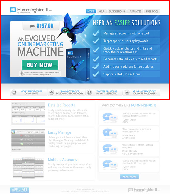
hummingbird landing page example

The most important navigation elements are located just above the fold, with the call to action well above the fold.

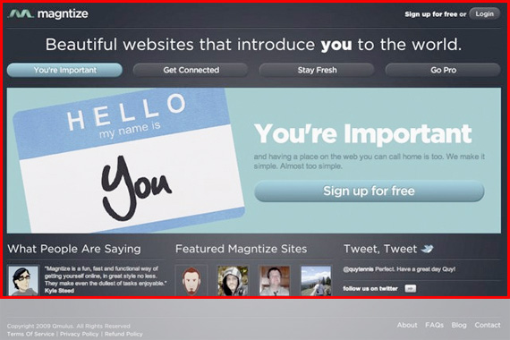
magnetize landing page example

The signup button is well above the fold here, too.

Below-The-Fold Calls to Action

That doesn’t mean you should neglect those users who scroll. Make sure calls to action appear at regular intervals on your page, tied into the page’s copy.

This becomes more and more important as your pages get longer. Make sure that your users have to do minimal scrolling once they decide to convert.

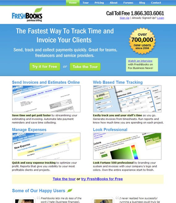
freshbooks landing page example

FreshBooks includes links to a free trial or tour throughout their landing page.

Use Minimal Images and Larger Fonts

Your landing pages should use only one or, at most, two images. You want to avoid visual clutter on the page, or anything that detracts from the message and call to action.

Larger font sizes are also a good idea to keep visitor’s eyes focuses on what matters and reduce eye strain. Just don’t go overboard and put everything in a headline-size font.

The ideal line length for copy readability is 39 characters, so size your font (and column width) accordingly.

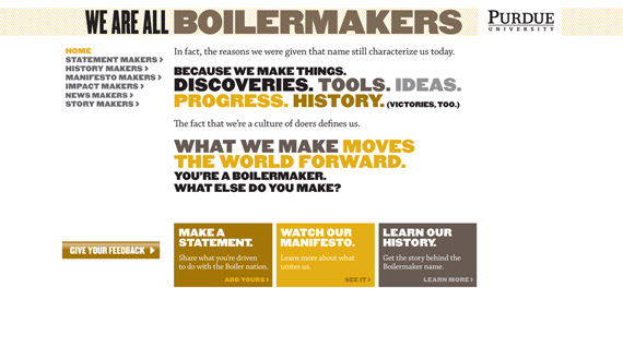
purdue landing page example

The typography becomes a major part of the visuals of this landing page, minimizing the need for graphics.

Start With a Centered, Single-Column Design

Studies show that centered, single-column landing pages convert best. Yet, there are still plenty of marketers out there who are opting for two-column designs.

Make sure that you test single-column versions against any two-column versions prior to committing to a design.

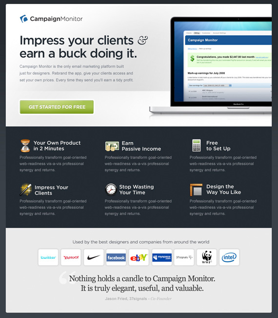
campaignmonitor landing page example

This is a great example of a centered page that makes great use of the available space.

Match the Look and Feel of Your Campaign

If your page is tied to an email campaign or PPC campaign, make sure the landing page echoes the look and feel of the ad or email.

If the designs of the two are wildly different, your visitors may wonder if they’ve ended up in the right place. The easiest way to do this is to carry over fonts, images, and colors from your campaign to your landing page. This is especially important for paid ads, as it can increase your quality score.

Use the Landing Page Tools to Get it Right

If you don’t want to have to use a web designer for your landing pages, there are options for creating great pages without any technical knowledge.

Unbounce is one of the easiest to use and lets you create landing pages without any IT experience. They have best-practices templates available that you can customize (or design your own page entirely from scratch), and flexible pricing (including a free plan for sites with limited traffic). Unbounce also integrates with Google Analytics for tracking your traffic, and Qualaroo for gathering user input.

Don’t Forget To Test Your Landing Page

Creating effective landing pages isn’t a one-size-fits-all project. What works for one site might not work so well for another. Finding the most effective page design is a matter of trial and error.

It’s important to test the different versions of your landing page (called A/B testing)to find the one that works the best for your particular situation. Without doing so, you might be leaving a lot of potential conversions on the table.

A few features to consider testing include:

  • headline
  • CTA
  • button size and placement
  • number of form fields
  • images
  • right, left, or center column design
  • colors

Just remember to test each variant one at a time — if you change five different elements, you won’t know which impacted conversions.

Landing Page Guide

A well-designed landing page can greatly increase conversions for your PPC or email marketing campaigns.  Here’s how to do it.

  1. Set a Goal For Your Landing Page

    Without concrete, specific goals, there’s no way to create an effective page. Your goal should be clear before you begin designing your page.

  2. A Clear Call to Action is Vital

    Your call to action should be specifically tied to your goal, and should be supported by everything else on your landing page, from headline and body copy to images and overall layout.

  3. Keep Copy Clear and Concise

    Landing pages are not the place to show off your creativity, unless that creativity is clear, concise, and persuasive. Leave the creative turns-of-phrase for your blog.

  4. Keep Your Landing Page Form Simple

    If your landing page includes a form, make sure it’s only asking for the most vital information.

  5. Remove Navigation Elements

    Your landing pages shouldn’t have your usual site navigation. Instead, the only clickable links should be your call to action, and possibly a link to more information for those who are undecided. 

  6. Simplify Your Normal Site Design

    Your landing page should still echo the design of your regular website, though, to reinforce your branding. 

  7. Pay Attention To The Fold

    Make sure that your call to action is located near the top of the page, where someone can click it without having to scroll.

  8. Use Minimal Images and Larger Fonts

    Your landing pages should use only one or, at most, two images. You want to avoid visual clutter on the page, or anything that detracts from the message and call to action.

  9. Start With a Centered, Single-Column Design

    Studies show centered, single-column landing pages convert best, so test that version first.

  10. Match the Look and Feel of Your Campaign

    If your landing page is tied to an email campaign, make sure that the landing page echoes the look and feel of the email. 

  11. Use the Landing Page Tools to Get it Right

    You don’t need a masters in computer science to design a landing page. Instead, use tools like Unbounce to create great looking landing pages.

  12. Don’t Forget To Test Your Landing Page

    Creating effective landing pages isn’t a one-size-fits-all project. What works for one site might not work so well for another. Finding the most effective page design is a matter of trial and error.

Conclusion

Landing pages are website pages designed with one goal in mind — conversions. Following the tips above will help you create a powerful page that drives users towards your business.

Just make sure to keep it simple. This is because landing pages have very specific goals and shouldn’t include any extraneous information that might distract your visitors and prevent them from converting.

Are you considering creating a landing page? What is your landing page goal?

12 Best Landing Page Examples

Let me ask you a question…

Would you rather have a beautiful website or a website your customers love?

From a business perspective, you shouldn’t go for either.

Your answer must be 100% I want a high-converting website.

Because if people buy, then they both like it and you can safely and predictably scale your business.

Many people get in the trap of creating designs they like while their perfect client avatar is so much different than what they would imagine.

And that can be easily noticed when you click on ads you see on social media.

You might like the ad itself but most times the landing page on the other side is not what you want to see.

The connection between your traffic and your landing page is called an accurate message to market fit.

You want your message to perfectly fit your market so you can start with a winning funnel that’s only bound to go up from there.

Because if you mess up there, you would be optimizing and tweaking little components that will barely get you to break even.

But if you nail your message you would be getting customers left and right without even knowing why or how they came to you.

It’s your most powerful weapon and most businesses do it completely wrong.

So to help you out and guarantee your immediate success, we’ll be going over the best 12 landing page examples that you should use to scale your business.

We’ll go over each one’s strengths and weaknesses while making sure you find one that fits your exact business.

After this post, you’ll be able to come up with high-converting landing pages like magic.

But before we do that, we must go over…

What Makes a Great Landing Page

That question solely depends on your needs.

So let me ask you a couple of questions that will help you clear your mind and think in the right direction.

#1 What do you want to accomplish with your landing page?

Your most common options are:

  • Getting people to opt-in in exchange for Free value on a subject
  • Directly selling a low-ticket product like a book or a mini-course
  • Free Trial offer for a monthly service or software
  • Free + Shipping offer where you count on upsells to make a profit

You’ve got to know exactly what offer you want to present in your landing page before creating it.

And of course, there are other offers you can make but the idea here is to clarify what is the one that you want to use for your business.

If you’re not sure, there would be multiple examples further down the post.

Now for the next question, you need to ask yourself…

#2 Are you committed to this project or are you just trying out an offer?

Building a high-converting landing page is not an overnight hustle.

You might find yourself optimizing a non-profitable landing page for months before it starts generating real returns.

And if you’re not ready for that, then I recommend you quit before you even start.

Yes, you can get a lucky shot and hit a homerun from your first try but counting on it is delusional.

Be ready for the long game so you catch the long-term gains that are so much sweeter than the momentary satisfaction.

And for the final question…

#3 What’s your budget?

Before you begin designing your high-converting landing page, you need to prepare a solid budget.

You can’t expect everything to go smoothly throughout the process.

Problems are going to occur and most times the easiest and fastest way to solve them is to pay someone who is an expert in the field.

That can be a developer, a Funnel designer/builder, an Ad specialist, or a CRO consultant.

Either way, you should be ready to pay someone to do it right so you don’t face the same problems over and over.

In marketing and life, there’s a rule of thumb that suggests you should finish your work and then let someone else judge it.

Obviously, for landing pages, the way is to run some ads and see if the traffic converts.

If it does, you raise your ad budget and try to scale.

If it doesn’t convert initially then you should let a professional take a look at it.

And even if you already hired someone to build it for you, don’t expect him to help you here.

Yes, he can optimize your page but you’ve got to keep in mind that people have an emotional attachment to their work.

That’s why you need a third party to help you out.

And especially when it comes to optimizing a landing page for conversions, you must consider the idea of hiring an agency.

Big marketing agencies nowadays have had hundreds if not thousands of clients who had been in your exact situation.

That’s why hiring a marketing agency to help you increase your conversion is the best bet.

And talking about CRO (conversion rate optimization) there’s no better choice than NP Digital.

It is simply the best marketing agency for both SEO and CRO.

If you’re at the stage where you want to optimize your existing landing page but you don’t know exactly how to do it…

Then you should book a quick call with a professional where you’ll unravel the secret conversion optimization methods your business needs.

And now for the main event…

The Best 12 Landing Page Examples

These are the 12 Best Landing Page Examples we could find.

We’ll be judging them for conversions, offer, design, and customer experience.

#1 Get Response

Get Response is an example of a simple yet interactive landing page example.

You can see the Get Response team are bold as they’re the only software in the industry that uses an interactive headline.

The yellow sign you see on the image below changes between the words growing, leads, and sales.

That makes it for a great attention-grabbing headline that just makes you read on.

Also, they use a friendly, positive face which is something we don’t see very often in business that is not centered around a personal brand.

That of course is not a bad thing. It automatically builds trust and makes it easier for people to sign up for their software.

#2 Slack

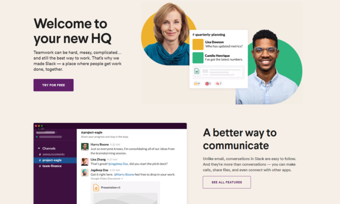
Slack is always on the top of its game when it comes to landing pages.

They are constantly optimizing for conversions and that’s the best way to find your winning landing page.

Their current one is once again, extremely interactive, has a big eye-popping headline, and also shows how easy it is to use the software with a quick 5-second giff.

Straight from the get-go, you can see they value customer satisfaction and if you’re still not sure, scrolling down will lead to non-stop credibility and results that prove their authority in the marketplace.

#3 Intercom

Intercom’s main objective on this landing page is to get you to opt-in with your email.

Keeping it to email only is a great way to increase your opt-in rate.

A big, positive headline that puts you in the right state of mind to act now.

The images they use perfectly represent the headline’s main USP.

You can see an overall friendly environment and you just have to opt-in if you got to this page.

#4 Lyft

Lyft has been riding up the charts in the past years and their website, landing page, and their overall online funnel is not lacking behind.

They focus on attracting new drivers that want to control their own life.

And promising your employees freedom while working for you is the best way to snap the best candidates from your competitors.

We know Lyft has used multiple landing pages in the past but their current one shows real professionalism.

Once again, we see a giant, attention-grabbing headline. This time with a question to anticipate curiosity and thought process in their prospects.

And check out the button “APPLY TO DRIVE”. It implies that it’s not 100% sure you’ll be able to get the position.

Making it so your clients have to compete to get a hold of your attention makes it so they try harder in the job itself.

#5 Zoho

Zoho’s landing page is a great example of a more complicated but still extremely powerful messaging.

They use more text than the average software in the industry but that’s not necessarily bad.

For their specific case, they need to convert the prospect to begin a free trial which automatically builds tension in a prospect because he knows it will come a time he’d have to pay.

And converting someone to pay is way harder than just getting their email.

That’s why using more text in their messaging makes it for a powerful copywriting punch that maximizes free-trial registrations.

#6 Squarespace

Squarespace tops the list for the least amount of text in their landing page design.

At first, you may think that is not enough to convert someone.

But once you see that they’re a website builder you can see how the design and the quick and powerful messaging are all you need to sign-up.

They know their prospects mainly struggle with complicated codes and want to show a safe space where they can relax and drag and drop their winning website design.

#7 ActiveCampaign

ActiveCampaign solely focuses on showing you how their software brings the best customer experience possible.

And if you’re a business owner, you both want to be treated well and want to help your customers in tough times.

Their headline hits 2 birds with one stone and once again there’s no useless text or design.

Everything leads to the big green button and you starting your free trial.

#8 Hubspot

Hubspot is one more CRM that tops out the list today.

They, just like ActiveCampaign, show you that using their software will both help you and your customers feel better throughout the process.

Knowing that their ideal customer’s main objection is that learning a whole new CRM from scratch might be hard, tedious, and maybe even impossible, helps them narrow their message straight to the point.

#9 Shopify Plus

Shopify is one of the most well-known platforms in today’s online space and they know it.

As they’ve been rapidly growing throughout the years, they’ve been able to test out multiple landing page designs to find one that converts.

And the Shopify Plus’s landing page shows for it. 

Their main goal is to book a consultation call with their prospects which takes more than just a couple of words.

They have the budget to shoot professional videos for all of their products and services which helps transfer valuable information to their prospects in the fastest possible way — video.

Down below you see powerful credibility and if you take the time to watch the video, you’re most likely going to book a call with them.

Videos are a deadly weapon in the right business’s hands and Shopify proves that here and pretty much with anything they do.

#10 Webflow

Webflow shows the insights of the software immediately when you land on their landing page.

You can see instant credibility from big websites that have used their services and also you can begin for free.

That breaks any tension the prospect might have.

On top of that, you can see that their software is similar to Photoshop.

So if you’ve ever used Adobe’s products, you immediately know this work will be a piece of cake for you.

#11 ClickFunnels

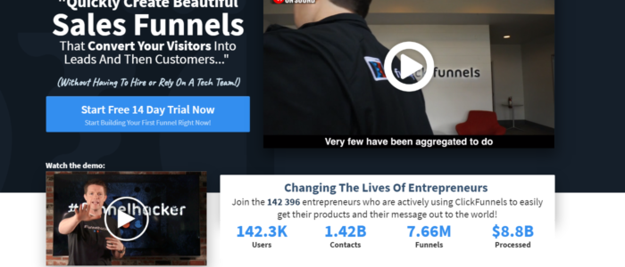
ClickFunnels uses its software to convert you for a free trial.

And even if you have any skepticism you can play around with the funnel pages and buttons to see the responsiveness of nowadays funnels.

You can see that they use more text than the average website/funnel builder.

But once again they’re trying to convert people to start a 14-day free trial which is not an easy task.

They also use powerful videos that sell directly to their ideal customers.

And the best part is the analytics they’ve slapped on their landing page.

It’s a bold and powerful move if done correctly.

The way these analytics are crafted makes it so they are constantly being updated and it’s not just 100K+ users as you might see on other platforms.

ClickFunnels values its customer’s success stories and is always there to record each result.

It’s one of the harder landing page designs to pull off but if you do it, your conversions will skyrocket.

#12 Conversion Lab

Conversion Lab has been using this landing page design for years now.

We’ve noticed they split test different button CTA-s like book a call, get a free consult, and many more.

Keeping their Founder on the main page of the website builds a long-term relationship many businesses nowadays miss out on.

They clearly state their services through their persuasive headline and even if you’re not ready to book a consultation call with them, a pop-up will appear collecting your email.

Email follow-up is a great way to ensure that a high percentage of prospects that land on your website will end up booking a call with you.

That is all for our list today.

To conclude what you need to know when building your landing page…

  • Find what your best customers struggle the most with and then directly destroy this objection with a short and punchy headline.
  • Use credibility and videos if possible.
  • Know your goals — Is it to get their email, phone, ook a call, start a free/paid trial, or something else?
  • Clear and easy to follow Call to Action

And always, always optimize in the process.

You can NOT be perfect from day one. Every business on this list tests their pages dozens if not hundreds of times before concluding a winner.

And even then, they still optimize.

Have you tried building a landing page before? How’d it go — did it convert well and what were your biggest breakthroughs when doing it?

The post 12 Best Landing Page Examples appeared first on Neil Patel.

Producing a Survey Landing Page A study touchdown web page i…

Producing a Survey Landing Page A study touchdown web page is an easy touchdown web page that asks the site visitor a couple of concerns as well as after that offers them with the telephone call to activity. When I initially remained utilizing a study touchdown web page, it was for a deal called SeniorSoulmates. …

The post Producing a Survey Landing Page
A study touchdown web page i…
first appeared on Online Web Store Site.

9 Steps to Creating a Landing Page That Reads Your Prospects’ Minds

So you’ve decided to create a landing page to promote your new product or service.

But how do you know if your landing page will convince your readers to convert?

There are a number of things you can do to ensure your readers are enticed by your landing page and want to know more information.

In this post, we’re going to figure out exactly what you need to do to produce a mind-reading landing page. But first, let’s start with the basics.

What is a landing page?

Before you create a landing page, you need to understand exactly what it is.

A landing page is a dedicated web page, often called a squeeze or splash page. The objective is to collect your visitor’s data through a lead capture form.

You might use a landing page to give away a free e-book, webinar, or course in exchange for your audience signing up for your email list.

Or maybe you collect emails before launching your new website.

The best part about a landing page is that it’s only one page.

It’s one page you need to optimize.

Why, then, do so many people make mistakes with their landing pages?

And why do so many people struggle to convert their customers?

A well-crafted landing page will enable you to target a specific audience, create a compelling message, and increase conversions.

But what goes into creating an effective one?

What makes some landing pages successful and some fall flat on their face?

It all comes down to whether you know your audience or not.

Those who know their audience will be able to create the right messaging, hold their audience’s attention, and come up with a mind-reading landing page.

But just how do you do that?

Let’s find out.

1. Create a persona

It all begins with creating your ideal persona. When you know who you’re targeting, you will be better equipped to create a landing page that resonates with them.

Your personas should be your ideal target audience. After all, if the right people aren’t visiting your landing page, you will never convert in the first place.

Your personas should include demographic information like where they live, their ages, and their genders.

But they should go further than that.

If you want to create a mind-reading landing page, you need to know what inspires your ideal personas and what they hope to achieve.

You must find out their opinions and how they feel towards specific ideas.

When you do this, you’ll able to position your offer to them so that it’s irresistible.

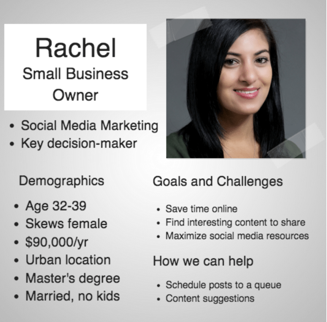
Buffer uses personas to connect with their target customers.

Screen Shot 2017 09 20 at 13.57.16

Using the information they’ve put together here, they will have a greater understanding of how to create their landing page.

You want to increase your chance of conversion, so don’t try to make your landing page appeal to absolutely everyone.

Instead, use the data in your personas to produce highly-targeted landing pages that speak to a specific group of people.

You only have a few moments to grab your visitor’s attention. And in those short few moments, they’ll decide whether or not they want to convert.

2. Present the offer

The reason landing pages are so effective is that they isolate the action.

There shouldn’t be a menu or other links on the landing page. It should all guide the visitor toward completing the action you want them to take.

Distracting them with multiple options is a surefire way to confuse them. Your conversion rate will suffer.

Do not give your visitors a choice. Make it clear what you want them to do.

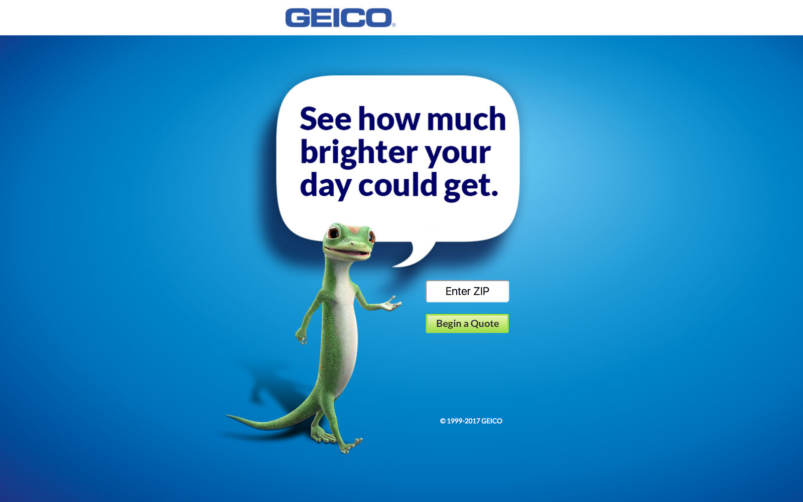
The only option they should have is to convert or not to convert, like in this example from GeicoScreen Shot 2017 09 15 at 16.12.02

The clear landing page means that whoever lands on the page only has one option. Enter their zip code or not.

But just making the chosen action clear isn’t enough to ensure that your visitors convert.

You need to create an offer that resonates with them enough to take the action.

Think about it. A landing page that asks its users to sign up for the newsletter in exchange for nothing isn’t going to convert very well.

Why?

Because there’s no incentive. Why should your visitor do anything for you without getting something in return?

And no, your newsletter alone is not enough of an incentive.

But creating a compelling offer doesn’t have to be a complicated task. You just need to provide your audience something they actually want.

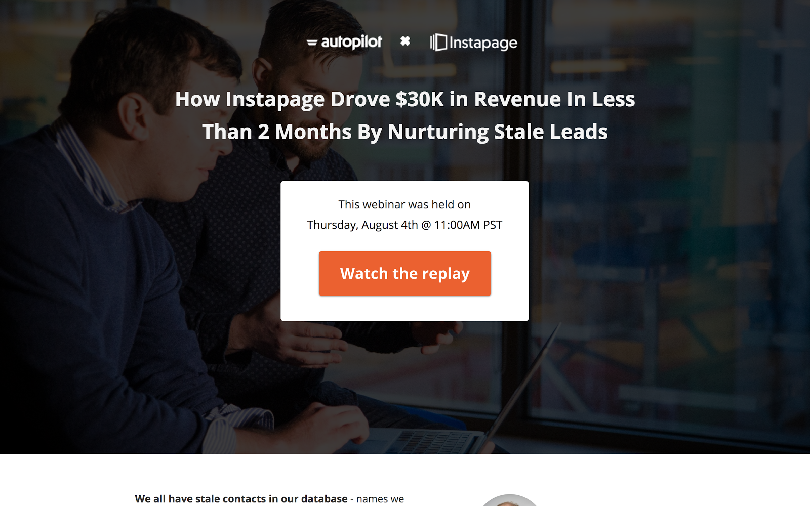
Autopilot knows their readers would be interested in growing revenue with Instapage, so a replay of the webinar would be beneficial to them.

Screen Shot 2017 09 15 at 16.13.29

This is a good example of a strong offer.

If you already have a landing page that you’re looking to improve, ask yourself whether or not as a visitor you would take the desired action.

If the answer is no, then there are changes you need to make.

If you’re struggling to create an offer, but you know you want to build your email list with a landing page, then look at your most popular piece of content.

We can see here that the most popular piece of content on my blog is [enter content].

If you were to offer this content as a downloadable PDF or checklist, people would be likely to give you their email address in exchange.

Why?

Because you already know it performs well. You have proof there’s a need for it.

Here, the hard work is done for you. Find a popular piece of content, find a way to repackage it as a downloadable piece, and offer it to your audience.

But what if your landing page isn’t for an e-book, checklist, or downloadable PDF?

Think about other ways you can provide value to your audience.

3. Write the headline

Once you’ve got your offer down, you need to start working on the headline. The headline must be captivating.

It’s usually the first thing your visitor will see, so you need to perfect it.

The headline is often the deciding factor of whether or not a visitor will convert. And you only have one real opportunity to make it work.

Your headline should be driven by the benefits. You need to outline exactly what will happen to the visitor once they take your desired action.

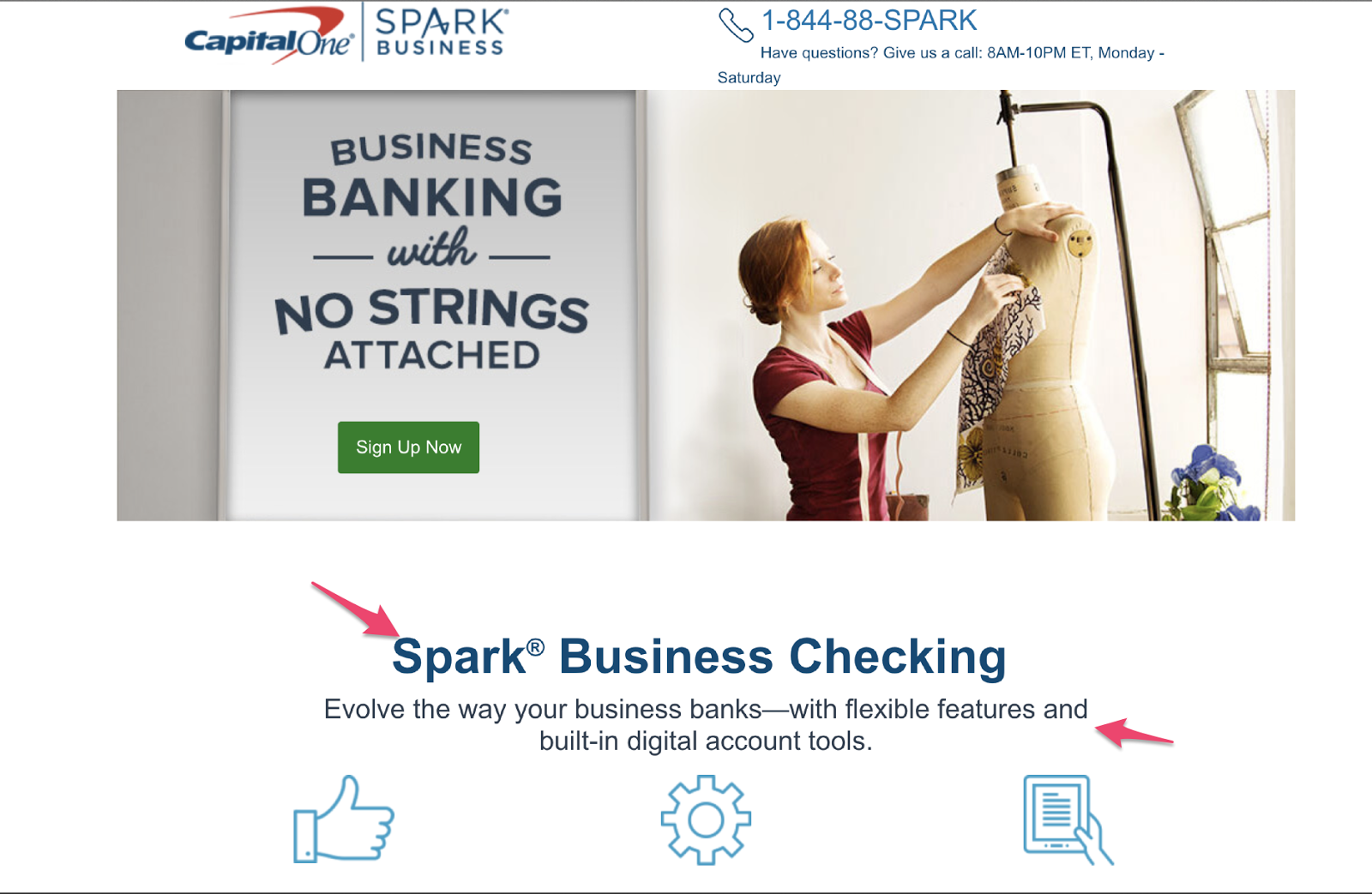
Capital One makes use of both a heading a subheading to get their point across:

Screen Shot 2017 09 20 at 14.10.15

They know people who are interested in their service are going to want to have their business in order, so they position their offer in that sequence.

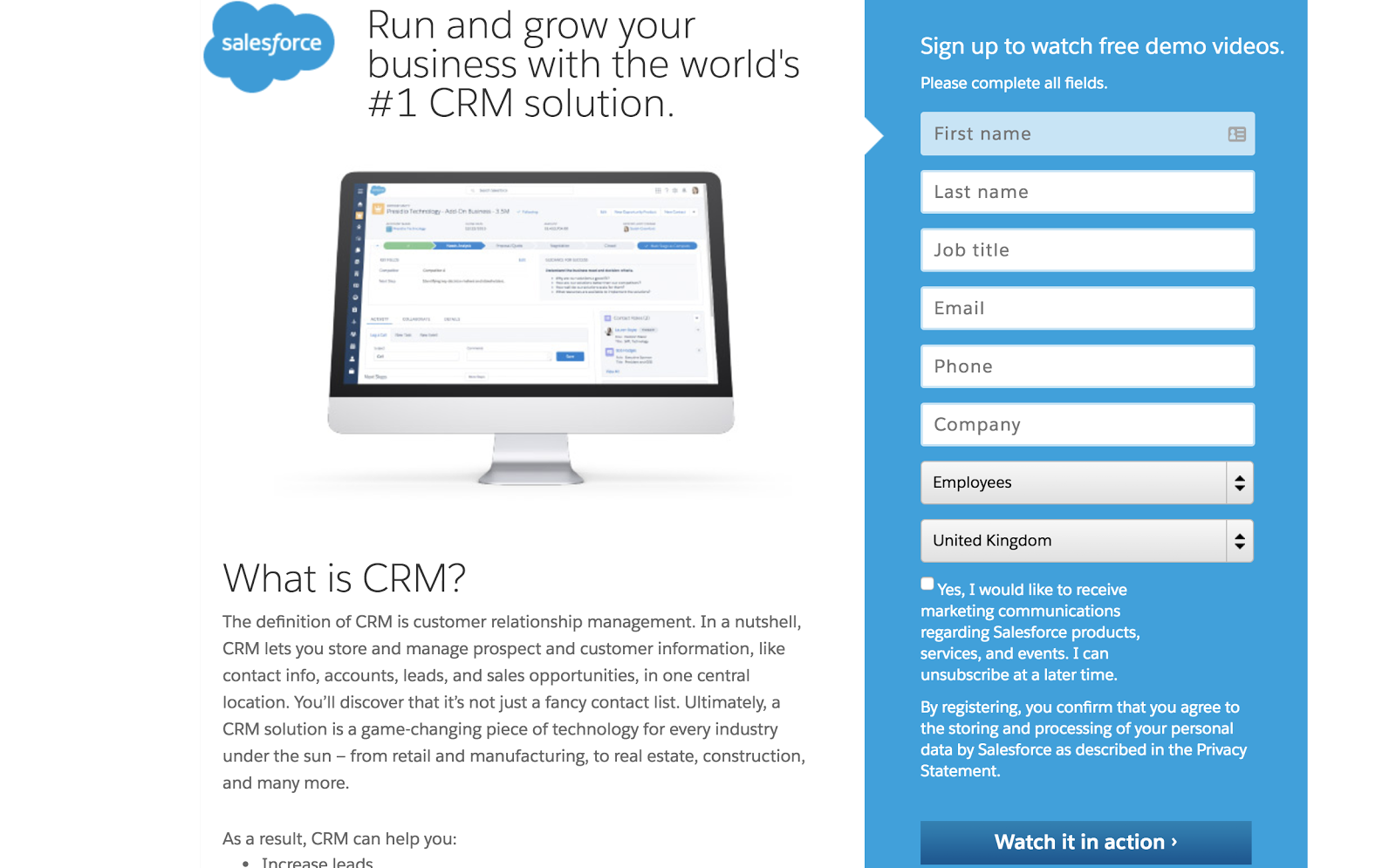
Salesforce has a clear headline and message:

Screen Shot 2017 09 20 at 14.01.23

This headline is great because it grabs the audience’s attention. They’re immediately drawn to it. Visitors automatically know what will happen if they fill in the form on the right.

Joanna Wiebe of Copy Hackers says if you’re struggling to find the right words, then look at the language your audience uses.

Why is this effective?

Because if you use your audience’s own language in your headline, it will resonate better with them.

After the headline, you’re likely going to use a subheading.

This is another opportunity to mention the benefits. It’s for people who were compelled by the headline but need some more convincing.

It gives you another chance to keep their attention and draw them closer to your call to action.

4. Create the copy

Good copy sells. You know that.  It’s why some companies pay copywriters thousands to put words on a page.

But it’s not as easy as just writing words on a page. They have to mean something to your target customer.

As we mentioned with the headline, if you’re struggling to find words, then utilize the language your prospects use.

Your copy is there as a tool to help you get your point and message across and increase the chance of conversion.

It all begins with finding the sweet spot for the right amount of copy. Write too little and you won’t have enough words to get your point across. But write too much and the page will become overwhelming.

However, just saying “find the sweet spot” doesn’t help you.

In general terms, the amount you write depends on the offer. For things that need a lot of explaining and persuading, you’re going to need more copy.

For things that require the prospect to provide you with more than just their email address, i.e. when they are making a purchase, you are naturally going to need to use additional copy to ensure all the necessary details are there.

When it comes to actually writing your copy, you should mirror your brand’s style.

Keep in mind that it’s not about you. It’s about the customer, so the phrasing you use should be customer-centric and focus on them.

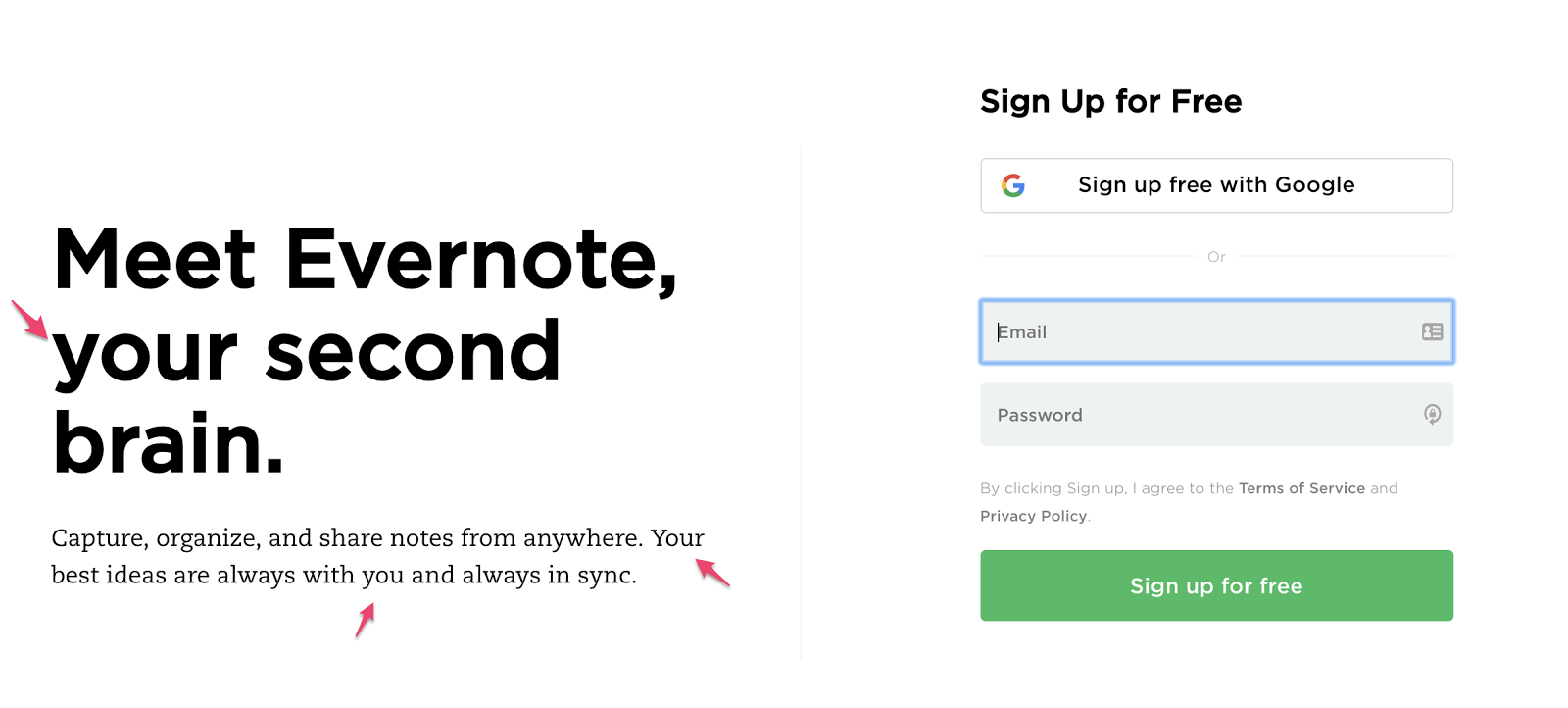
Evernote personalizes their landing page copy by avoiding using words like “we” or “our” and instead opts for words like “your” and “you”:
Screen Shot 2017 09 20 at 14.11.57
These words highlight to your prospects that the main reason for this landing page (and your business) is to help them solve their problems.

5. Use visual aids

Like we said, your landing page is only one page, so everything should be there for a reason and have a purpose. The same rule applies to any images or videos you use.

When you’re adding images to your landing page, you should utilize ones that help your visitors visualize their life after they’ve taken your action.

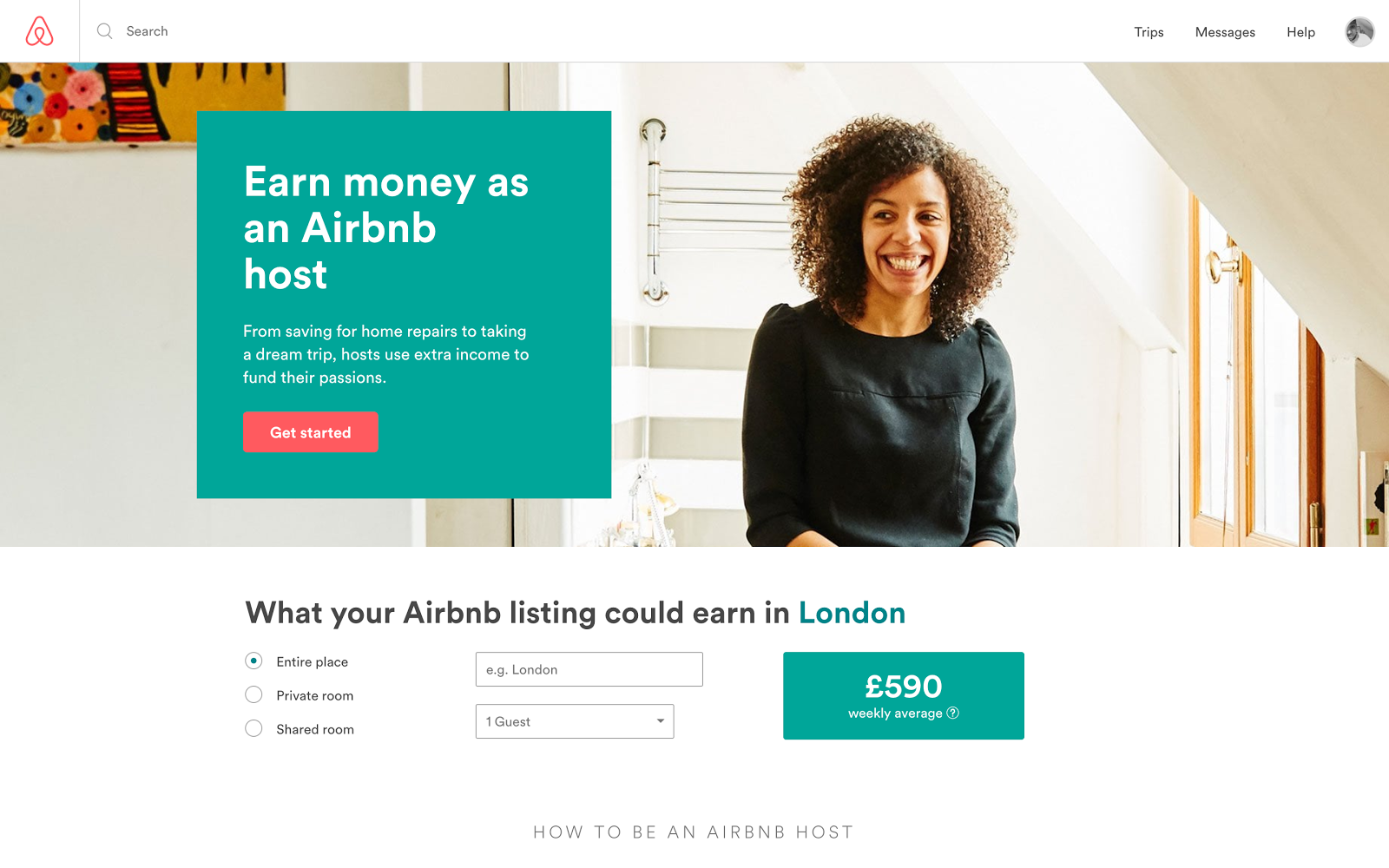
Airbnb is a business that focuses on people. So it makes sense that they should use images of people on their landing page:  Screen Shot 2017 09 15 at 16.23.39

They want their users to feel accomplished and happy if they sign up as an Airbnb host, so they include an image of a woman smiling.

For anyone thinking about signing up for the Airbnb platform, seeing an image like this will encourage them it’s a good idea.

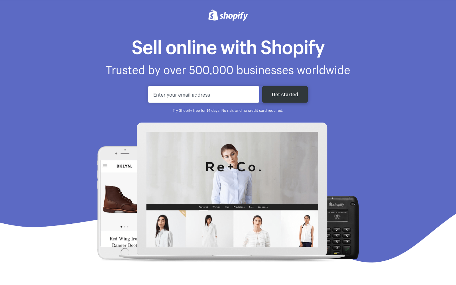
Shopify, an e-commerce platform, uses images to show visitors how their shop could look:

Screen Shot 2017 09 15 at 16.24.15

You can utilize images to guide your audience towards the call to action.

The images make your offer more human.

Your audience cannot touch or hold your product. Your landing page should make use of images to help them visualize it.

6. Include social proof

When creating a mind-reading landing page, understand that one question your audience will have is, “Do I need this?”

This is true for every landing page.

One way to read their minds is to address their question through the concept of social proof.

People are more inclined to take action if they know other people just like them have taken action and benefited from it.

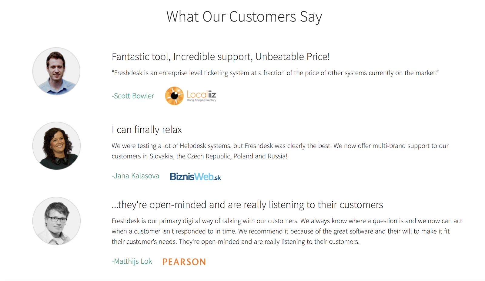
Using social proof on your landing page provides prospects with another layer of trust. They feel like it’s more likely your product/service will actually do what you say it will because they can see what other people thought about it.

For example, check out what Freshdesk does on their landing page:Screen Shot 2017 09 20 at 14.16.30

Do you have reviews and testimonials for your product you can use on the landing page?

Visitors get to experience how their life could be different from signing up. And they learn that from other people just like them.

7. Utilize a call to action

Your call to action button is important. It’s perhaps the most important element on the page.

If your audience can’t see your button clearly, they’re not going to know what to do.

Each landing page should have a call to action. The call to action is there to guide your user’s attention.

Let’s talk about your call to action button copy.

Your button copy should be action driven and relate to the offer available.

“Download” copy on the call to action is vague, and the visitor might not even remember what it is they’re downloading.

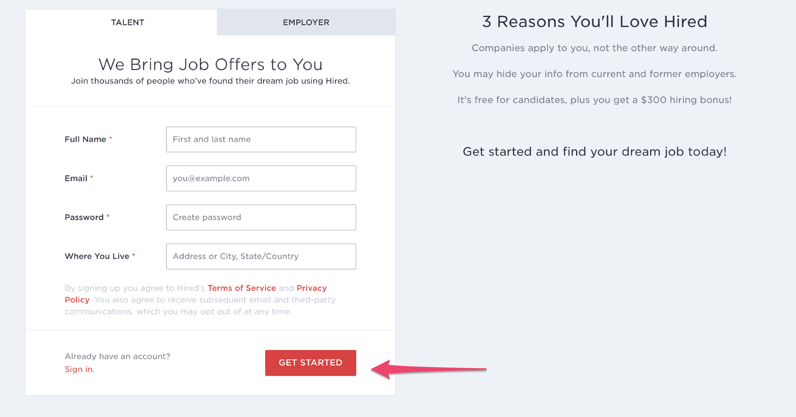
Take a look at the call to action button on Hired. It stands out as the only red button on the page:

Screen Shot 2017 09 20 at 14.22.19

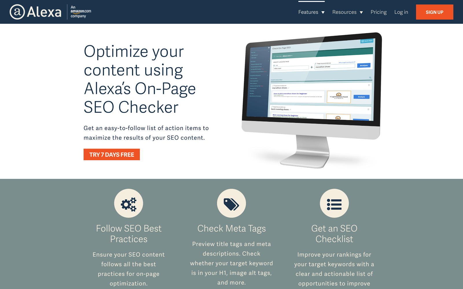
Alexa uses the “Try 7 days free” copy, which takes the pressure off the visitor. They don’t have to fully commit to using the service, and won’t be charged if they’re not happy with it:

Screen Shot 2017 09 15 at 16.27.59

Both Hired and Alexa use excited copy like “Get started.” Using the word “get” psychologically makes people feel as though they are getting something in return for giving you their details.

8. Measure your results

If you don’t measure the results of your landing page, you have no real way of understanding whether or not it is converting successfully.

Use Google Analytics to measure how many visitors came to your landing page and converted by giving you their data.

When looking at the effectiveness of your landing page, consider your bounce rate.

Your bounce rate is the number of people who landed on your landing page and didn’t convert.

If your bounce rate is low it could mean one of the following things:

You aren’t using the right keywords. Your keywords should be relevant to the audience you want to attract. If not, you will have a bunch of untargeted prospects coming to your site with no interest in what you’re offering.

The design on your landing page is poor. Consider how often the average person spends on your landing page. If it doesn’t follow a logical flow or is too confusing, they’re more than likely going to bounce.

9. Make sure you test

The only way to know if your attempts are working is to run tests.

A/B testing your landing page involves splitting your traffic in half, so half the traffic sees one version of the landing page and the other half sees another.

This way you will be able to make informed decisions about what does and doesn’t work.

You can compare two versions of your landing page and test different elements.

Do you have two headlines you want to use, but you aren’t sure which will work best? Use A/B testing.

Then after you’ve generated enough traffic, you’ll be able to see which led to the highest number of conversions.

With this data, you can continually improve your landing page to ensure it converts the most people.

When testing elements, don’t try and test everything all at once. If you do this, you’ll have no clear idea what you need to change and what you need to keep the same.

Instead, change a few elements at a time and keep the other elements the same as a control variable.

Conclusion

Your landing page has one job, and one job only: To convert.

So why are you not doing everything you can to encourage your visitors to take your desired action?

It all begins with planning.

But the planning begins even before you start thinking about what you will have on your landing page.

If you want it to be successful, you have to read your prospects’ minds.

Essentially, you need to know your customers really well.

Once you know them, you’ll determine what words, images, and reasoning resonate most with them.

And once you start using their own ideas on your landing pages, your conversion rates are going to increase.

But, with everything in marketing, there is no one size fits all.

Follow the best practices listed in this post and develop your understanding of your audience, and you’ll be able to create winning landing pages for all your offers.

What strategies do you use to improve your landing pages?

The post 9 Steps to Creating a Landing Page That Reads Your Prospects’ Minds appeared first on Neil Patel.

Landing Page Optimization: The Perfect Landing Page SEO

Landing Page Optimization: The Perfect Landing Page SEO “Begin with the end in mind” – Stephen Covey, Author of The 7 Habits Of Highly Effective People The landing page is the first webpage that a visitor lands on as a result of your traffic acquisition efforts. The question is, can you convince every single web …

The post Landing Page Optimization: The Perfect Landing Page SEO appeared first on Get Funding For Your Business And Ventures.

The post Landing Page Optimization: The Perfect Landing Page SEO appeared first on Buy It At A Bargain – Deals And Reviews.