Hello! I’m a rising undergrad senior studying biomedical engineering at the University of Waterloo, specializing in AI. I’m looking for new grad ML engineering roles in any industry at companies series A or larger ideally, but seed for the right role.
According to the Bureau of Labor Statistics, the consumer price index (CPI) has risen 16% under President Biden. The CPI rose 3.2% in the year ending in July, an acceleration from the 3% reading in June.
Such rapid devaluation of the currency has some people referring to the dollar as “Monopoly money,” but it turns out that’s unfair to the eponymous board game.
In fact, if the nation had begun using Monopoly money in 1935, when the game first went on sale, inflation over the last 88 years would have been substantially lower because the supply of Monopoly money has grown much less than that of Federal Reserve notes.
That is an amazing fact considering that the only board games with higher lifetime sales are chess and checkers, and they had head starts of hundreds and thousands of years, respectively.
Approximately 1.8 million Monopoly games were sold in the first year of its release, beginning in 1935, with each game containing $20,580. The initial money supply of Monopoly money was about $37 billion.
Amazingly, that is almost exactly the same as the M2 money supply in 1935 of $39 billion, as calculated by Milton Friedman and Anna Schwartz.
Since Monopoly’s introduction, about 300 million games have been sold, including its many variants. Today’s Monopoly money supply of $6,174 billion is 16,586% higher than it was in 1935. If that seems like an astronomical increase, consider what M2 has done over that same time.
Data from the Board of Governors of the Federal Reserve System show the money supply rose to $21,577 billion in 2022, which is 55,226% higher than it was in 1935. The supply of Federal Reserve notes has grown more than three times faster than the supply of Monopoly money.
This actually overstates the amount of Monopoly money in existence because many games have been thrown away over the last 88 years, but even this inflated figure still proves that Monopoly money’s growth has been more in line with growth in the real economy than M2 has.
Real gross domestic product (GDP), measured in 2012 dollars, was $986.905 billion in 1935. In 2022, it was $20,014.128, an increase of 1,928%. Over that same time, Monopoly money grew about nine times faster than real GDP, while M2 grew about 29 times faster.
And this is not the result of some bygone era; the Federal Reserve’s mismanagement of the money supply continues to this day. For example, in 2020, Monopoly saw a huge increase in sales because of lockdowns, selling 9.15 million games, increasing the supply of Monopoly money by $188 billion. Conversely, M2 increased by $2,818 billion, almost 15 times the increase in Monopoly money.
Put more whimsically, the mustachioed character in the middle of the Monopoly board, named “Rich Uncle Pennybags,” has done a better job managing his currency than the collective chairs of the Federal Reserve Board of Governors for nearly nine decades. The reason why lies in the political constraints faced by Federal Reserve Chair Jerome Powell and his predecessors.
There is tremendous pressure for the Federal Reserve to finance massive budget deficits like we have seen for the last three years. When they do so, the government’s spending, borrowing and creating too much money causes inflation.
People often use the term “Monopoly money” as a pejorative. It turns out the resulting devaluation of the Federal Reserve note has been worse than if the nation had used Monopoly money instead. That’s quite an indictment of Bidenomics.
Marcus Smart said first-year head coach Joe Mazzulla has “rightfully” faced criticism for his decisions but noted that he’s been “able to learn,” like all great players and coaches.
Planet Farms | Data Engineer/Analyst | Office in Coimbra, Portugal
We make vertical farms.
Hybrid office job, Coimbra, Portugal. Relocation, assistance of lawyers at the expense of the company.
The task is to found the data team and grow into its lead. At first it will be just you, but during the year it is planned to hire more people to the team.
It is necessary to lay the foundation of Data Mesh (current leading idea, up to discussion) and data culture in the company, which will allow scaling to dozens of factories.
In the beginning, you need to work a lot with your hands on the backend and infrastructure: raise the database, write the API and everything else.
Requirements:
Data Engineering experience, Data Analysis experience, Good people skills. You will have the support of our team, but we need you to be the driver of the project.
SKULabs | Fullstack/Node.js Developer | ONSITE / REMOTE | Full-time | $90-$140k | Pay based on experience.
SKULabs is seeking two additional developers experienced in Node.js to help accelerate existing projects in 2023. You’ll join a team of 5 developers and help ecommerce sellers deliver satisfaction to their customers like the pros. Specifically, SKULabs offers a multi-channel platform to manage everything from receiving inventory to shipping orders and everything in-between. Billed as a lightweight ERP, we grew out of the app-store ecosystem to meet the needs of an ever-growing audience of those who need inventory solutions with or without ecommerce. We’re rated almost 5 stars on all channels by our customers and have an excellent roadmap for 2023. We’d love to have you on the team if making impactful changes and seeing results matter to you.
Tim Berners-Lee, the inventor of the World Wide Web, says the web is for everyone. Unfortunately, that isn’t always the case.
Poor design decisions can present barriers for many different groups of people. In fact, research by WebAIM finds that across one million homepages, there were over 50,000,000 “distinct accessibility errors” at an average of just over 50 per page.
These errors don’t just make people feel marginalized; they stop hundreds of thousands of people from interacting with your brand or buying your product.
Few webmasters want to purposefully marginalize people or limit access to their site. That’s why it’s so important to understand the most common web accessibility issues and learn how to resolve them with clean design.
Let’s get started.
Why Is UX Accessibility Important?
Because the internet has become an essential part of the day-to-day lives of more than a billion people, site owners must take steps to make sure everyone can access it equally. It’s not just a matter of human rights, however. There is an obvious financial case for making your site accessible. Given that 61 million people in the United States have some form of disability, an inaccessible site could be harming your bottom line. Make your site accessible, and you potentially open the door to thousands of more customers.
Complying with UX accessibility design trends can bolster your company’s reputation. Making an effort to cater to a particular group of disadvantaged users proves your company cares about all of its customers. This added step may encourage potential customers to do more business with your brand going forward.
There’s also the small matter of legal compliance. While there’s debate about whether the 1990 Americans with Disabilities Act includes websites as well as physical stores, that hasn’t stopped thousands of lawsuits getting filed with federal courts each year. You may not be punished for a lack of ADA website compliance, but the threat of legal action is clear.
Ultimately, designing with UX accessibility doesn’t just improve the browsing experience for users with disabilities; it improves the user experience for everyone. Even users with perfect vision benefit from a better color contrast and more labels — and your SEO certainly benefits from things like added alt text and better link descriptions.
The 7 Most Common Web Accessibility Mistakes
Making your website more accessible is as much about avoiding common issues as it is about integrating new technology. Avoid the following seven mistakes, and you’ll go a long way to making your site more accessible than your competitors.
1: Missing Alt Text on Images
Alt text is an HTML attribute that describes what an image represents. From an accessibility perspective, alt text provides information for screen readers to accurately describe images to visually-impaired users. If you don’t provide alt text or your alt text isn’t very descriptive, then you aren’t making your site’s images available to everyone.
There’s a difference between empty alt text and missing alt text. Sometimes images can be for purely decorative purposes. Where this is the case, an empty alt tag can be used, which appears as alt=””. This is ignored by screen readers and doesn’t impact usability.
Often, alt text isn’t empty but missing completely. When a screen reader comes across a missing alt attribute, it will assume that the image is important and inject the file name. For images like graphs and infographics that are fundamental to a user’s understanding of a webpage, the file name won’t be sufficient. That’s why it’s essential to create alt text for all of your images.
2: Weak Color Contrast
Have you ever tried to read a white font on a yellow background? Not easy, is it? But that could be how many users feel every time they visit your site. The truth is some people struggle to read text unless the color contrast between the font and the background is very stark. It’s why black font on a white background is such a popular choice.
The easiest way to improve color contrast is to avoid using similar colors for backgrounds and text. That means no orange font on a red background. Or green text on a blue background. Pay particular attention to design features like your website’s header or the submit button on forms, too. These features tend to incorporate brand colors and are more likely to cause contrast issues.
Alternatively, you can use a tool like the Contrast Checker from WebAIM to quantify your contrast ratio. The higher your ratio, the better the contrast and the more readable your website will be. The tool will tell you whether your colors pass or fail. As a rule, text and background colors should have a contrast ratio of at least 3:1 for large text and at least 4:1 for normal-sized text.
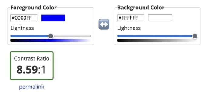
As you can see from the images below, dark blue text on a white background has a great contrast ratio.
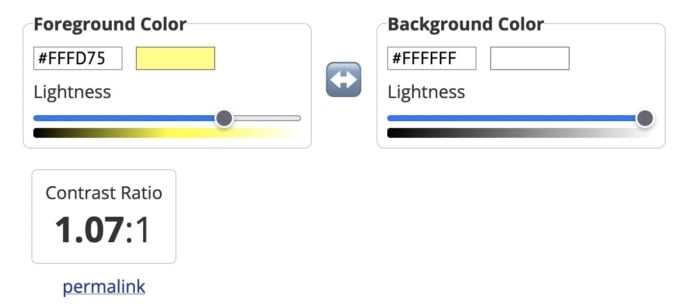
But yellow text on a white background has a terrible contrast ratio.
3: Poor Link Text
Links are a vital part of a web page, both from a user experience perspective and for SEO. But you need to accurately describe them using link text to make them effective.
While those versed in SEO might never dream of missing a chance to add a keyword in an internal link, missing link text is surprisingly common. Logos, buttons, and icons are all guilty of having no text, which means screen readers will ignore them. That’s not great if you want users to click your CTA button.
Vague or ambiguous link text is also an issue. Not only does a phrase like “click here” offer no SEO value, but it can also hamper users accessing your site via a screen reader. Including the entire http:// link without any anchor text whatsoever is even worse. Neither version contains the information these users need.
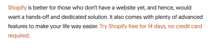
Instead, make sure the clickable text describes exactly what the user can find on the next page. In the example below, for instance, you know that by clicking the link, you’ll be directed to a page where you can get a 14-day free trial of Shopify.
Then there are navigation links. These can also create problems for screen readers if they are poorly coded. That’s because screen readers will not skip over them, meaning users will have to listen to your navigation menu every time they open a new page. Solve this by assigning ARIA roles to your navigation menus to indicate their purpose. This will help screen readers to avoid them where necessary.
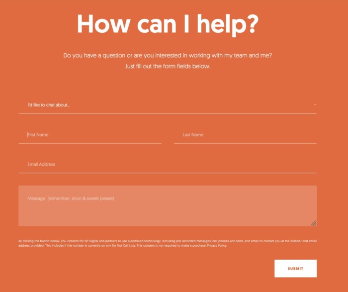
4: Missing Form Labels
I’m almost certain your website has at least one form on it, even if it’s only on your contact page. But does every field have a label telling users what information they need to input? If not, your forms aren’t accessible to everyone.
Just like with link text, form input fields need a label so screen readers and other accessibility devices can understand them and help users navigate them. A label isn’t just the placeholder text you can see in the form field, though. You also need to add a description in the form’s code. That’s because placeholder text is usually ignored by screen readers. It also doesn’t help that placeholder text usually lacks a strong color contrast.
Ideally, you’ll have a visible label inside a <label> element so everyone (users, screen readers, bots) can understand what’s meant to go in each field.
5: No Markup For Data Tables
Tables are something of a nightmare for screen readers and other accessibility devices. When screen readers come across a table, they tell the user that there is a table with a given amount of columns and rows and then proceed to list out all of the data. Unfortunately, that data may not be read in the correct order. Worse still, screen readers can’t read out tables where there is more than one set of row or column headers.
In truth, the best way to make tables accessible is to not have them at all. Of course, that’s not going to work for some websites. So, where tables are required, you need to make them as simple as possible and use the correct markup. ID, HEADERS, and SCOPE attributes should be used to correctly label each part of your table. You can also use table captions to provide additional information to users about how to best understand your table.
Another alternative is presenting your data as an image file, with appropriate alt text listing out the data. However, for complex tables, that may not be feasible.
6: Lack of Keyboard Accessibility For Screen Readers
Not everyone is going to use a mouse to navigate your website. Many visually-impaired people will use a keyboard or another accessibility device to move around your website. And that means you need to pay special attention when designing and creating the layout of your site.
Specifically, users must be able to navigate your website using the space bar and tab key. Simple sites built in semantically correct HTML may make this possible without any adjustment, but more complicated websites will need to code in digital landmarks that better allow keyboard users and screen readers to move about.
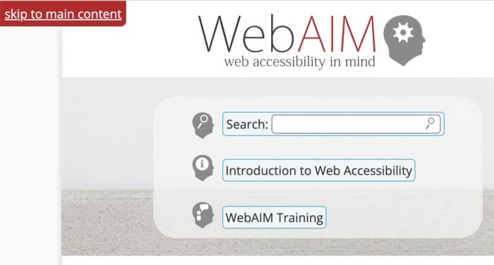
Adding skip-to-content links at the top of each page can also save your users from having to tab through every menu item every time they open a new page. These buttons, which appear when you push the tab key, allow users to navigate the site using the tab and spacebar keys to skip the navigation and head straight to the main content of the page.
7: Non-HTML Content WIthout Proper Markup</h3>
It’s easy to forget about non-HTML elements when optimizing your site for accessibility. But content like PDFs and Word documents can also be an issue. Out of the box, users cannot customize these documents to make them easier to read nor do they work well with assistive technologies. Accessibility issues are even worse when documents are produced as image-only PDFs.
One solution is to solve navigation mistakes by tagging these resources for navigation by screen readers. Another is to use Office’s built-in Accessibility Checker to improve the accessibility of these documents when you create them.
Interactive content like sliders, accordions, and drag-and-drop widgets can also affect accessibility. So, too, can dynamic content like pop-up boxes and confirmation messages. If the screen reader can’t understand when these pieces of content are loading, it won’t be able to tell users about them.
Once again, you can use ARIA attributes to resolve this issue. Tagging these interactive and dynamic elements with the correct ARIA attribute will notify screen readers that the page’s content has changed. Alternatively, you can design your site in a way that avoids the need for pop-ups and other forms of dynamic content. Static websites may not look as flashy, but they are much more accessible.
FAQs
What are the four significant categories of accessibility?
The Web Content Accessibility Guidelines are built upon the four principles of POUR: perceivable, operable, understandable and robust.
What is ADA compliance?
If your site is ADA-compliant, then it meets the recommendations set out in the Americans with Disabilities Act of 1990 and is accessible to someone with a disability.
How do I make my website more accessible?
You can make your website more accessible by improving color contrast, adding alt text, or adding keyboard accessibility for screen readers.
What is an example of website accessibility?
Allowing users to navigate your website using a keyboard instead of a mouse is an example of website accessibility. So is adding alt text to every image on your website.
Conclusion
Unfortunately, even the best designers and web entrepreneurs can create inaccessible websites. It’s why it’s so important to keep referring back to these mistakes whenever you build a website or create a new piece of content.
It’s more effort to include alt text on all images, add markup data to tables and improve the quality of your link text, but millions of users will thank you for it.
+ 100% remote
+ real-life impact through a SaaS in the health industry
+ the company’s dedication to current issues (e.g. Black History Month, Women’s International Day)
+ different levels of seniority available, from medior to senior staff
+ work from Ireland, UK, Germany, Canada, the US
This website uses cookies to improve your experience. We'll assume you're ok with this, but you can opt-out if you wish.AcceptRejectRead More
Privacy & Cookies Policy
Privacy Overview
This website uses cookies to improve your experience while you navigate through the website. Out of these, the cookies that are categorized as necessary are stored on your browser as they are essential for the working of basic functionalities of the website. We also use third-party cookies that help us analyze and understand how you use this website. These cookies will be stored in your browser only with your consent. You also have the option to opt-out of these cookies. But opting out of some of these cookies may affect your browsing experience.
Necessary cookies are absolutely essential for the website to function properly. This category only includes cookies that ensures basic functionalities and security features of the website. These cookies do not store any personal information.
Any cookies that may not be particularly necessary for the website to function and is used specifically to collect user personal data via analytics, ads, other embedded contents are termed as non-necessary cookies. It is mandatory to procure user consent prior to running these cookies on your website.