We know Google has hundreds of ranking factors when it comes to determining where a URL will land on Search Engine Results Pages (SERPs). According to Google, website accessibility is not a direct ranking factor because it’s difficult to quantify. So if that’s the case, is there any correlation between accessibility and SEO? While there … Continue reading Does Poor Website Accessibility Affect Your Rankings?
Tag: accessibility
Does Poor Website Accessibility Affect Your Rankings?
We know Google has hundreds of ranking factors when it comes to determining where a URL will land on Search Engine Results Pages (SERPs). According to Google, website accessibility is not a direct ranking factor because it’s difficult to quantify.
So if that’s the case, is there any correlation between accessibility and SEO?
While there may not be a direct link, there is likely to be an indirect one. This comes down to user experience metrics. So what exactly is the correlation and what should you expect as a website owner?
In this post, we’ll introduce website accessibility standards and why they exist. We’ll then compare the performance of four websites with varying levels of accessibility compliance to see if accessibility does have a noticeable impact on SEO. So let’s dive in!
Why We Have Website Accessibility Standards
Accessible websites that are intuitive and easy to use for all visitors are the right thing to do. Unfortunately, that doesn’t often translate to what website owners actually do.
It’s not out of malice. In fact, it’s mostly from a lack of knowledge on the topic. How can one even begin to make their website accessible if the definition of “accessible” varies from person to person?
That’s where website accessibility standards come in. These standards lay the foundation for accessibility best practices. So instead of website designers and developers creating what they think is accessible, they can know the techniques they implement are part of the approved standards.
Where Do Sites Struggle Most With Website Accessibility?
The greatest struggle for sites is in the marriage between design and accessibility. That is, web designers and developers feel like they have to prioritize one over the other. A few common examples of this include:
- Popups or flyouts that may confuse visitors or screen readers
- Text on images without a high enough contrast for visually impaired visitors
- Text on images with too small font size
- Complex nested navigation
- Poorly structured tables
- Lack of “skip to content” link
There are plenty of ways to combine design and accessibility whether you’re using a pre-built layout or building your own from scratch.
What We Learned From Analyzing 4 Websites
In this part of the article, we’ll look closely at the breakdown of accessibility issues for each site. We’ll also consider the last six months of domain ranking information and that domain’s keyword positions for the month of June. This will help us to develop a fuller picture and understand the true impact of web accessibility and SEO.
Amazon: Not As Accessible As You Would Think
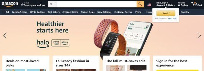
Surely a global giant like Amazon would have website accessibility all figured out, right? Unfortunately, that’s not the case based on our analysis. Amazon is actually number two on our list when it comes to the number of total accessibility issues.
The breakdown of issues, as of this writing, is one critical issue, 18 serious issues, and 114 minor accessibility issues.
To provide some context, here are the differences between these classifications:
- Critical issues are those that stop most users of assistive technology (e.g. screen readers, screen magnifiers, refreshable braille displays) from using the website.
- Serious issues are those that may cause problems or increased frustration for users, but it doesn’t fully prevent them from using the site.
- Minor issues are those that may cause problems or frustrations for a smaller number of users.
To understand the impact of accessibility and SEO, we must also consider other domain ranking factors. As such, we’ve analyzed the last six months of website domain statistics.
Over the last six months, Amazon has maintained a domain rating of 96, 18.8 million backlinks, and 179,700 referring domains. When looking at their ranking profile, in particular, we see 73.7 million organic keywords with roughly 900.9 million organic traffic visits per month.
To narrow in even further, in June 2022, Amazon has 13.25 million keywords ranking in positions one through three. Of those keywords, 13 million are non-branded.
Etsy: All-Around Accessibility and Performance
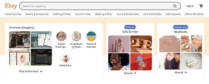
Etsy is a marketplace, like Amazon. Unlike Amazon, which has a wide range of manufactured products, Etsy focuses on handmade and vintage products.
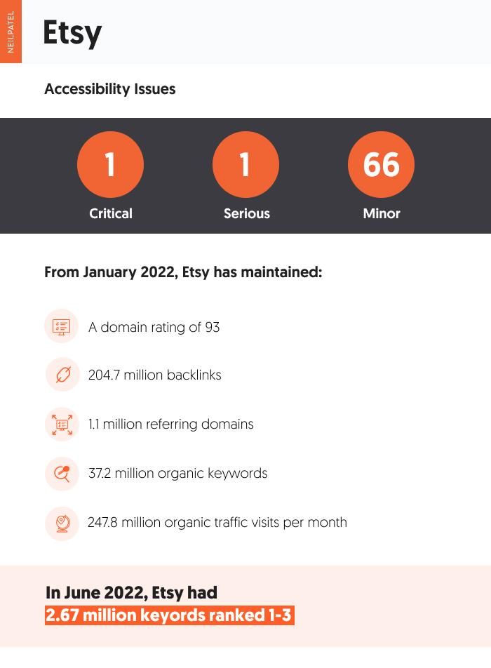
When it comes to accessibility issues, Etsy has 68 total issues with one critical issue and one serious issue among them.
Over the last six months, Etsy has maintained the second highest domain ranking on our list, 93. In addition, its number of backlinks is 204.7 million with 1.1 million referring domains. When looking at keyword statistics, in particular, Etsy ranked for 37.2 million organic keywords with roughly 247.8 million organic traffic visits per month.
And how about keyword ranking performance? In June 2022, Etsy has 2.76 million keywords ranking in positions one through three. Of those, 2.74 million are non-branded.
Nordstrom: The Front-Runner

Amazon and Etsy are e-commerce marketplaces with tens of thousands of brands (or millions, in the case of Amazon). Nordstrom, on the other hand, is an e-commerce storefront. So how does it compare?
According to our analysis, Nordstrom is the most accessible website on our list with a total of 42 accessibility issues. Nordstrom has no critical or serious accessibility issues, unlike the other three websites in our analysis.
When it comes to domain rating, Nordstrom scores an 87. The e-commerce site has 5.4 million backlinks and 79,100 referring domains. It also ranks for 3 million organic keywords with roughly 43.2 million organic traffic visits per month.
For June 2022, Nordstrom has 343,800 keywords ranking in positions one through three. Of those keywords, 329,600 are non-branded.
Lululemon: How Accessibility and Performance Interact
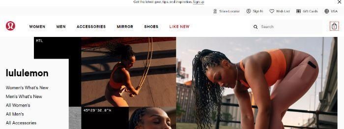
Lululemon is an athletic wear and lifestyle apparel brand founded in the ‘90s. It grew in popularity within the Yoga community, but it soon expanded its reach to all areas of athletic and leisure apparel. Similar to Nordstrom, Lululemon hosts an e-commerce storefront.
According to our analysis of accessibility issues, Lululemon is the least accessible website on our list with 133 total issues. This includes three critical issues and 49 serious issues.
Coincidentally, Lululemon also has the lowest domain rating on our list with an 82. Over the last six months, Lululemon has maintained 1.1 million backlinks, 30,000 referring domains, and 489,900 organic keyword rankings. This has netted Lululemon roughly 8.3 million in organic website traffic per month.
When zeroing in on June 2022, Lululemon has just 12,800 keywords in positions one through three. Of those, just 1,900 are non-branded.
Web Accessibility Main Takeaways
The goal of this part of the article is to determine just how much of a factor website accessibility is on website rankings. To do so, compared the keyword ranking metrics of each website based on overlapping keywords. What did we find?
Using the Keyword Gap tool in ahrefs, we narrowed it down to roughly 2,900 overlapping keywords that ranked in positions one through three. These include keywords like “mesh sports bra,” “tie dye mens shorts,” and “mid rise skirt.”
Of those almost 3,000 keywords, this is how each of the four sites performed:
- Amazon ranked for 2,470 keywords in positions one through three;
- Etsy ranked for 479 keywords in positions one through three;
- Nordstrom ranked for 694 keywords in positions one through three; and
- Lululemon ranked for 84 keywords in positions one through three.
Lululemon did rank lowest among the four websites, which isn’t surprising considering its domain rating and organic keyword profile. If website accessibility was a big factor, though, you’d expect Amazon to do poorly. However, Amazon has the highest number of ranking keywords by far. This may have to do with its strong domain rating.
While these results don’t show a direct correlation between poor website accessibility and keyword rankings, it’s still a legal requirement. While there are no enforceable laws in the United States specifically referencing website accessibility, most websites do fall under Title III of the Americans with Disabilities Act (ADA). This means website owners can face civil lawsuits from website users and potentially be fined by the federal government.
We also know sites with better User Experience (UX) perform the best in SERPs, so having an accessible website is a must.
Creating an Accessibility Improvement Strategy for Your Website
According to the Web Content Accessibility Guidelines (WCAG) as outlined by The World Wide Web Consortium (W3C), to be compliant, a website must be:
- Perceivable
- Operable
- Understandable
- Robust
These terms of subjective, so how can we know what’s truly accessible? Fortunately, WCAG lays that out very clearly.
So how do we put this into practice?
There are a lot of steps you can take to meet ADA website compliance requirements. If you’re just getting started, these are the most important ones to consider.
Choose a Content Management System that Supports Accessibility
Not all e-commerce platforms are created equal. There are some that support accessibility better than others. So if you’re in a position to choose a new content management system, then do so with accessibility in mind and be sure to add it to your redesign checklist.
An accessible platform will make it easy to incorporate accessibility features like alt text, anchor text, high-contrast text, and content structure. It may also have accessibility elements built into its HTML structure, or it gives you full access to the HTML files to do so yourself.
Include Descriptive Alt Text for Images
Images make up about 50% of digital content. As such, they cannot be ignored when it comes to making accessibility accommodations on your website.
One way to optimize your images is with descriptive alt text.
Alt text is a written description of the content of the image. It describes what it is and the contextual purpose it serves on a website or blog post.
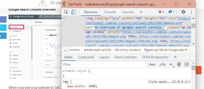
As an added bonus, descriptive alt text can also increase the odds of your content being found with Google image search.
Use a Logical Content Organization Structure
Screen readers and other types of web accessibility software rely heavily on HTML to determine what content should be read in what order. A logical content organization structure is important for this type of software, but also for visual readers in general.
What do we mean by a logical structure?
This includes the page structure itself, consisting of the header, nav, main, aside, and footer elements. It also includes content structure as you might see on a product page or blog post. This includes the use of heading and subheading tags like H1, H2, etc.
Use Descriptive Anchor Text for Links
How you link can be just as important as where you link. Descriptive anchor text ensures users understand where they are going before they click a hyperlink on your site.
An example of non-descriptive anchor text would be:
“To learn more about this topic, go here” with “here” serving as the anchor text.

A better way to link to internal and external sites is to incorporate your links naturally into your content. In the example image above, you can see “Search Console website” is another link that goes to – you guessed it! – the Search Console website.
The clear and concise anchor text leaves no questions as to what type of content the link will lead to.
FAQs
Do you still have questions about web accessibility and SEO? Here are the answers to some frequently asked questions.
What is website accessibility?
Web accessibility is the inclusive practice of making websites available and easy to use for all visitors. This is inclusive of those with physical disabilities, cognitive limitations, and even socioeconomic factors like bandwidth restrictions and speed.
What are some examples of accessible design?
Examples of accessible design include any measure that’s designed to ensure those who are differently abled or have limitations can make full use of a website. This can range from closed captioning on any video/audio to items like reducing image size to make it easier for pages to load for users with lower internet bandwidth.
Why is website accessibility important?
Web accessibility’s main goal is to make the internet a more accessible place for all people. It is also a great way to ensure a smooth user experience for everyone, regardless of disabilities or limitations. There can even be an added SEO benefit to doing so.
Where can I find tools to check my website’s accessibility?
How do I make my website accessible?
One of the best first steps you can take is doing an accessibility audit using both your own team’s expertise as well as free and paid tools. When you know what areas your website is struggling most, begin laying out a plan to address them. Depending on your team’s bandwidth, you may have to focus on lower-effort areas like lowering image sizes and make plans for more extensive changes later.
{
“@context”: “https://schema.org”,
“@type”: “FAQPage”,
“mainEntity”: [
{
“@type”: “Question”,
“name”: “What is website accessibility?”,
“acceptedAnswer”: {
“@type”: “Answer”,
“text”: ”
Web accessibility is the inclusive practice of making websites available and easy to use for all visitors. This is inclusive of those with physical disabilities, cognitive limitations, and even socioeconomic factors like bandwidth restrictions and speed.
”
}
}
, {
“@type”: “Question”,
“name”: “What are some examples of accessible design?”,
“acceptedAnswer”: {
“@type”: “Answer”,
“text”: ”
Examples of accessible design include any measure that’s designed to ensure those who are differently abled or have limitations can make full use of a website. This can range from closed captioning on any video/audio to items like reducing image size to make it easier for pages to load for users with lower internet bandwidth.
”
}
}
, {
“@type”: “Question”,
“name”: “Why is website accessibility important?”,
“acceptedAnswer”: {
“@type”: “Answer”,
“text”: ”
Web accessibility’s main goal is to make the internet a more accessible place for all people. It is also a great way to ensure a smooth user experience for everyone, regardless of disabilities or limitations. There can even be an added SEO benefit to doing so.
”
}
}
, {
“@type”: “Question”,
“name”: “Where can I find tools to check my website’s accessibility?”,
“acceptedAnswer”: {
“@type”: “Answer”,
“text”: ”
There are plenty of free and paid tools to check your website’s accessibility. These include accessiBe, WAVE, and audioeye.
”
}
}
, {
“@type”: “Question”,
“name”: “How do I make my website accessible?”,
“acceptedAnswer”: {
“@type”: “Answer”,
“text”: ”
One of the best first steps you can take is doing an accessibility audit using both your own team’s expertise as well as free and paid tools. When you know what areas your website is struggling most, begin laying out a plan to address them. Depending on your team’s bandwidth, you may have to focus on lower-effort areas like lowering image sizes and make plans for more extensive changes later.
”
}
}
]
}
Conclusion
There isn’t such a clear connection between web accessibility and SEO. While it is likely a ranking factor considered by Google, it’s not one that seems to have a noticeable impact on search results. That doesn’t mean it’s something you can forego.
Web accessibility standards are a legal requirement, so a website not in good legal standing is likely to see some negative impacts. So if you want to achieve SEO success, it’s just good practice to have an intuitive, user-friendly, accessible website.
Common UX Accessibility Mistakes Found on Websites
Tim Berners-Lee, the inventor of the World Wide Web, says the web is for everyone. Unfortunately, that isn’t always the case. Poor design decisions can present barriers for many different groups of people. In fact, research by WebAIM finds that across one million homepages, there were over 50,000,000 “distinct accessibility errors” at an average of … Continue reading Common UX Accessibility Mistakes Found on Websites
Common UX Accessibility Mistakes Found on Websites
Tim Berners-Lee, the inventor of the World Wide Web, says the web is for everyone. Unfortunately, that isn’t always the case.
Poor design decisions can present barriers for many different groups of people. In fact, research by WebAIM finds that across one million homepages, there were over 50,000,000 “distinct accessibility errors” at an average of just over 50 per page.
These errors don’t just make people feel marginalized; they stop hundreds of thousands of people from interacting with your brand or buying your product.
Few webmasters want to purposefully marginalize people or limit access to their site. That’s why it’s so important to understand the most common web accessibility issues and learn how to resolve them with clean design.
Let’s get started.
Why Is UX Accessibility Important?
Because the internet has become an essential part of the day-to-day lives of more than a billion people, site owners must take steps to make sure everyone can access it equally. It’s not just a matter of human rights, however. There is an obvious financial case for making your site accessible. Given that 61 million people in the United States have some form of disability, an inaccessible site could be harming your bottom line. Make your site accessible, and you potentially open the door to thousands of more customers.
Complying with UX accessibility design trends can bolster your company’s reputation. Making an effort to cater to a particular group of disadvantaged users proves your company cares about all of its customers. This added step may encourage potential customers to do more business with your brand going forward.
There’s also the small matter of legal compliance. While there’s debate about whether the 1990 Americans with Disabilities Act includes websites as well as physical stores, that hasn’t stopped thousands of lawsuits getting filed with federal courts each year. You may not be punished for a lack of ADA website compliance, but the threat of legal action is clear.
Ultimately, designing with UX accessibility doesn’t just improve the browsing experience for users with disabilities; it improves the user experience for everyone. Even users with perfect vision benefit from a better color contrast and more labels — and your SEO certainly benefits from things like added alt text and better link descriptions.
The 7 Most Common Web Accessibility Mistakes
Making your website more accessible is as much about avoiding common issues as it is about integrating new technology. Avoid the following seven mistakes, and you’ll go a long way to making your site more accessible than your competitors.
1: Missing Alt Text on Images
Alt text is an HTML attribute that describes what an image represents. From an accessibility perspective, alt text provides information for screen readers to accurately describe images to visually-impaired users. If you don’t provide alt text or your alt text isn’t very descriptive, then you aren’t making your site’s images available to everyone.
There’s a difference between empty alt text and missing alt text. Sometimes images can be for purely decorative purposes. Where this is the case, an empty alt tag can be used, which appears as alt=””. This is ignored by screen readers and doesn’t impact usability.
Often, alt text isn’t empty but missing completely. When a screen reader comes across a missing alt attribute, it will assume that the image is important and inject the file name. For images like graphs and infographics that are fundamental to a user’s understanding of a webpage, the file name won’t be sufficient. That’s why it’s essential to create alt text for all of your images.
2: Weak Color Contrast
Have you ever tried to read a white font on a yellow background? Not easy, is it? But that could be how many users feel every time they visit your site. The truth is some people struggle to read text unless the color contrast between the font and the background is very stark. It’s why black font on a white background is such a popular choice.
The easiest way to improve color contrast is to avoid using similar colors for backgrounds and text. That means no orange font on a red background. Or green text on a blue background. Pay particular attention to design features like your website’s header or the submit button on forms, too. These features tend to incorporate brand colors and are more likely to cause contrast issues.
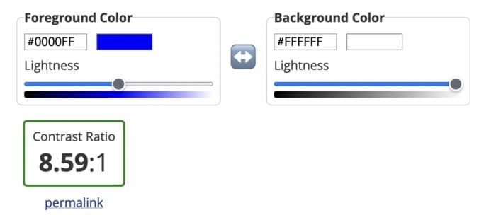
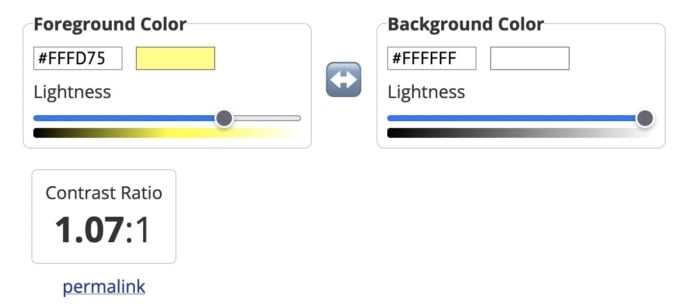
Alternatively, you can use a tool like the Contrast Checker from WebAIM to quantify your contrast ratio. The higher your ratio, the better the contrast and the more readable your website will be. The tool will tell you whether your colors pass or fail. As a rule, text and background colors should have a contrast ratio of at least 3:1 for large text and at least 4:1 for normal-sized text.
As you can see from the images below, dark blue text on a white background has a great contrast ratio.
But yellow text on a white background has a terrible contrast ratio.
3: Poor Link Text
Links are a vital part of a web page, both from a user experience perspective and for SEO. But you need to accurately describe them using link text to make them effective.
While those versed in SEO might never dream of missing a chance to add a keyword in an internal link, missing link text is surprisingly common. Logos, buttons, and icons are all guilty of having no text, which means screen readers will ignore them. That’s not great if you want users to click your CTA button.
Vague or ambiguous link text is also an issue. Not only does a phrase like “click here” offer no SEO value, but it can also hamper users accessing your site via a screen reader. Including the entire http:// link without any anchor text whatsoever is even worse. Neither version contains the information these users need.
Instead, make sure the clickable text describes exactly what the user can find on the next page. In the example below, for instance, you know that by clicking the link, you’ll be directed to a page where you can get a 14-day free trial of Shopify.

Then there are navigation links. These can also create problems for screen readers if they are poorly coded. That’s because screen readers will not skip over them, meaning users will have to listen to your navigation menu every time they open a new page. Solve this by assigning ARIA roles to your navigation menus to indicate their purpose. This will help screen readers to avoid them where necessary.
4: Missing Form Labels
I’m almost certain your website has at least one form on it, even if it’s only on your contact page. But does every field have a label telling users what information they need to input? If not, your forms aren’t accessible to everyone.
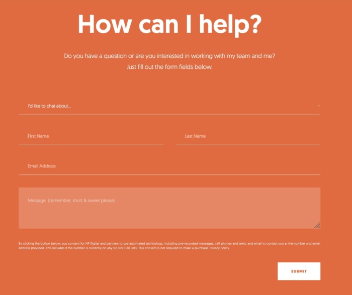
Just like with link text, form input fields need a label so screen readers and other accessibility devices can understand them and help users navigate them. A label isn’t just the placeholder text you can see in the form field, though. You also need to add a description in the form’s code. That’s because placeholder text is usually ignored by screen readers. It also doesn’t help that placeholder text usually lacks a strong color contrast.
Ideally, you’ll have a visible label inside a <label> element so everyone (users, screen readers, bots) can understand what’s meant to go in each field.
5: No Markup For Data Tables
Tables are something of a nightmare for screen readers and other accessibility devices. When screen readers come across a table, they tell the user that there is a table with a given amount of columns and rows and then proceed to list out all of the data. Unfortunately, that data may not be read in the correct order. Worse still, screen readers can’t read out tables where there is more than one set of row or column headers.
In truth, the best way to make tables accessible is to not have them at all. Of course, that’s not going to work for some websites. So, where tables are required, you need to make them as simple as possible and use the correct markup. ID, HEADERS, and SCOPE attributes should be used to correctly label each part of your table. You can also use table captions to provide additional information to users about how to best understand your table.
Another alternative is presenting your data as an image file, with appropriate alt text listing out the data. However, for complex tables, that may not be feasible.
6: Lack of Keyboard Accessibility For Screen Readers
Not everyone is going to use a mouse to navigate your website. Many visually-impaired people will use a keyboard or another accessibility device to move around your website. And that means you need to pay special attention when designing and creating the layout of your site.
Specifically, users must be able to navigate your website using the space bar and tab key. Simple sites built in semantically correct HTML may make this possible without any adjustment, but more complicated websites will need to code in digital landmarks that better allow keyboard users and screen readers to move about.
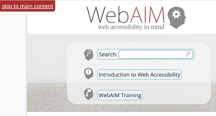
Adding skip-to-content links at the top of each page can also save your users from having to tab through every menu item every time they open a new page. These buttons, which appear when you push the tab key, allow users to navigate the site using the tab and spacebar keys to skip the navigation and head straight to the main content of the page.
7: Non-HTML Content WIthout Proper Markup</h3>
It’s easy to forget about non-HTML elements when optimizing your site for accessibility. But content like PDFs and Word documents can also be an issue. Out of the box, users cannot customize these documents to make them easier to read nor do they work well with assistive technologies. Accessibility issues are even worse when documents are produced as image-only PDFs.
One solution is to solve navigation mistakes by tagging these resources for navigation by screen readers. Another is to use Office’s built-in Accessibility Checker to improve the accessibility of these documents when you create them.
Interactive content like sliders, accordions, and drag-and-drop widgets can also affect accessibility. So, too, can dynamic content like pop-up boxes and confirmation messages. If the screen reader can’t understand when these pieces of content are loading, it won’t be able to tell users about them.
Once again, you can use ARIA attributes to resolve this issue. Tagging these interactive and dynamic elements with the correct ARIA attribute will notify screen readers that the page’s content has changed. Alternatively, you can design your site in a way that avoids the need for pop-ups and other forms of dynamic content. Static websites may not look as flashy, but they are much more accessible.
FAQs
The Web Content Accessibility Guidelines are built upon the four principles of POUR: perceivable, operable, understandable and robust.
If your site is ADA-compliant, then it meets the recommendations set out in the Americans with Disabilities Act of 1990 and is accessible to someone with a disability.
You can make your website more accessible by improving color contrast, adding alt text, or adding keyboard accessibility for screen readers.
Allowing users to navigate your website using a keyboard instead of a mouse is an example of website accessibility. So is adding alt text to every image on your website.
Conclusion
Unfortunately, even the best designers and web entrepreneurs can create inaccessible websites. It’s why it’s so important to keep referring back to these mistakes whenever you build a website or create a new piece of content.
It’s more effort to include alt text on all images, add markup data to tables and improve the quality of your link text, but millions of users will thank you for it.
But don’t stop there. Next, learn how to create inclusive content and improve the overall user experience of your website.
What UX accessibility mistakes are you going to correct first?
Olark (YC W09) Is Hiring an Account Executive who cares about accessibility
Article URL: https://olark.hire.trakstar.com/jobs/fk02daq?source=hn
Comments URL: https://news.ycombinator.com/item?id=32784845
Points: 1
# Comments: 0

