9 Steps to Creating a Landing Page That Reads Your Prospects’ Minds
So you’ve decided to create a landing page to promote your new product or service.
But how do you know if your landing page will convince your readers to convert?
There are a number of things you can do to ensure your readers are enticed by your landing page and want to know more information.
In this post, we’re going to figure out exactly what you need to do to produce a mind-reading landing page. But first, let’s start with the basics.
What is a landing page?
Before you create a landing page, you need to understand exactly what it is.
A landing page is a dedicated web page, often called a squeeze or splash page. The objective is to collect your visitor’s data through a lead capture form.
You might use a landing page to give away a free e-book, webinar, or course in exchange for your audience signing up for your email list.
Or maybe you collect emails before launching your new website.
The best part about a landing page is that it’s only one page.
It’s one page you need to optimize.
Why, then, do so many people make mistakes with their landing pages?
And why do so many people struggle to convert their customers?
A well-crafted landing page will enable you to target a specific audience, create a compelling message, and increase conversions.
But what goes into creating an effective one?
What makes some landing pages successful and some fall flat on their face?
It all comes down to whether you know your audience or not.
Those who know their audience will be able to create the right messaging, hold their audience’s attention, and come up with a mind-reading landing page.
But just how do you do that?
Let’s find out.
1. Create a persona
It all begins with creating your ideal persona. When you know who you’re targeting, you will be better equipped to create a landing page that resonates with them.
Your personas should be your ideal target audience. After all, if the right people aren’t visiting your landing page, you will never convert in the first place.
Your personas should include demographic information like where they live, their ages, and their genders.
But they should go further than that.
If you want to create a mind-reading landing page, you need to know what inspires your ideal personas and what they hope to achieve.
You must find out their opinions and how they feel towards specific ideas.
When you do this, you’ll able to position your offer to them so that it’s irresistible.
Buffer uses personas to connect with their target customers.
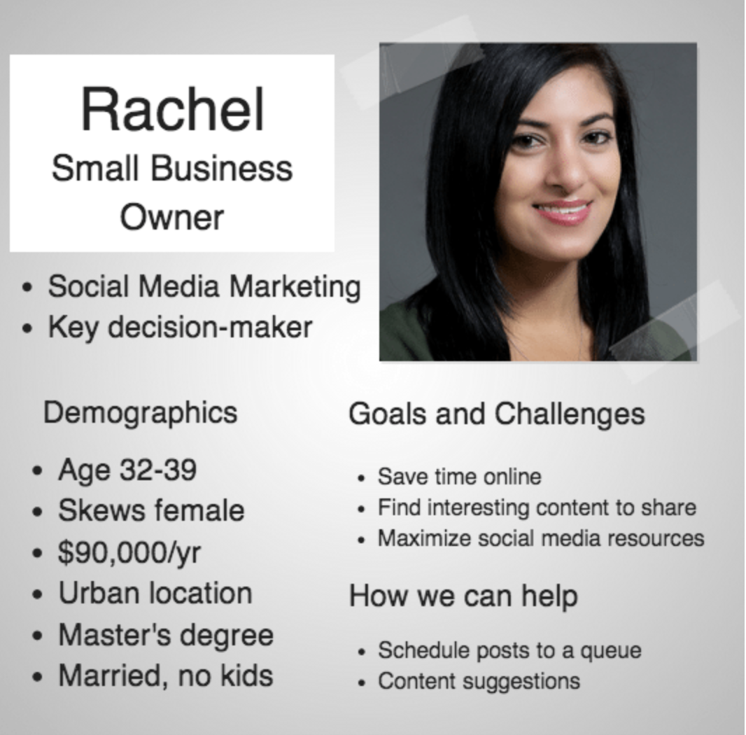
Using the information they’ve put together here, they will have a greater understanding of how to create their landing page.
You want to increase your chance of conversion, so don’t try to make your landing page appeal to absolutely everyone.
Instead, use the data in your personas to produce highly-targeted landing pages that speak to a specific group of people.
You only have a few moments to grab your visitor’s attention. And in those short few moments, they’ll decide whether or not they want to convert.
2. Present the offer
The reason landing pages are so effective is that they isolate the action.
There shouldn’t be a menu or other links on the landing page. It should all guide the visitor toward completing the action you want them to take.
Distracting them with multiple options is a surefire way to confuse them. Your conversion rate will suffer.
Do not give your visitors a choice. Make it clear what you want them to do.
The only option they should have is to convert or not to convert, like in this example from Geico: 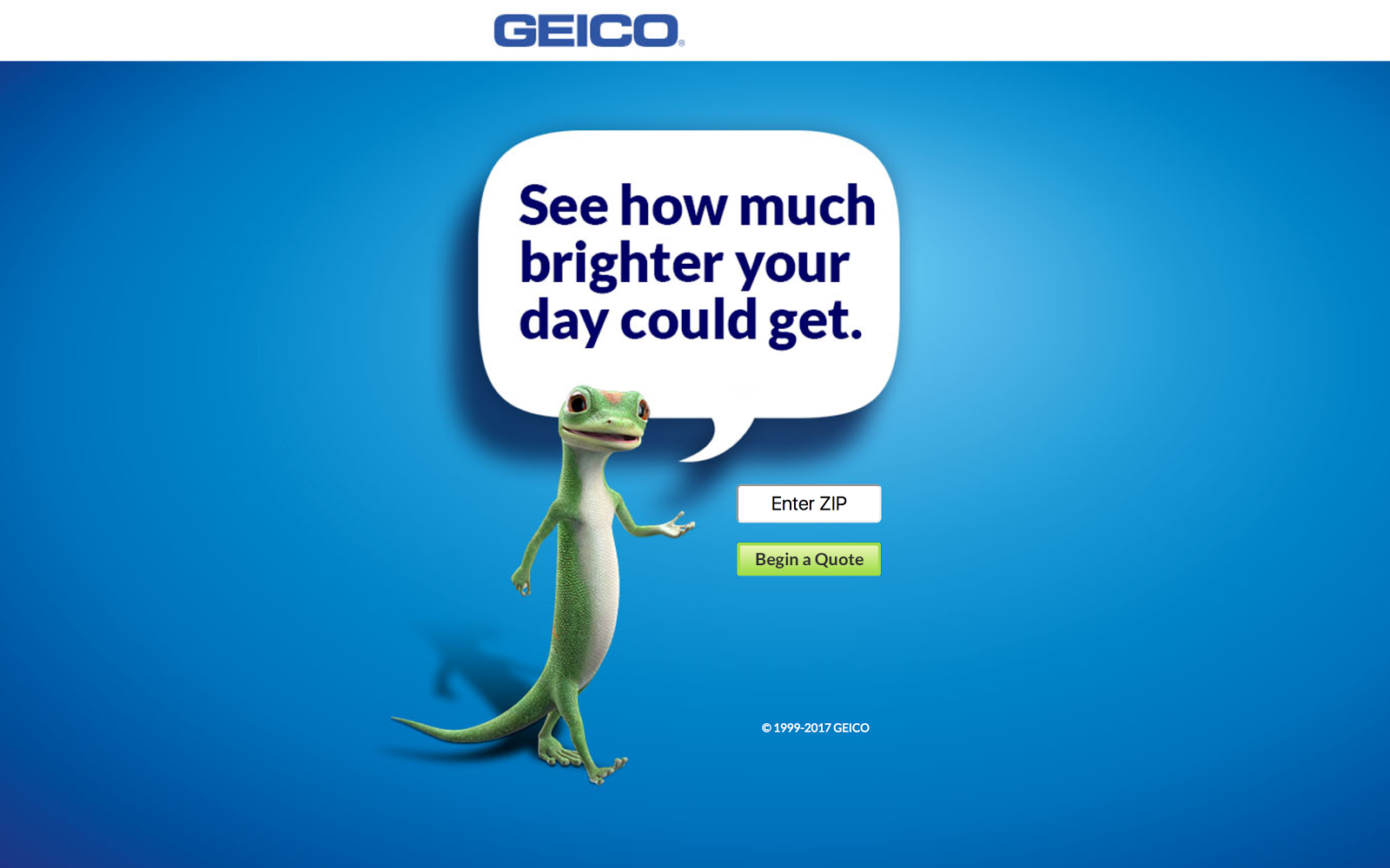
The clear landing page means that whoever lands on the page only has one option. Enter their zip code or not.
But just making the chosen action clear isn’t enough to ensure that your visitors convert.
You need to create an offer that resonates with them enough to take the action.
Think about it. A landing page that asks its users to sign up for the newsletter in exchange for nothing isn’t going to convert very well.
Why?
Because there’s no incentive. Why should your visitor do anything for you without getting something in return?
And no, your newsletter alone is not enough of an incentive.
But creating a compelling offer doesn’t have to be a complicated task. You just need to provide your audience something they actually want.
Autopilot knows their readers would be interested in growing revenue with Instapage, so a replay of the webinar would be beneficial to them.

This is a good example of a strong offer.
If you already have a landing page that you’re looking to improve, ask yourself whether or not as a visitor you would take the desired action.
If the answer is no, then there are changes you need to make.
If you’re struggling to create an offer, but you know you want to build your email list with a landing page, then look at your most popular piece of content.
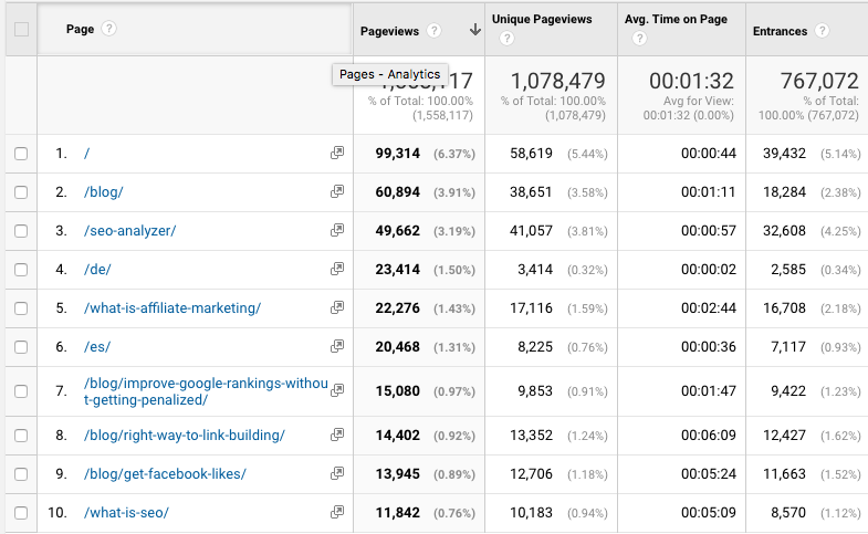
We can see here that the most popular piece of content on my blog is [enter content].
If you were to offer this content as a downloadable PDF or checklist, people would be likely to give you their email address in exchange.
Why?
Because you already know it performs well. You have proof there’s a need for it.
Here, the hard work is done for you. Find a popular piece of content, find a way to repackage it as a downloadable piece, and offer it to your audience.
But what if your landing page isn’t for an e-book, checklist, or downloadable PDF?
Think about other ways you can provide value to your audience.
3. Write the headline
Once you’ve got your offer down, you need to start working on the headline. The headline must be captivating.
It’s usually the first thing your visitor will see, so you need to perfect it.
The headline is often the deciding factor of whether or not a visitor will convert. And you only have one real opportunity to make it work.
Your headline should be driven by the benefits. You need to outline exactly what will happen to the visitor once they take your desired action.
Capital One makes use of both a heading a subheading to get their point across:
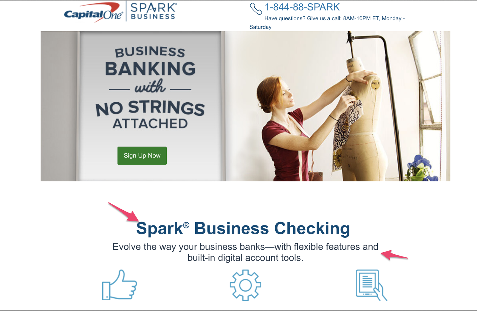
They know people who are interested in their service are going to want to have their business in order, so they position their offer in that sequence.
Salesforce has a clear headline and message:
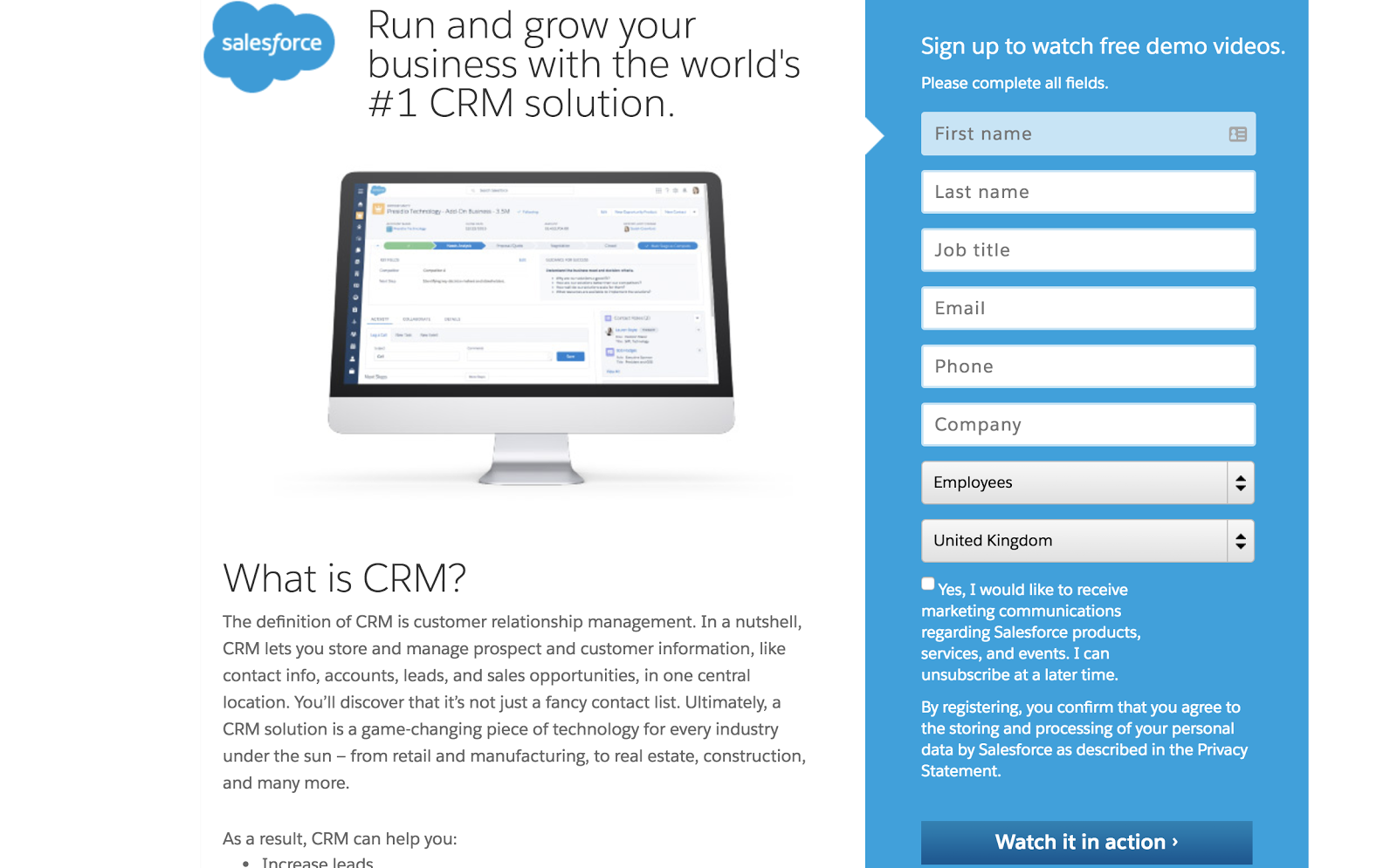
This headline is great because it grabs the audience’s attention. They’re immediately drawn to it. Visitors automatically know what will happen if they fill in the form on the right.
Joanna Wiebe of Copy Hackers says if you’re struggling to find the right words, then look at the language your audience uses.
Why is this effective?
Because if you use your audience’s own language in your headline, it will resonate better with them.
After the headline, you’re likely going to use a subheading.
This is another opportunity to mention the benefits. It’s for people who were compelled by the headline but need some more convincing.
It gives you another chance to keep their attention and draw them closer to your call to action.
4. Create the copy
Good copy sells. You know that. It’s why some companies pay copywriters thousands to put words on a page.
But it’s not as easy as just writing words on a page. They have to mean something to your target customer.
As we mentioned with the headline, if you’re struggling to find words, then utilize the language your prospects use.
Your copy is there as a tool to help you get your point and message across and increase the chance of conversion.
It all begins with finding the sweet spot for the right amount of copy. Write too little and you won’t have enough words to get your point across. But write too much and the page will become overwhelming.
However, just saying “find the sweet spot” doesn’t help you.
In general terms, the amount you write depends on the offer. For things that need a lot of explaining and persuading, you’re going to need more copy.
For things that require the prospect to provide you with more than just their email address, i.e. when they are making a purchase, you are naturally going to need to use additional copy to ensure all the necessary details are there.
When it comes to actually writing your copy, you should mirror your brand’s style.
Keep in mind that it’s not about you. It’s about the customer, so the phrasing you use should be customer-centric and focus on them.
Evernote personalizes their landing page copy by avoiding using words like “we” or “our” and instead opts for words like “your” and “you”:
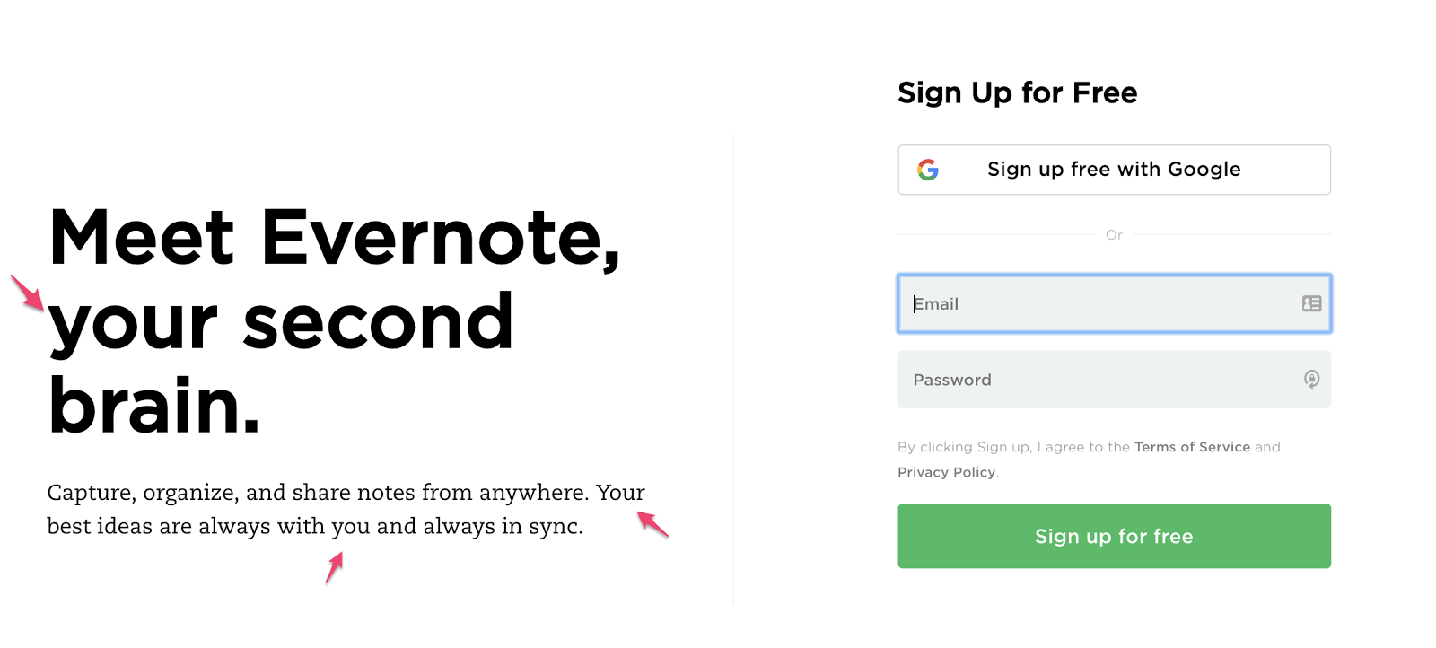
These words highlight to your prospects that the main reason for this landing page (and your business) is to help them solve their problems.
5. Use visual aids
Like we said, your landing page is only one page, so everything should be there for a reason and have a purpose. The same rule applies to any images or videos you use.
When you’re adding images to your landing page, you should utilize ones that help your visitors visualize their life after they’ve taken your action.
Airbnb is a business that focuses on people. So it makes sense that they should use images of people on their landing page: 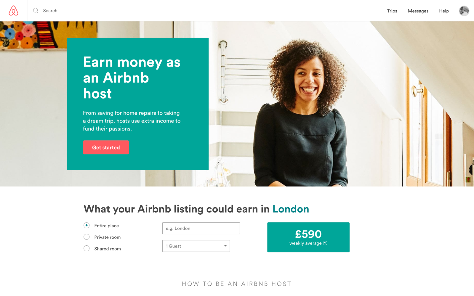
They want their users to feel accomplished and happy if they sign up as an Airbnb host, so they include an image of a woman smiling.
For anyone thinking about signing up for the Airbnb platform, seeing an image like this will encourage them it’s a good idea.
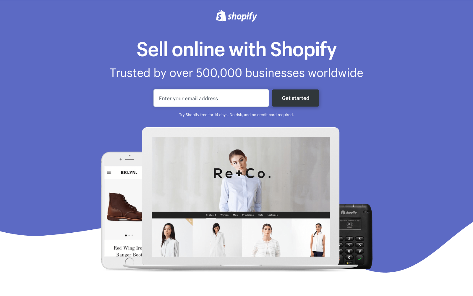
Shopify, an e-commerce platform, uses images to show visitors how their shop could look:
You can utilize images to guide your audience towards the call to action.
The images make your offer more human.
Your audience cannot touch or hold your product. Your landing page should make use of images to help them visualize it.
6. Include social proof
When creating a mind-reading landing page, understand that one question your audience will have is, “Do I need this?”
This is true for every landing page.
One way to read their minds is to address their question through the concept of social proof.
People are more inclined to take action if they know other people just like them have taken action and benefited from it.
Using social proof on your landing page provides prospects with another layer of trust. They feel like it’s more likely your product/service will actually do what you say it will because they can see what other people thought about it.
For example, check out what Freshdesk does on their landing page: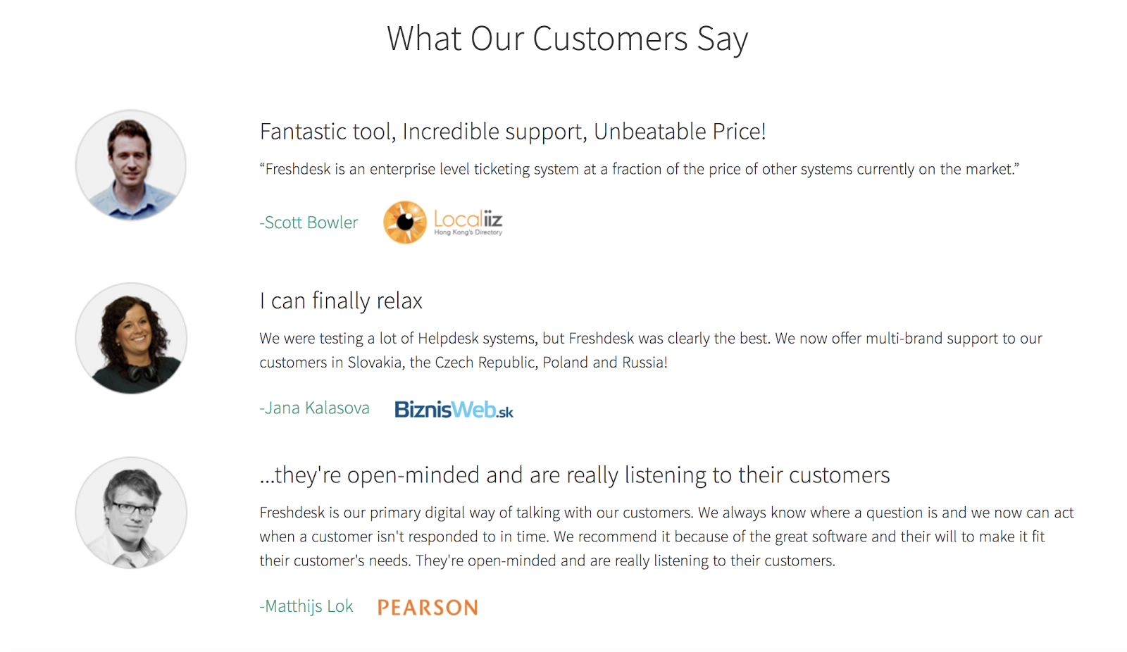
Do you have reviews and testimonials for your product you can use on the landing page?
Visitors get to experience how their life could be different from signing up. And they learn that from other people just like them.
7. Utilize a call to action
Your call to action button is important. It’s perhaps the most important element on the page.
If your audience can’t see your button clearly, they’re not going to know what to do.
Each landing page should have a call to action. The call to action is there to guide your user’s attention.
Let’s talk about your call to action button copy.
Your button copy should be action driven and relate to the offer available.
“Download” copy on the call to action is vague, and the visitor might not even remember what it is they’re downloading.
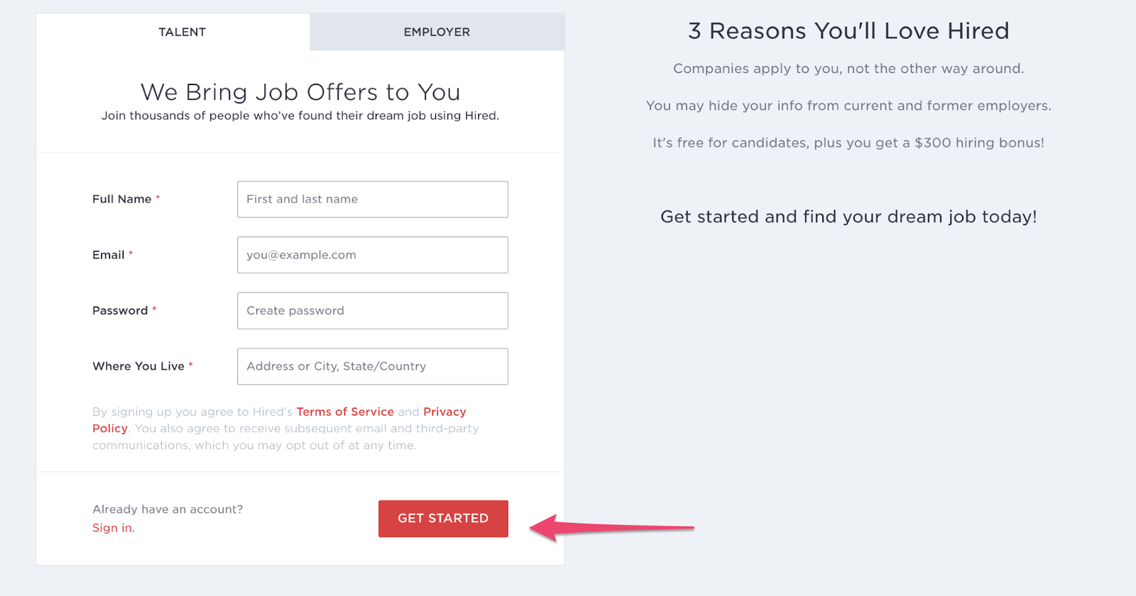
Take a look at the call to action button on Hired. It stands out as the only red button on the page:
Alexa uses the “Try 7 days free” copy, which takes the pressure off the visitor. They don’t have to fully commit to using the service, and won’t be charged if they’re not happy with it:
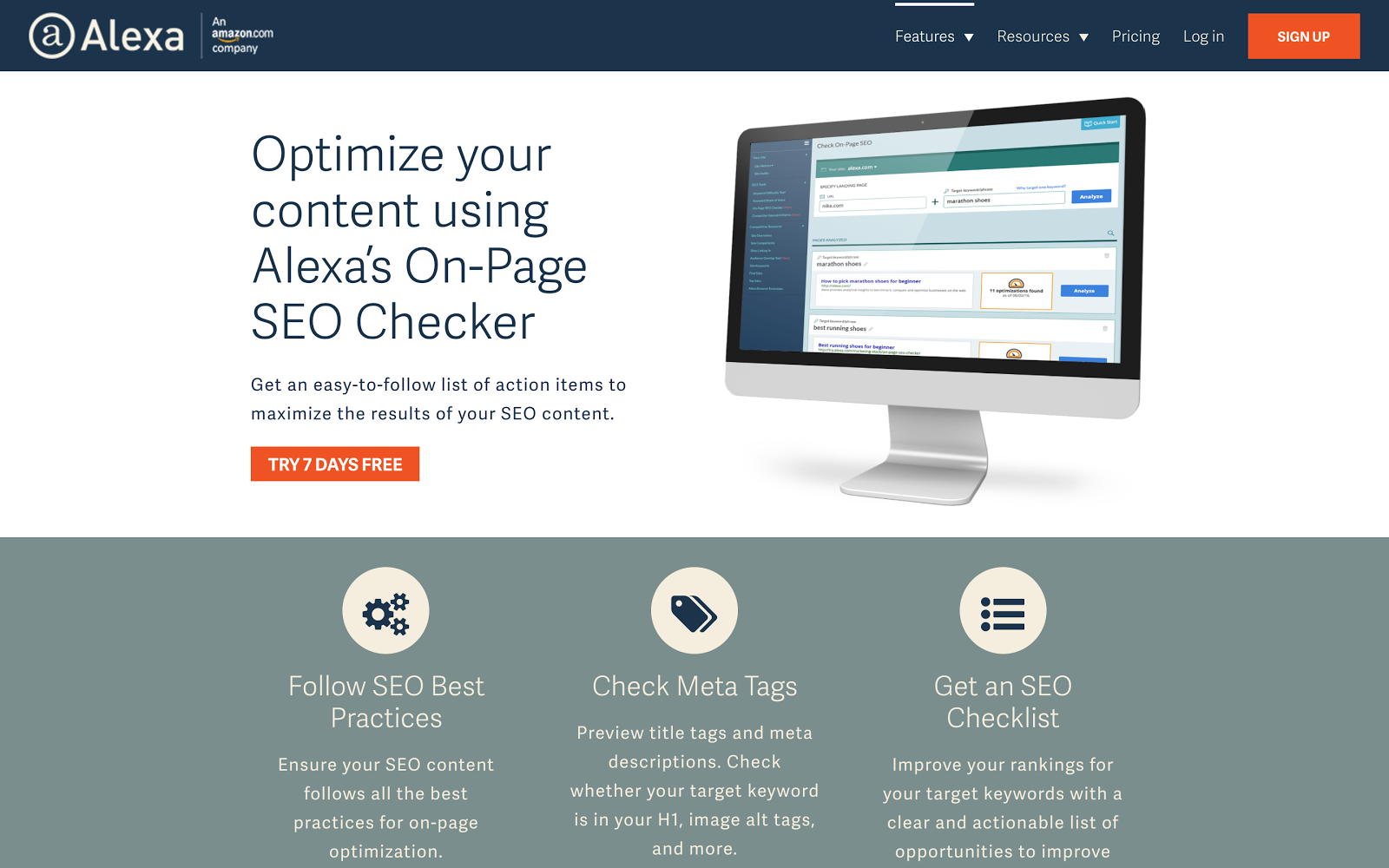
Both Hired and Alexa use excited copy like “Get started.” Using the word “get” psychologically makes people feel as though they are getting something in return for giving you their details.
8. Measure your results
If you don’t measure the results of your landing page, you have no real way of understanding whether or not it is converting successfully.
Use Google Analytics to measure how many visitors came to your landing page and converted by giving you their data.
When looking at the effectiveness of your landing page, consider your bounce rate.
Your bounce rate is the number of people who landed on your landing page and didn’t convert.
If your bounce rate is low it could mean one of the following things:
You aren’t using the right keywords. Your keywords should be relevant to the audience you want to attract. If not, you will have a bunch of untargeted prospects coming to your site with no interest in what you’re offering.
The design on your landing page is poor. Consider how often the average person spends on your landing page. If it doesn’t follow a logical flow or is too confusing, they’re more than likely going to bounce.
9. Make sure you test
The only way to know if your attempts are working is to run tests.
A/B testing your landing page involves splitting your traffic in half, so half the traffic sees one version of the landing page and the other half sees another.
This way you will be able to make informed decisions about what does and doesn’t work.
You can compare two versions of your landing page and test different elements.
Do you have two headlines you want to use, but you aren’t sure which will work best? Use A/B testing.
Then after you’ve generated enough traffic, you’ll be able to see which led to the highest number of conversions.
With this data, you can continually improve your landing page to ensure it converts the most people.
When testing elements, don’t try and test everything all at once. If you do this, you’ll have no clear idea what you need to change and what you need to keep the same.
Instead, change a few elements at a time and keep the other elements the same as a control variable.
Conclusion
Your landing page has one job, and one job only: To convert.
So why are you not doing everything you can to encourage your visitors to take your desired action?
It all begins with planning.
But the planning begins even before you start thinking about what you will have on your landing page.
If you want it to be successful, you have to read your prospects’ minds.
Essentially, you need to know your customers really well.
Once you know them, you’ll determine what words, images, and reasoning resonate most with them.
And once you start using their own ideas on your landing pages, your conversion rates are going to increase.
But, with everything in marketing, there is no one size fits all.
Follow the best practices listed in this post and develop your understanding of your audience, and you’ll be able to create winning landing pages for all your offers.
What strategies do you use to improve your landing pages?
The post 9 Steps to Creating a Landing Page That Reads Your Prospects’ Minds appeared first on Neil Patel.